2360 Text On Image Website Designs

























































































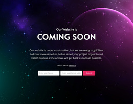



Cohesive Text On Image Website Design for a Consistent Visual System
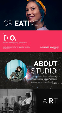
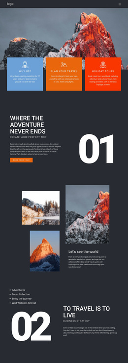
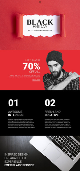
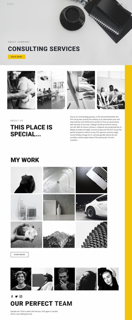
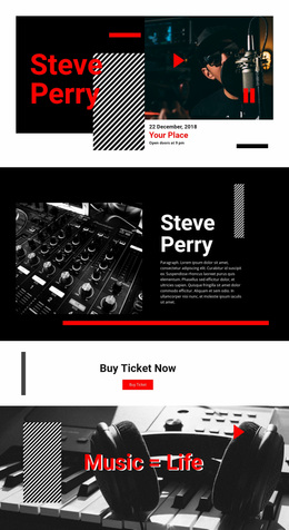
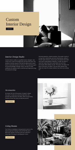
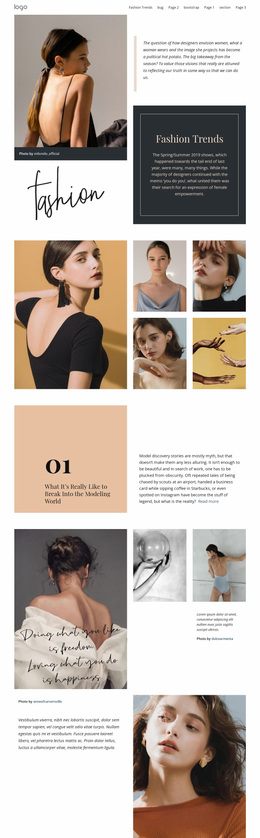
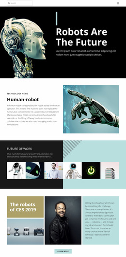
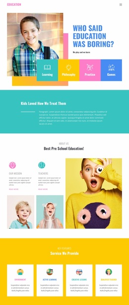
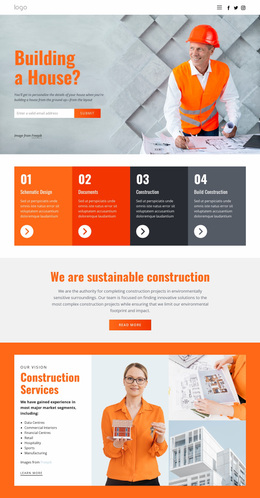
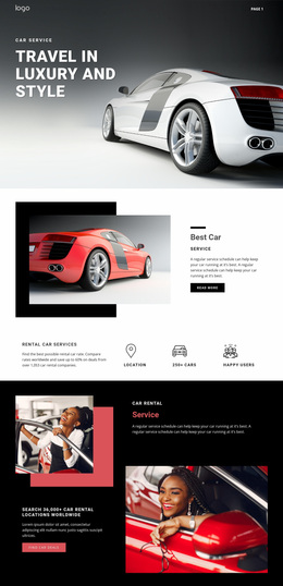
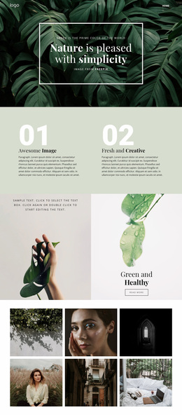
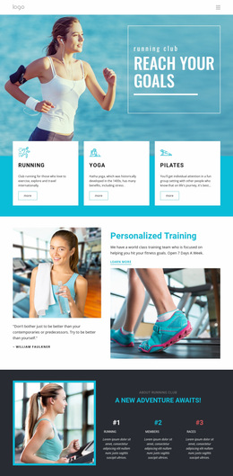
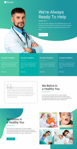
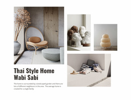
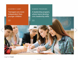
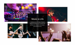
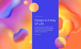
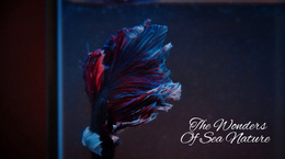
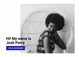
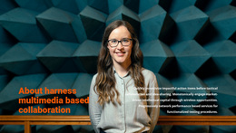
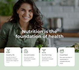
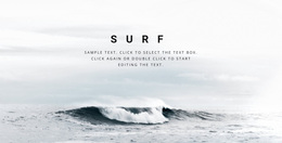
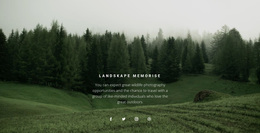
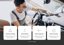
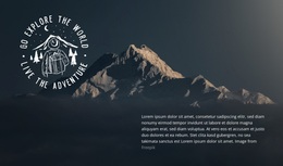
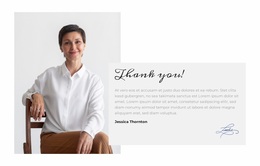
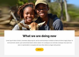
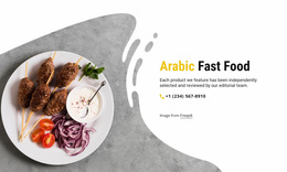
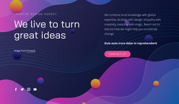
Text On Image Website Design is about making an image-led message belong to the website's wider visual language. The section still combines a dominant image, headline, and supporting copy, but the main concern is not choosing a ready-made block. It is deciding how imagery, typography, colors, and contrast should work together so the composition feels connected to the rest of the site.
The image may change from page to page, but its treatment should still feel intentional within the broader design system.
Define a Consistent Visual Language
Several visual decisions shape how Text On Image sections relate to the rest of the website:
- Typography: recurring heading styles and text hierarchy.
- Color: overlay colors and accents that connect to the broader palette.
- Image treatment: consistent mood, intensity, cropping logic, or tonal direction.
- Contrast: readable text that still respects the image.
- Focal hierarchy: a predictable relationship between visual subject and message.
A background-focused design direction can provide ideas for atmosphere and image treatment, but the image here has a more specific role: it works directly with the message.
Coordinate Typography and Color Across Sections
The headline should feel like part of the same website even when the image beneath it changes. Reusing related font choices, scale relationships, and color logic can make different Text On Image sections feel connected.
Nicepage Theme Settings can establish shared Colors, Fonts, and Typography for pages and sections. The Site Colors settings help manage a common color scheme instead of rebuilding the same choices individually.
A useful design approach is to keep:
- recurring heading typography;
- a controlled overlay color range;
- consistent spacing;
- similar contrast logic across related sections.
These shared rules create cohesion without making every composition identical.
Develop a Consistent Image Treatment
Consistency does not mean using the same photography everywhere. Different pages can require different subjects, crops, or moods.
The visual system can remain recognizable through:
- similar contrast or saturation;
- related cropping styles;
- a recurring approach to negative space;
- repeated overlay-placement logic.
Nicepage's Image Element supports the dominant visual, while the wider design direction determines how images relate across sections.
Keep the Message Readable Without Flattening the Design
Strong brand styling shouldn't make the overlay hard to read. Check whether the headline remains primary, supporting copy stays secondary, the focal subject is visible, and the overlay treatment fits the wider website. The goal is cohesion without sameness.
Text On Image vs Website Templates
Website Templates focus on selecting and adapting a prepared section for a specific page or broader site structure.
Website Design focuses on the visual system behind that section: typography, colors, image treatment, contrast, and consistency across different parts of the website.
This distinction keeps the design page centered on visual coordination rather than on choosing or reusing a ready-made block.
Text On Image vs Layered Images
Layered Images create visual interest through relationships among multiple pictures. Overlap, scale, position, and depth between those visuals are central to the composition.
Text On Image is organized around one dominant image and a primary message. The design challenge is therefore to coordinate imagery, overlay typography, color, and focal placement with the visual rules used elsewhere on the site.
FAQ About Text On Image Website Design
Should every Text On Image section use the same photography style?
Not necessarily. Images can change with the message, but a consistent approach to treatment, color relationships, typography, and hierarchy can help different sections feel like part of the same visual system.
How can overlay typography stay consistent across a website?
Use shared font and typography choices for recurring text roles, then adjust the local composition so the headline remains readable against its specific image.
Do all Text On Image sections need identical color overlays?
No. The exact treatment can vary, but the color choices should still relate to the broader palette and maintain consistent contrast logic.
What should remain consistent when imagery changes?
Keep the hierarchy, typography, color relationships, and general image-treatment logic recognizable even when the subject matter changes.
Is Text On Image the same as a Layered Images section?
No. Text On Image centers one dominant image and its message. Layered Images uses relationships among multiple visuals as the main composition.
Bring the Image-Led Section Into the Visual System
Refine the headline, supporting copy, image treatment, contrast, and focal placement so the section feels intentional on its own and connected to the wider website. Use shared typography and color rules where they strengthen consistency, while allowing each image-led composition to retain its own visual character.