
Color Website Templates
A color-led brand needs more than a striking homepage. These templates connect palette choices with a complete page set, shared navigation, and site-wide styling so Home, About, Services, Portfolio, and Contact feel like one project.






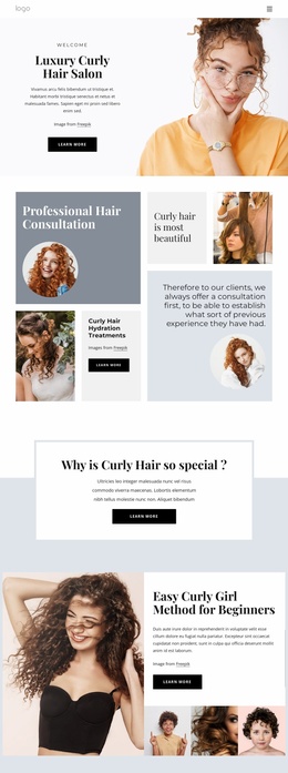
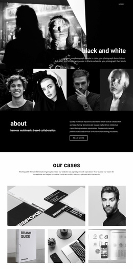

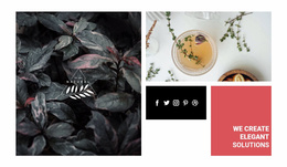
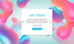








































Other Art & Design Website Templates
Ready-Made Color Website Templates You Can Adapt to Your Brand
Most people choose a color website template based on a single screenshot. The homepage looks confident, the accent is strong, and the decision feels made. Then the rest of the demo opens, and the palette has nothing left to do. A services list sits on a plain white background, a portfolio grid clashes with the accent, and the contact screen could belong to a different project.
Looking Past the Homepage Preview
Color categories on template marketplaces hold different things. Some templates arrive as a set of several pages; others as a single page or a block meant to be added to an existing project. Whatever the pack contains, scroll through all of it before deciding that the palette works.
Four details are visible in a demo before you download anything: - The same accent carries buttons, links, and the active navigation item instead of drifting into three close tones; - Long text blocks sit on a calmer background while the signature color stays for smaller areas; - Images and gallery blocks, where the demo shows them, are not fighting a saturated surface behind them; - Inner screens keep the family resemblance even once the hero image is out of sight.
Swapping in Your Own Brand Colors
Templates rarely stay as purchased. A client sends a new brand palette, another five pages appear over the year, or the accent that looked great in the demo turns out to be the wrong green. Repainting screen by screen is where color projects quietly fall apart.
Nicepage Theme Colors keep that work in one place. The Site Colors workflow defines a Color Scheme for the entire project, so a swap applies to every button, link, and header at once. The same scheme covers screens you add later, which starts to matter as a small site grows.
One Accent, Many Destinations
Different projects lean on a palette in different ways. A studio site can push saturated tones through its portfolio and calm them down where the contact details live. A restaurant or event site has the harder job: promotional screens want intensity, while booking and directions screens need to stay quiet, and both still have to read as the same brand.
One last test is worth doing before you commit. Look at the homepage, the most text-heavy screen in the demo, and any screen that contains a form. If a single palette holds up across all three, the template will carry you through the rest of your project.