110 Slider Website Designs















































































Slider Website Design Ideas for Ready-Made Page Sections
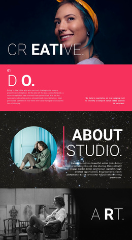
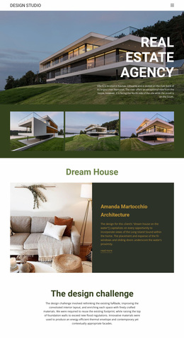
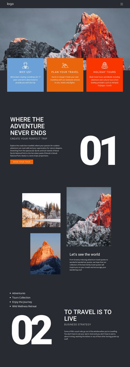
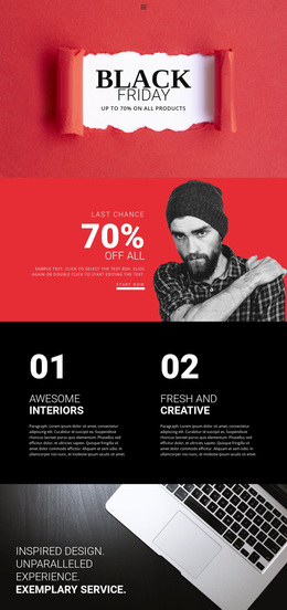
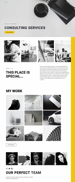
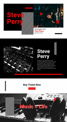
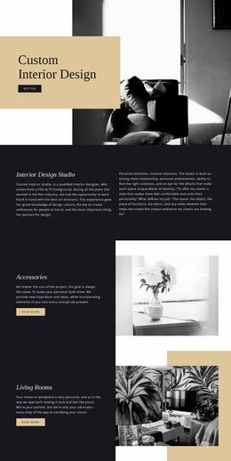
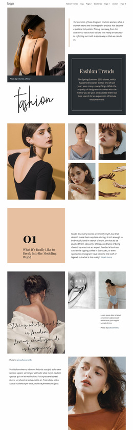
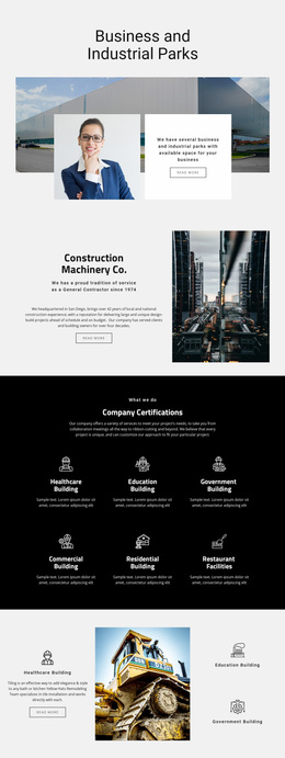
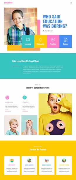
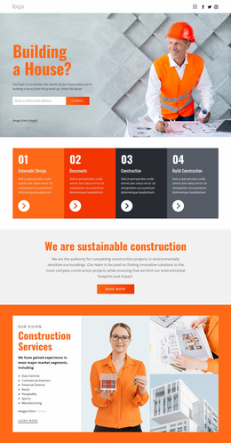
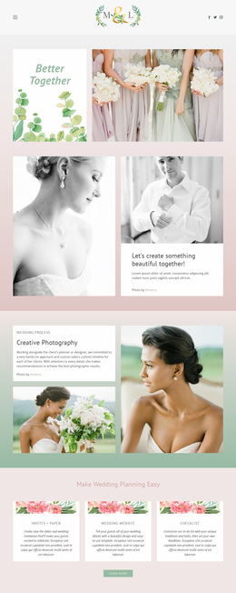
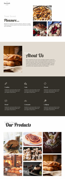
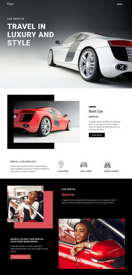
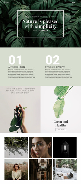
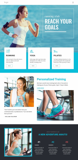
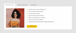
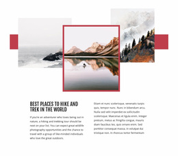
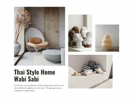
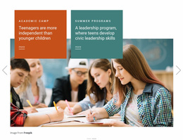
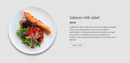
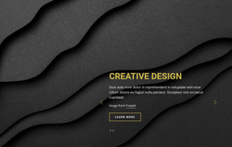
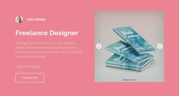
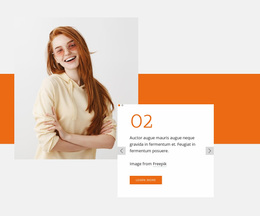
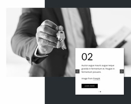
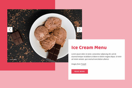
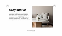
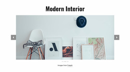
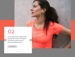
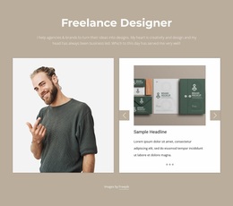
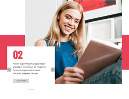
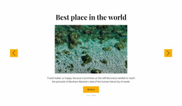
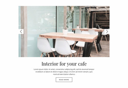
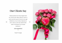
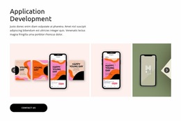
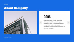
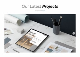
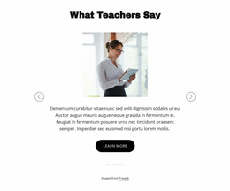
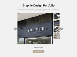
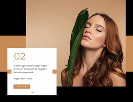
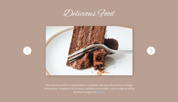
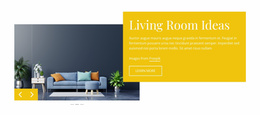
Slider Website Design options offer different visual approaches to presenting rotating content within a page. Some use strong product photography, some foreground a testimonial, and others balance short editorial text with an image. Choosing from these finished compositions helps you establish the section's visual character before customizing the details.
A ready-made design is useful when the slider should feel connected to surrounding content. Look for consistent typography, an appropriate background, and a slide arrangement that suits the page's existing visual direction.
Shape the Slider’s Visual Hierarchy
- A clear focal point can make the main image or headline lead each slide.
- Contrasting backgrounds help the copy remain legible as imagery changes.
- Consistent typography gives varied messages a shared visual rhythm.
- Aligned controls make transitions feel like part of one composed section.
An effective Slider Website Design preserves a recognizable relationship among headline, image, and navigation even when the slide content changes. For instance, a large photograph may need a separate text zone so captions do not compete with the subject.
Look at the Visual Decisions Already Made
An appealing Slider Website Design settles composition-level relationships: which element leads, how the headline and image balance, and where the section begins and ends relative to adjacent blocks. Review several slides to see whether the intended visual hierarchy survives the content changes.
The Slider Element supports varied slide elements and navigation. The design question here is not how to style individual controls through CSS, but whether the Slider supports the page’s overall visual rhythm and message priority.
Match the Slider to the Surrounding Page
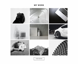
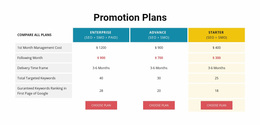
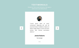
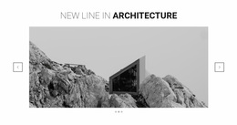
A quiet quotation Slider can introduce a pause between dense service descriptions. A wide portfolio Slider may serve as a visual bridge to a tighter project grid, while a promotional sequence can inherit the color accents of a nearby CTA section. These neighboring elements determine the slider’s scale, contrast, and section boundaries.
Assess three practical qualities when browsing:
- Visual weight: Does the slider complement nearby sections?
- Content capacity: Will the layout fit your actual headings and images?
- Responsive presentation: Does the hierarchy still make sense at narrow widths?
Nicepage's Responsive Modes support review and adjustment across screen sizes. A good design keeps its main message clear even when the image and text need to be rearranged.
Slider Website Design FAQ
How do I choose between a visual and a text-focused slider?
Select an image-led design when the imagery carries the story; choose a text-focused composition when the statement or explanation needs to be read first.
Can a ready-made slider match an existing design style?
Yes. Start with similar proportions and visual weight, then adapt the colors, imagery, and typography in Nicepage.
Is a large slider always better for a homepage?
No. A compact section may fit better when the homepage has other strong content areas. Choose the scale that suits its role.
Can Nicepage AI provide another starting point?
Nicepage AI Services can generate blocks, pages, and sites. You can also begin with a ready-made Slider design whose visual arrangement already meets your needs.
Select a Design That Belongs on Your Page
Evaluate the chosen Slider as part of the complete page composition. Its visual hierarchy, typography, color contrast, and interaction with adjacent sections should remain coherent from the first slide to the last.