370 Contacts Website Designs



















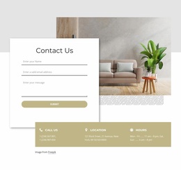

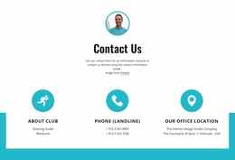
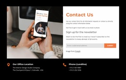
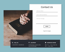














Creative Contacts Website Design Styles for Business Contact Sections
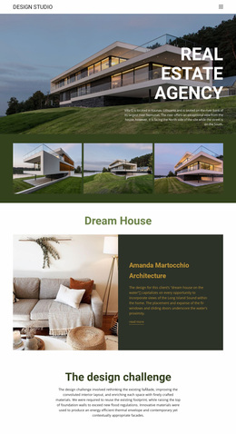
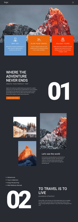
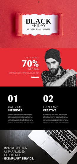
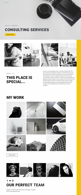
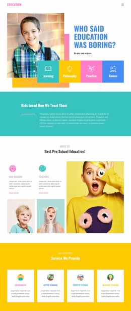
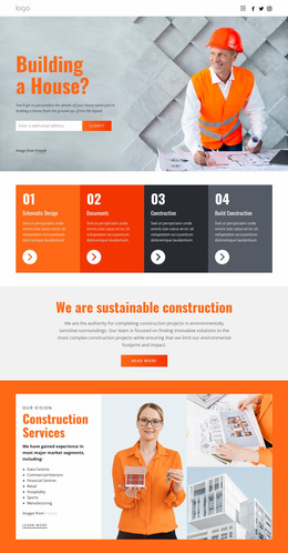
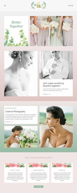
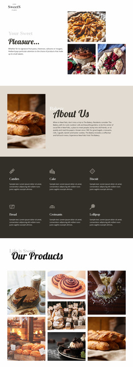
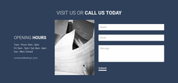
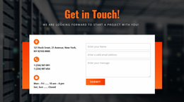
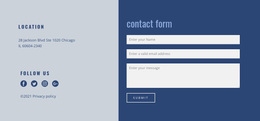
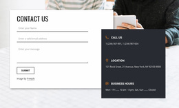
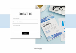
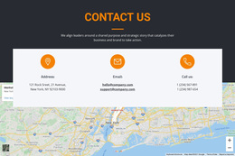
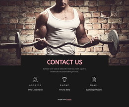
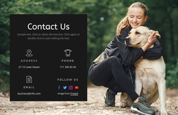
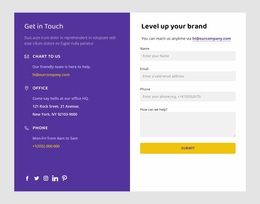
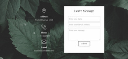
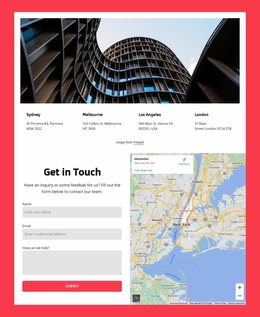
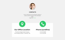
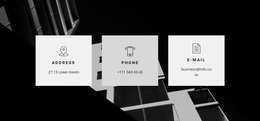
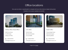
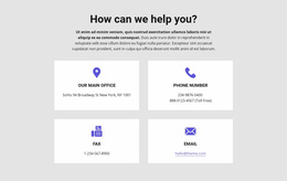
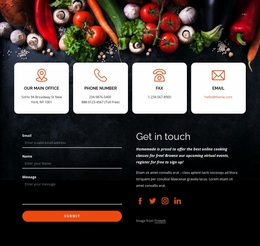
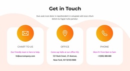
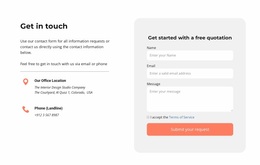
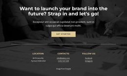
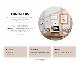
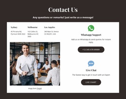
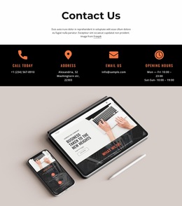
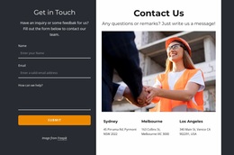
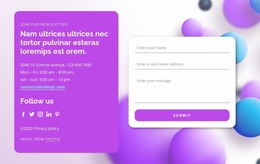
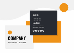
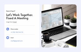
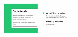
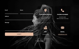
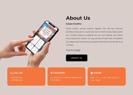
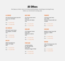
Contacts Website Design presents ready-made visual treatments for contact sections. Compare how typography, contrast, color accents, and iconography draw attention to a phone number, email link, or written address. The central choice is how convincingly each prepared design communicates contact information at a glance.
These are editable contact designs, not simply abstract inspiration; compare the visual style of the finished section with real phone, email, and address details.
Compare the Visual Character of Contacts Website Designs
The same accurate contact details can look formal, quiet, or highly prominent depending on the finished visual treatment.
Compare visible qualities in the available designs:
- Typography: whether a telephone number or contact heading draws the eye before supporting details.
- Contrast: whether an email link remains distinguishable from descriptive text.
- Color accents: whether one important contact action is emphasized without obscuring the address.
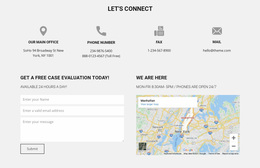
- Iconography: whether phone, email, and location symbols clarify the labels rather than compete with them.
- Visual balance: whether several contact values remain legible without one decorative element overpowering the others.
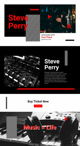
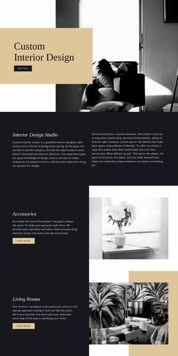
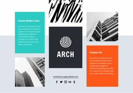
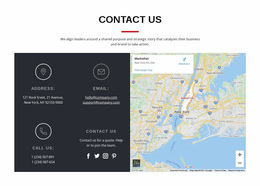
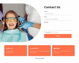
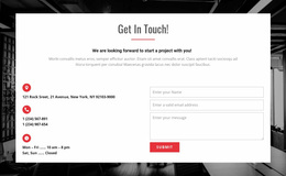
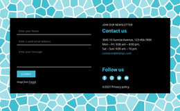
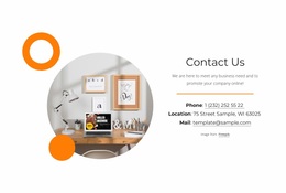
For example, restrained typography, low-contrast dividers, and muted icons create a different impression from bold type, saturated color combinations, and bright visual accents—even when both designs display the same details. Neither style belongs exclusively to one industry.
Choose the visual language first, then assess whether it remains readable with complete addresses and real contact details.
Judge the Readability of Contact Channels
Two ready-made designs with identical contact content may lead the eye to different details. Compare whether the primary telephone link is identifiable immediately, whether the email address looks actionable, and whether a multi-line address remains easy to scan.
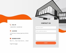
Visual weight matters more than a layout's label. An oversized graphic can make a necessary phone number secondary; restrained decoration can give the address and hours an intentional hierarchy.
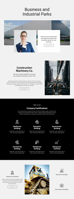
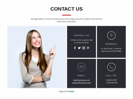
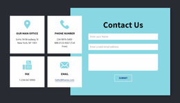
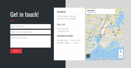
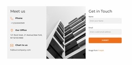
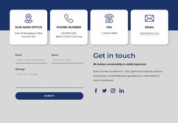
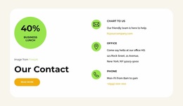
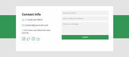
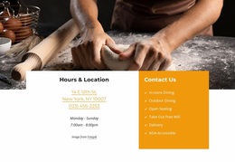
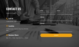
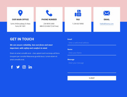
A large, high-contrast telephone number draws attention, while small icons aligned with email and address details create a quieter directory-like appearance. Fine borders around contact cards feel different from solid-colored panels.
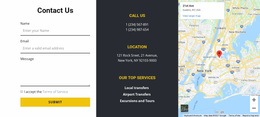
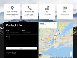
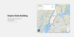
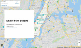
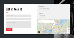
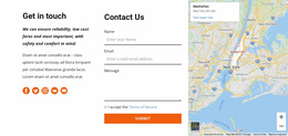
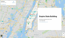
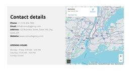
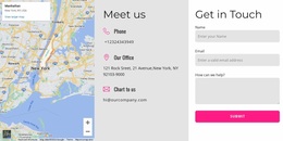
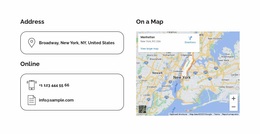
Nicepage's Google Maps Element can support a selected map-led design.
Supporting visuals should reinforce contact clarity. Their color and scale should feel related to the text without distracting from actual communication channels.
For locations with long addresses or multiple operating-hour lines, leave enough space for the text to stay readable without excessive wrapping.
Compare the Finished Impression of the Contact Section
The same phone number and address can look reserved or expressive in different prepared designs. A subtle email link, a strongly weighted phone number, or a distinct address heading each creates a different order of attention.
Compare type scale, background contrast, icon size, and spacing between each address label and its value. These details characterize the style more accurately than the section's position on a page.
Compare their visual mood without treating these qualities as exclusive template families:
- Understated: minimal decoration and quieter text treatment.
- Expressive: larger headings, color contrasts, or graphic accents.
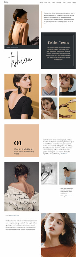
- Editorial: stronger typography with restrained supporting elements.
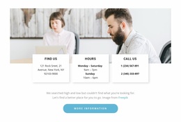
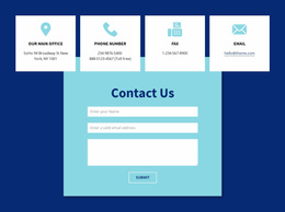
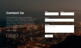
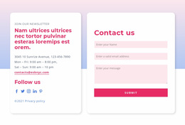
A muted background can make office cards feel orderly; stronger contrast can make a phone number or contact heading the focal point. Icon size, line spacing, and link color matter as much as the palette.
The best design makes the intended contact channel recognizable while maintaining this section's visual character. It need not belong exclusively to any industry or site type.
Adapt Contact Layouts for Different Screen Sizes
On smaller screens, check whether phone numbers remain legible at the chosen type scale, email links retain sufficient contrast, and contact-card padding stays balanced. The main goal is to preserve the visual treatment.
Nicepage Responsive Modes can help compare how the selected designs look in smaller views.
Review the relationship between text and maps when columns become stacked. Phone numbers and email addresses should remain recognizable, and opening hours should stay close to the relevant location.
Assess the actual mobile version of the prepared composition rather than assuming every wide map or card layout behaves identically.
Contacts Website Design FAQ
How do I choose a visual style for a Contacts section?
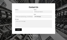
Compare how the same phone, email, and address appear in minimalist, high-contrast, and typography-led designs. Favor legible link colors, deliberate icon treatment, and a tone that suits the project.
Should I use a compact or visually prominent design?
A compact style uses restrained type and separators; a prominent style may enlarge the telephone number or place contact details on a contrasting background. Both should preserve readable addresses and obvious links.
How can I keep a Contacts block readable on mobile devices?
Use a layout that keeps contact details grouped when columns stack vertically. Review text sizes, spacing, and map proportions in Nicepage Responsive Modes, adjusting the section for smaller screens as needed.
Can a chosen Contacts design be adapted in Nicepage?
Yes. You can refine a ready-made Contacts section in the visual editor while keeping the visual direction that led you to choose it.
Select a Contacts Website Design in Nicepage
Compare ready-made Contacts website designs by typography, contrast, icon treatment, and the prominence of phone, email, and address details. Select the visual treatment that makes the most useful communication channel stand out, then adapt the content in Nicepage.
The strongest choice looks deliberate as a contact section and keeps every required communication option readable.