
Mosaic Website Designs
For studios, photographers, and visual brands, a mosaic site needs recognizable rules rather than a different grid on every page. Repeated tile proportions, typography, and color relationships keep varied content within one coherent design language.

More Website Designs from Art & Design Category
-
-

-
-
-
-
-
-
-
-
-
-
-
-
-
-
-
-
-
-
-
-
-
-
-
-
-
-
-
-
-
-
-
-
-
-
Free Website Builder SoftwareDownload
-
-
-
-
-
-
-
-
-
-
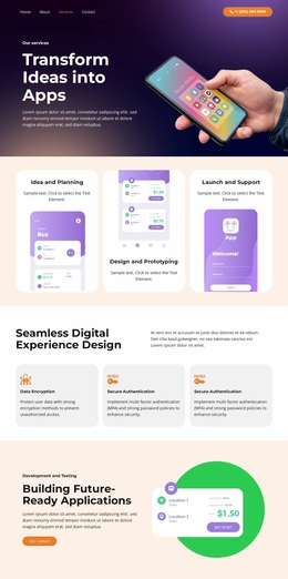
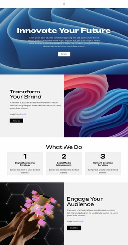

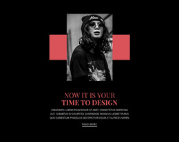


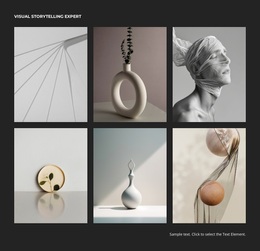







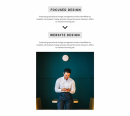
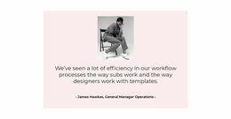
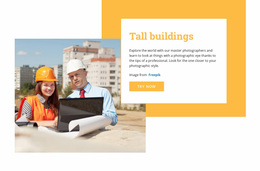

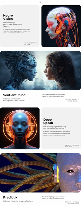








Other Art & Design Website Designs
Complete Website With Modern Mosaic Website Design
A design agency site rarely stops at one screen. There is a homepage, a list of work, and a page for every case. The About and Contact sections sit behind the same navigation. Mosaic website design is what holds that set together: one type scale, one palette, one way of treating images from the entry point to the deepest section.
Global Styles That Travel Between Pages
Identical pages would be tiring to visit, so the repetition lives in the styles while the layouts stay free. What visitors recognize is decided once, at site level.
A mosaic design system usually settles a handful of things site-wide:
- headings, body text and credits taken from one type scale
- a palette that returns in backgrounds, buttons and image overlays
- proportions and spacing that reappear in every listing
- one shared treatment of the main action, from Get a Quote to Contact
Nicepage keeps this layer in Theme Settings, where fonts and colors are defined for the entire site. Header and footer live in the same place, so a change made once shows up everywhere.
From Homepage Into Deeper Sections
Visitors rarely stop at the homepage. The route usually runs to a listing, then to one case, then to contacts, and a site feels coherent when every step looks like a continuation of the last.
An agency can keep the densest arrangement at the entrance and let inner sections settle down. A photography site often does the opposite, saving the largest images for the deepest sections. A product showcase can hold a mosaic on category screens and switch to plain rows where prices matter.
Complete website designs are easier to judge as a set. The homepage shows the character, and the inner sections show whether it survives longer text and smaller images.
Header, Footer and Steady Navigation
Navigation carries more weight here, since much of the movement happens by clicking images. The menu stays in the same position throughout, and the footer repeats the main sections, so the way forward remains predictable.
Recurring components hold the rest together. A card style defined once appears in the work listing, in related items, and in the news block, and they all read as one family.
Density is the part that changes between sections. A homepage can be busy, a services page can be almost empty, and the difference still reads as a single design, with typography, spacing, and image treatment staying in place.
Later additions follow the same rules. A new case study, a new service, or a seasonal landing section inherits the header, the type scale, and the proportions agreed at the start.