570 Wide Website Designs














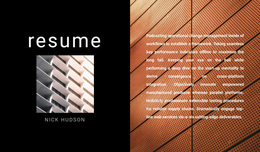

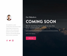











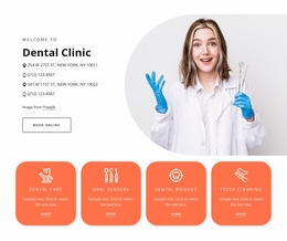




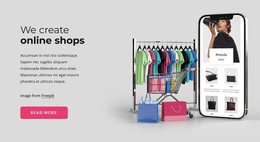
















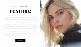


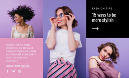

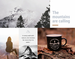

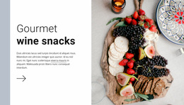


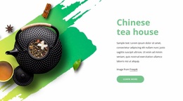
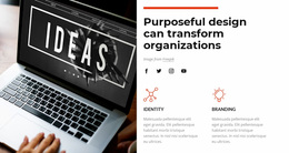


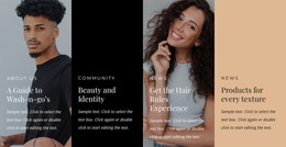




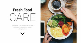





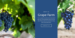

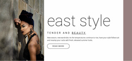


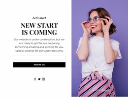
Unique Wide Website Design for Stronger Visual Identity
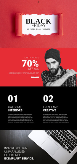
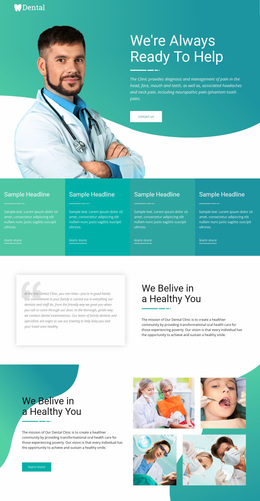
Wide Website Design asks a different question from templates: how does width change the way the site is perceived? ** A broad section can alter visual hierarchy, increase image impact, interrupt a boxed layout, or create a stronger expression of brand character.
Its effect comes from composition: browser span, crop, focal point, contrast, section height, color, and typography all influence how prominent the section feels.
Use Browser Span to Change Visual Hierarchy
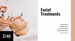
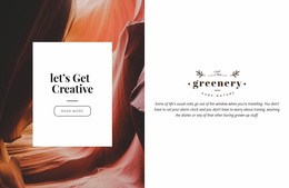
An edge-to-edge section carries more visual weight than content held inside a narrow container.
A shallow full-width band may add emphasis without dominating the page. A taller image field can become a major landmark. A short statement placed across a broad area can feel more authoritative simply because the surrounding composition gives it more visual weight.
The design decision is therefore not just “make it wider.” It is about how much attention the width should command.
Create Contrast With Boxed Layouts
Wide becomes especially powerful when it interrupts a more constrained system.
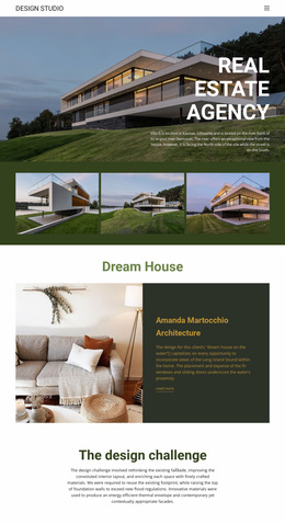
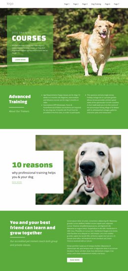
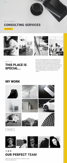
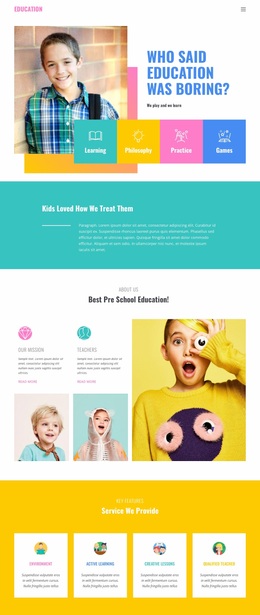
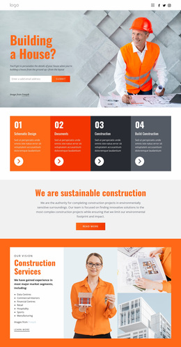
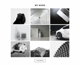
For example, a boxed portfolio grid → edge-to-edge project image creates a clear visual accent. A narrow editorial column followed by a full-width image can signal a major shift in the story. A grid of cards can be interrupted by a broad color field to create a stronger pause.
That contrast works because the Wide section changes the viewer's spatial expectation.
Control Image Scale, Crop, and Focal Point
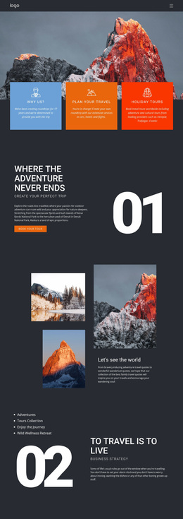
Large images behave differently when they span much of the browser.
The composition should account for:
- the location of the focal subject;
- crop changes across screen widths;
- the relationship between text and the focal area;
- vertical height;
- how much visual detail remains readable at scale.
The design challenge is to preserve the intended emphasis while the image occupies a much larger field.
Use Color and Typography to Support Brand Expression
A Wide section may be visually dominant, but it still needs to belong to the same site identity.
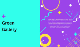
Nicepage Site Colors lets Theme Colors define a shared Color Scheme across project pages. This allows a broad section to create contrast while remaining connected to the established palette.
Nicepage Site Fonts provides a Fonts Scheme and Typography Styles for site pages. A Wide statement can use a stronger scale or more dramatic placement while still following the same typographic family and hierarchy.
The result is brand expression through composition, not a disconnected decorative section.
Shape the Character of the Site
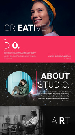
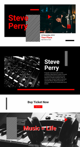
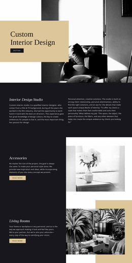
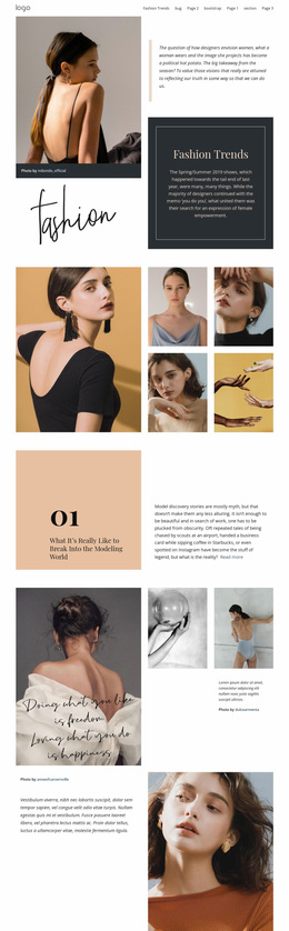
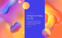
Wide can make the same site feel more cinematic, editorial, minimal, luxurious, expressive, or restrained depending on the composition.
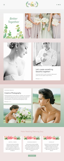
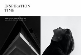
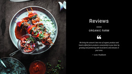
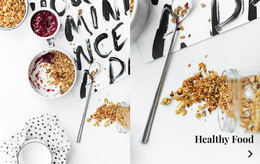
Photography-led brands can use expansive image fields. Editorial sites can use large-scale typography. Minimal interfaces can create impact through a broad monochrome field. Portfolio sites can use edge-to-edge work to punctuate a more controlled grid.
These choices shape the website's personality because Wide changes how the viewer experiences scale and contrast.
Wide Website Design FAQ
How does Wide change the visual effect of a page?
It changes hierarchy and scale by giving one section more browser space than surrounding content, making imagery, typography, or color feel more prominent.
Why does Wide work well beside boxed content?
The shift from constrained content to edge-to-edge composition creates contrast and makes the Wide section feel like a deliberate visual landmark.
Why is image crop important in Wide design?
Large images are exposed to more drastic crop changes across viewport widths, so the focal point and key visual details need to stay effective as the composition shifts.
How should colors and fonts behave in a Wide section?
They can become more prominent, but they should still support the site's established palette and typography so the section reinforces rather than breaks visual identity.
Use Wide as a Visual Design Decision
Treat Wide as a compositional choice. Browser span, image scale, crop, contrast, color, and typography should work together so the section changes the page's visual rhythm while strengthening the site's overall identity.