2020 Shapes Website Designs


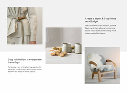
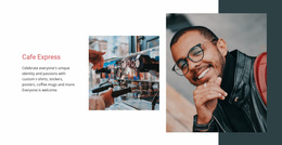
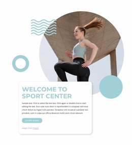
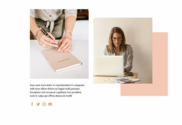































Inspiring Shapes Website Design Ideas for Modern Sites
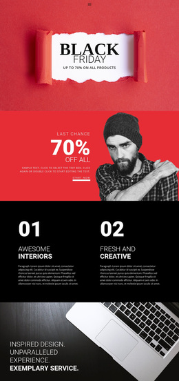
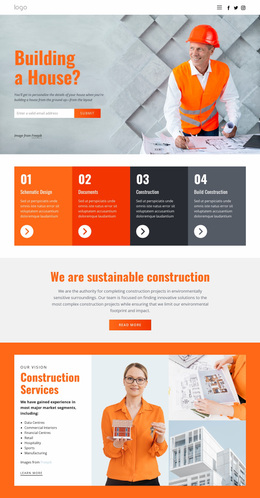
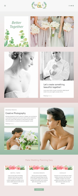
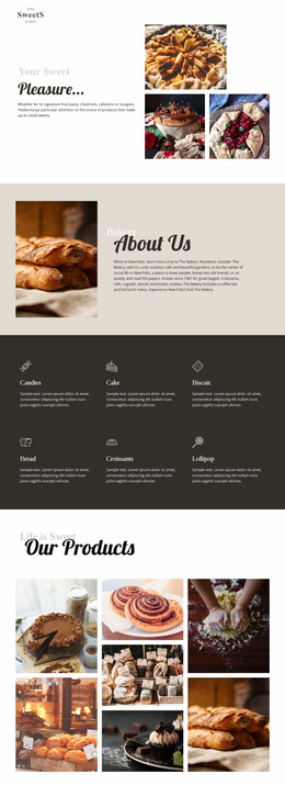
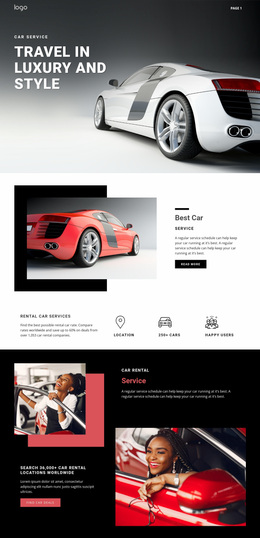
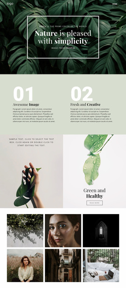
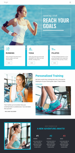
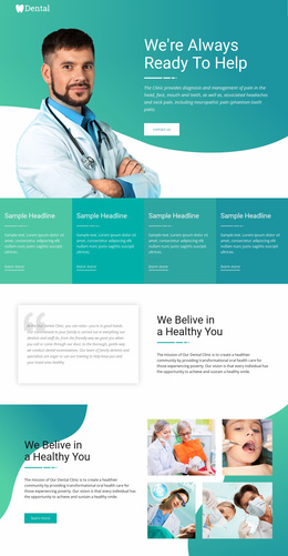
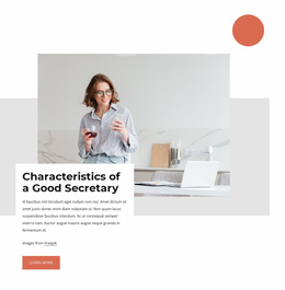
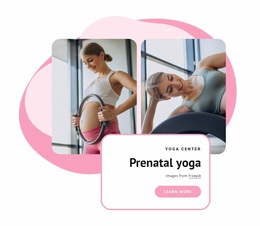
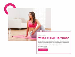
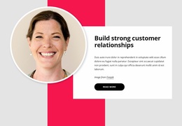
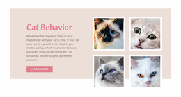
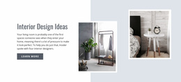
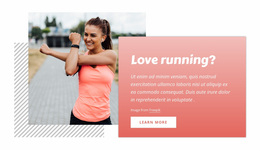
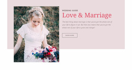
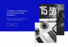
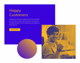
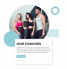
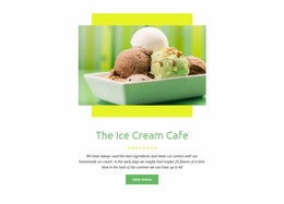
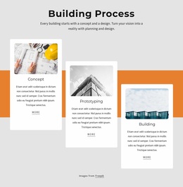
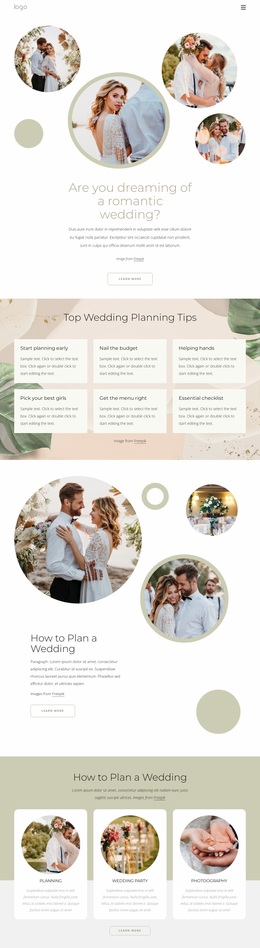
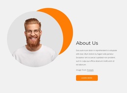
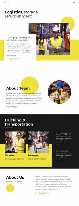
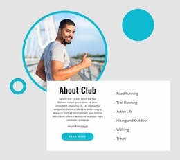
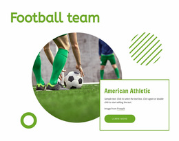
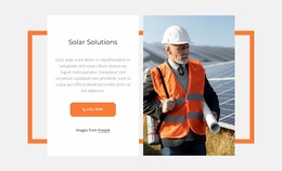
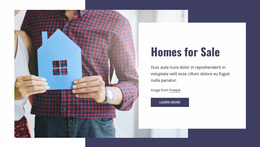
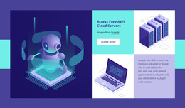
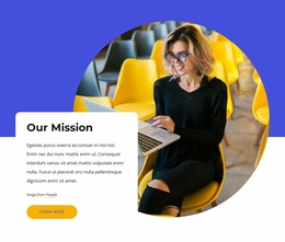
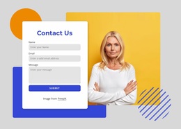
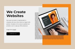
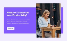
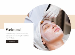
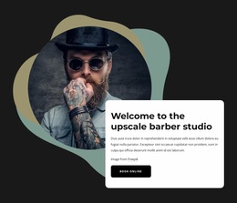
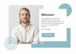
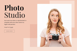
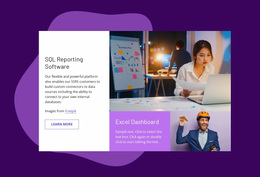
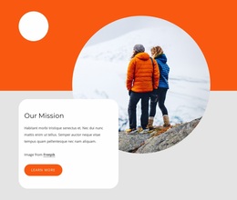
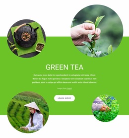
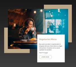
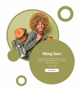
Shapes Website Design covers a broad range of visual approaches that use geometry to make websites feel more distinctive. Circles, rectangles, abstract fields, curved forms, and angular accents can influence a hero, frame imagery, separate sections, or create a recognizable background treatment. The useful question is not whether a site repeats one shape everywhere, but how the geometry contributes to the overall design.
Looking at website design examples can help you compare different moods before choosing a direction. Some sites use:
- restrained geometry to keep professional content clean;
- oversized abstract forms for a more editorial or creative look. Both can work when the shapes complement the page structure and content rather than compete with them.
Find Website Design Inspiration by Shape Type
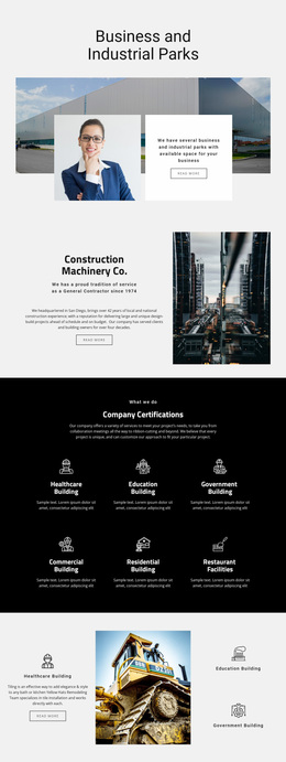
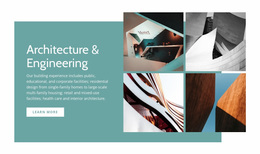
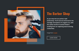
Start by noticing the forms themselves. - Rounded geometry often feels softer and more organic. - Angular shapes can make a layout feel sharper and more technical. A hexagon-inspired motif, for example, can introduce a stronger structural character without requiring every section to use the same form.
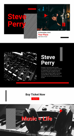
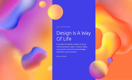
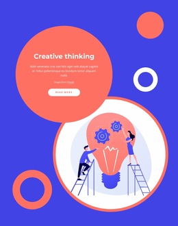
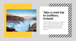
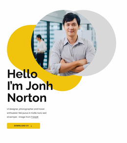
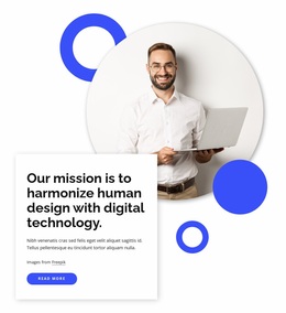
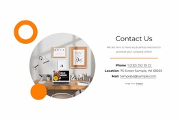
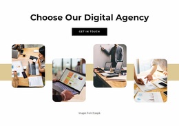
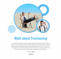
Also compare scale. - One oversized background shape can anchor a hero. - Several smaller accents may be better for feature areas or image captions. The same basic geometry can feel completely different depending on whether it is used as a background, border-like frame, foreground accent, or visual separator.
Compare Layout Balance and Image Framing
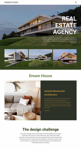
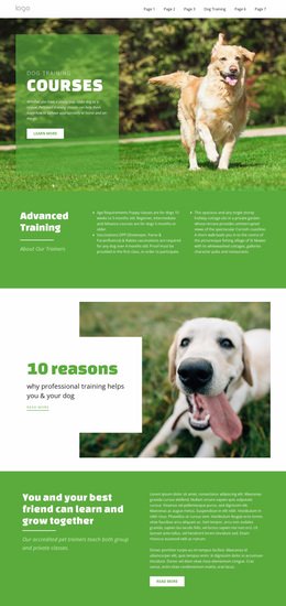
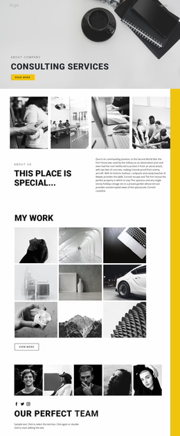
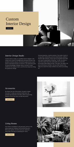
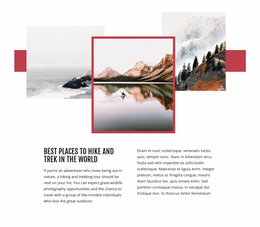
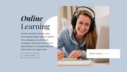
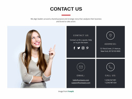
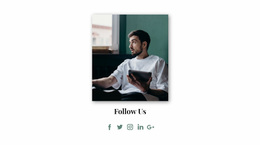
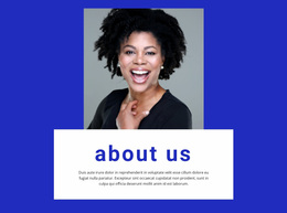
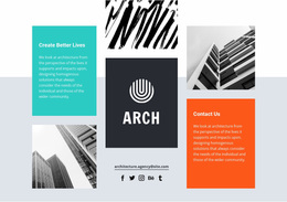
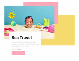
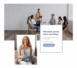
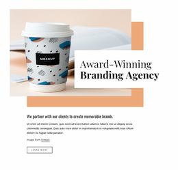
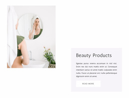
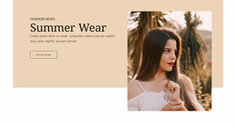
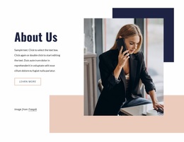
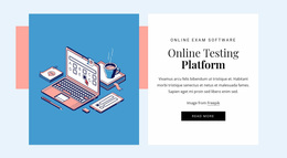
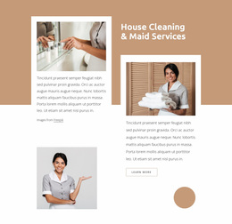
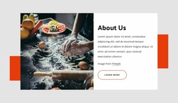
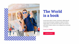
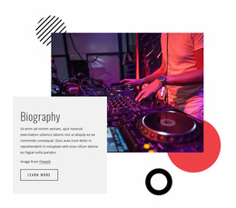
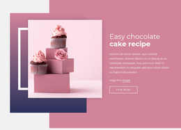
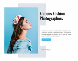
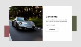
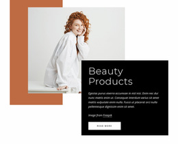
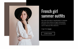
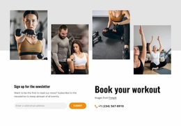
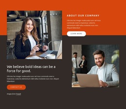
Website design examples are easier to evaluate when you look at how geometry changes the relationship between text and imagery. A shape can sit behind a product photo, create a cutout-like frame, balance an asymmetrical text block, or give an otherwise simple section more depth.
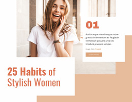
Balance does not require symmetry. An image, headline, or open space on the other can counter a large form on one side. What matters is whether the viewer can quickly understand the intended focal point.
If an example depends on a custom geometric accent you want to recreate, Nicepage's Shape Element can help adapt the form, scale, and placement. It is one option within the larger composition, not a requirement for every shape-led website design.
Use Backgrounds and Section Transitions Deliberately
Geometric backgrounds can do more than fill space. Geometric backgrounds can:
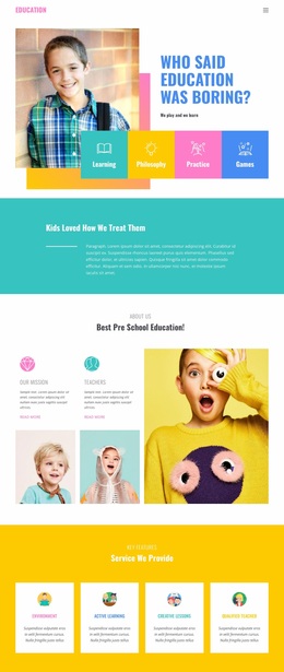
- introduce a new content topic with a color field;
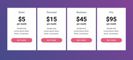
- soften the transition between white and colored sections with an abstract form;
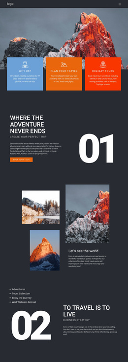
- carry visual movement down the page with a directional shape.
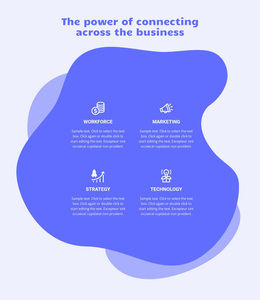
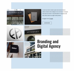
A line-based design direction can provide a lighter alternative when the page needs subtle separation rather than large background forms. In other areas, broader geometry may be more effective for making a section feel like a distinct chapter in the site.
Section transitions are particularly useful on long pages. Repeating the same rectangle behind every section can become predictable, while varying the scale and placement of related shapes can keep the design connected without making it repetitive.
Notice How Shape Styles Stay Consistent Across a Site
Cross-page consistency is one useful detail to compare, but it does not need to define the entire design direction. Related colors, proportions, edge treatments, or visual weight can make different compositions feel connected without repeating the same geometric pattern on every page.
Nicepage supports Theme Colors in Site Settings, applying a global Color Scheme across project pages. Fonts and typography can also be managed at the project level, so these settings can support a coordinated visual identity after you've chosen the broader website design direction.
Choose Geometry That Fits the Website Content
The right approach depends on the subject. The right approach depends on the subject:
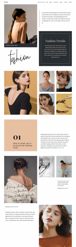
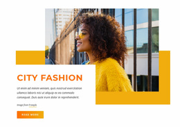
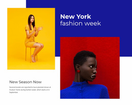
- A fashion site may use soft organic fields around photography.
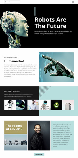
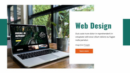
- A technology project can use sharper forms and strong contrast.
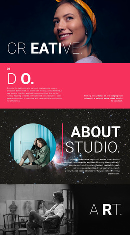
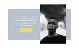
- A creative portfolio may combine oversized shapes with asymmetric layouts. Inspiration is most useful when it shows which geometric approaches suit different content, imagery, and audiences.
Also consider how much visual energy the site can support. Information-heavy pages often benefit from quieter backgrounds and smaller accents, while portfolios or campaign-style sites can accommodate larger forms and stronger contrast. The geometry should reinforce the character of the content rather than force every project into the same visual formula.
Shapes Website Design FAQ
What should I look for in Shapes website design examples?
Compare the type and scale of the shapes, the balance between text and imagery, background treatments, section transitions, color relationships, and how the design behaves across different parts of the site.
How can I keep shape colors consistent across a website project?
Nicepage Theme Colors can be modified in Site Settings. The selected global Color Scheme applies across the project, helping related shape sections use a coordinated color direction.
Can typography be managed consistently across pages too?
Yes. Site Settings include a Fonts Scheme and Typography Styles for project pages. Typography Styles can also be adjusted for individual Responsive Modes.
Do shape motifs need to repeat exactly on every page?
No. A site can stay visually consistent by repeating related colors, proportions, curves, angles, or visual weight while allowing each page or section to use a different composition.
Can shape-heavy website design still work for content-rich pages?
Yes. Use quieter backgrounds, smaller accents, and more open space around dense text areas. Reserve larger or more expressive geometry for heroes, image-led sections, or transitions where it will not compete with detailed content.
Compare Shape-Led Website Design Directions
Use the examples to compare what creates each visual direction: shape scale, background treatment, image framing, contrast, section transitions, and the relationship between geometry and content. Some references may be useful for their mood, others for their balance or image treatment. The goal of browsing is to recognize which approaches fit the kind of website you are considering, not to follow one example as a step-by-step template.