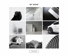
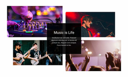
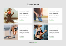
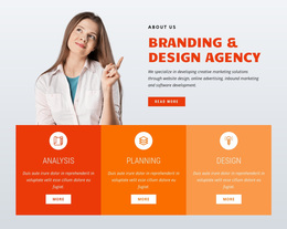
320 Text & Button Website Designs
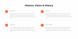
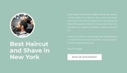
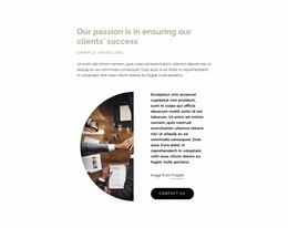






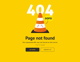
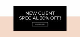
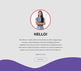
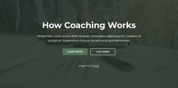


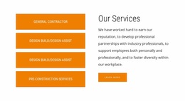

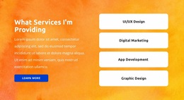


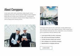
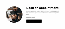
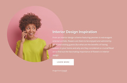
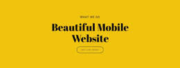
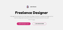
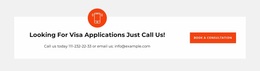
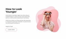
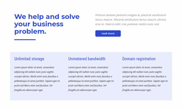
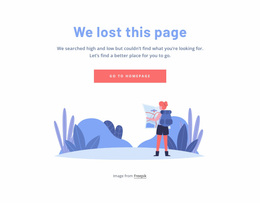
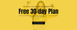
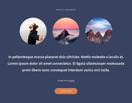
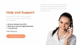


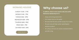
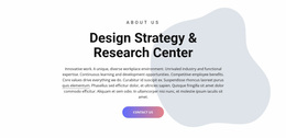


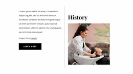
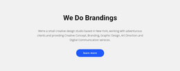
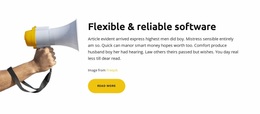
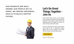










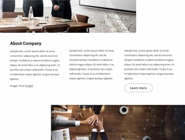
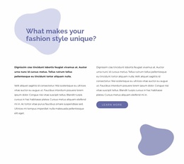
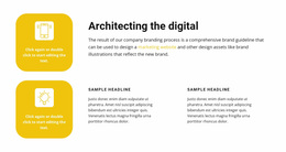
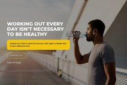
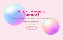
Professional Text & Button Website Design for Balanced CTA Composition
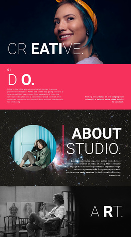
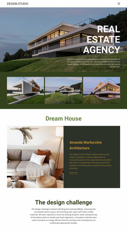
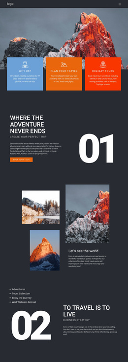
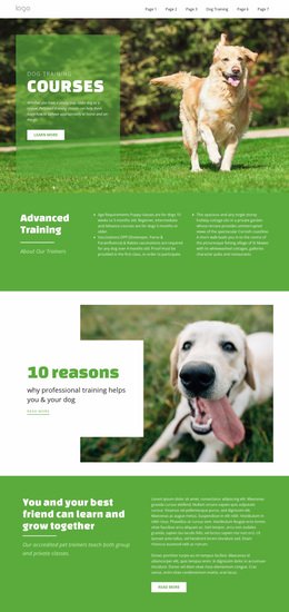
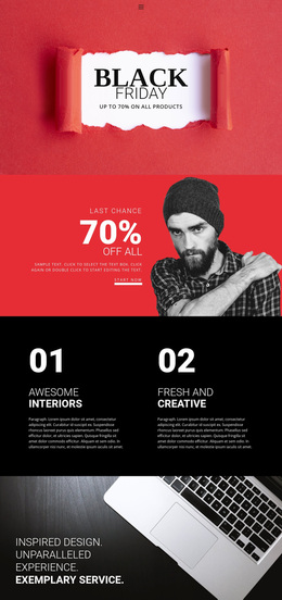
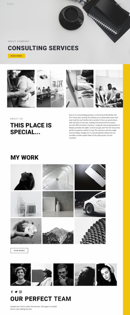
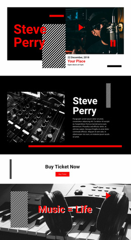
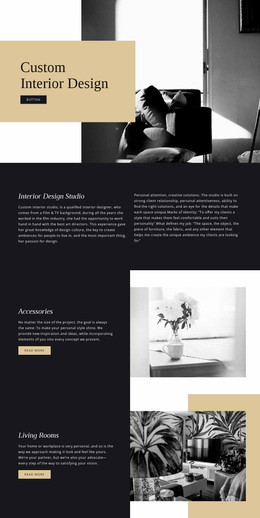
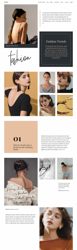
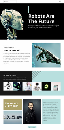
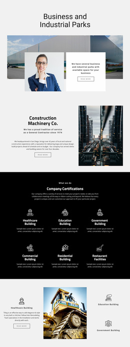
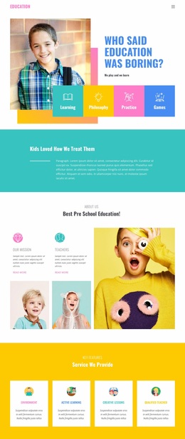
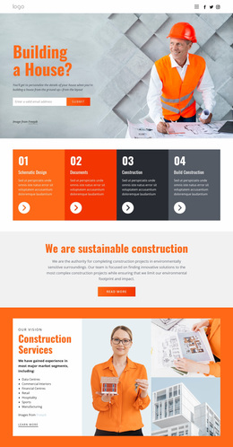
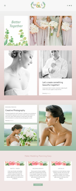
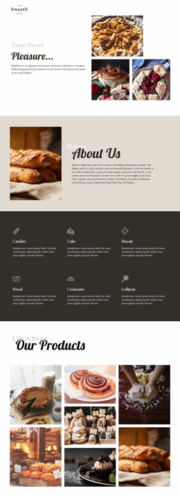
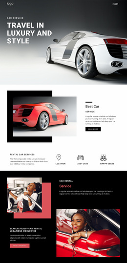
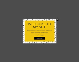
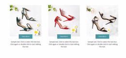
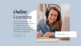
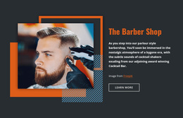
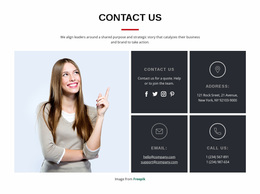
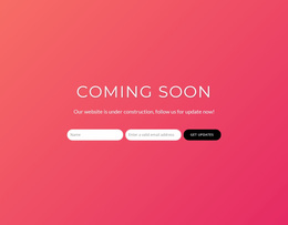
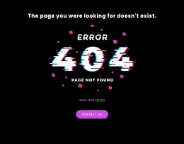
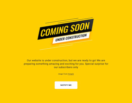
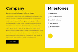
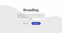
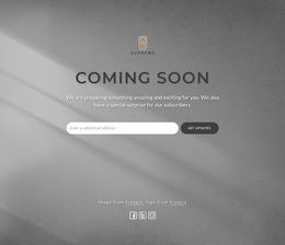
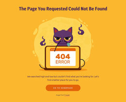
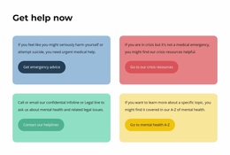
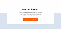
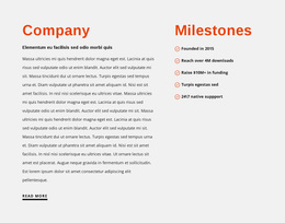
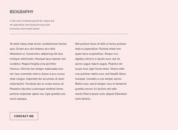
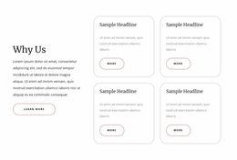
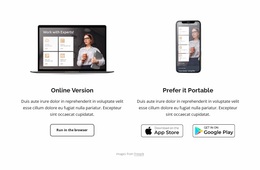
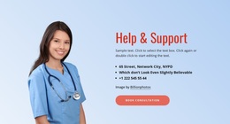
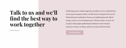
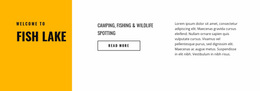
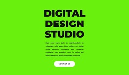
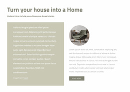
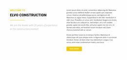
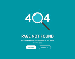
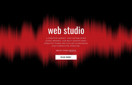
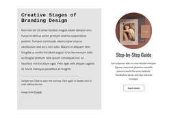
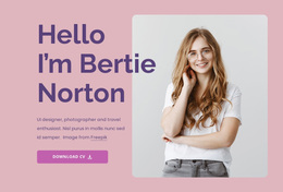
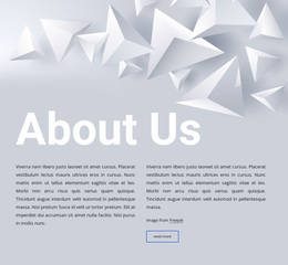
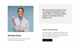
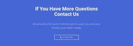
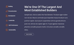
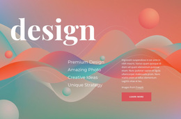
Text & Button Website Design is about visual composition and inspiration: how concise copy and an explicit action can be arranged so they feel intentional, balanced, and easy to read. Different treatments can use the same basic content but create very different impressions through typography, alignment, proportion, contrast, whitespace, and button styling.
Compare Visual Directions for Text & Button Sections
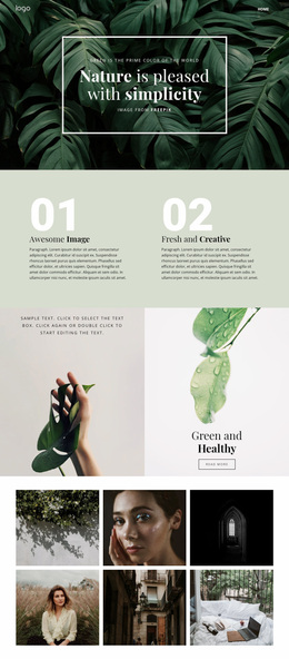
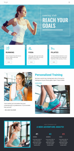
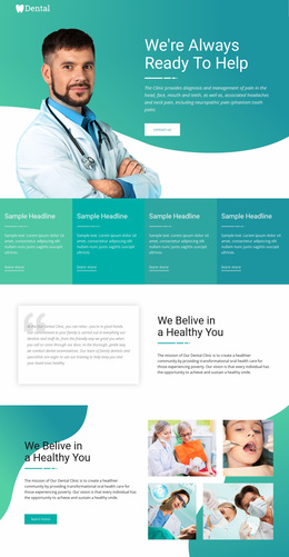
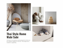
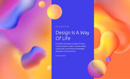
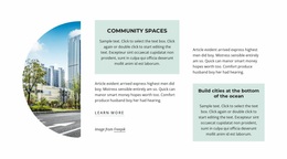
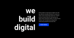
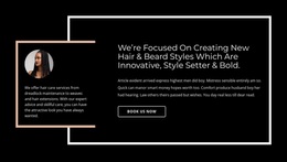
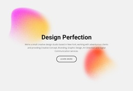
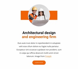
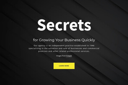
A centered composition can create a compact focal point. A split layout can distribute text and action across a wider section. Editorial treatments can use quieter typography and more white space, while high-contrast designs can make the CTA more assertive.
Compare design ideas through:
- alignment between text and action;
- proportion between headline, supporting copy, and CTA;
- typography that establishes a clear reading hierarchy;
- white space that keeps the block open rather than crowded;
- contrast that makes the action visible without overpowering the message;
- button treatment that belongs to the same visual system as the copy.
Shape the Relationship Between Text and Button
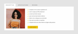
The button should feel visually connected to the message it follows. Spacing that is too wide can make the action look unrelated, while spacing that is too tight can compress the hierarchy.
Text width also matters. A long line can weaken readability, while a narrow column may create excessive wrapping. The strongest composition gives the headline, supporting copy, and CTA enough room to form one clear visual group.
Nicepage provides a Button Element for the action itself. You can refine its size, alignment, contrast, and surrounding space as part of the overall composition.
Use Typography, Proportion, and White Space Deliberately
Visual hierarchy does not come from button size alone. Typography and proportion establish where the eye enters the section and how quickly it moves toward the action.
A useful design may use:
- a large headline with restrained supporting copy;
- a compact text group with a stronger CTA;
- generous white space around a minimal message;
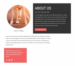
- a wider composition where text and action share horizontal space;
- a quieter editorial treatment where contrast is controlled rather than extreme.
The Nicepage element editing workflow supports moving, resizing, aligning, and arranging elements while refining these relationships.
Keep the Visual Direction Coherent Across Widths
Responsive adjustments should preserve the design idea even when the exact arrangement changes. A wide split layout may stack on a phone, but the relative hierarchy, spacing, and CTA prominence should still feel intentional.
Text & Button Website Design FAQ
Can I change the position and alignment of elements in a Text & Button section?
Yes. Nicepage lets you edit, move, resize, align, and arrange elements. Use these controls to refine the visual relationship between text, whitespace, and the Button Element.
Can I adjust the Text & Button design for different screen sizes?
Yes. Review the section at relevant widths and preserve the intended hierarchy, spacing, proportion, and CTA prominence even when the layout needs to reflow.
How is Text & Button different from Text On Image?
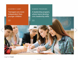
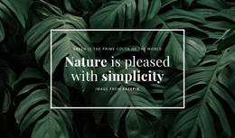
Text & Button keeps the explicit action central to the composition. Text On Image depends more strongly on the image itself as part of the message and visual structure.
Refine the Composition as One Visual System
Use typography, alignment, proportion, whitespace, contrast, and button treatment to make the section feel coherent. The result should look intentionally composed rather than like separate text and CTA elements placed next to each other.