
Wave Pattern Website Designs
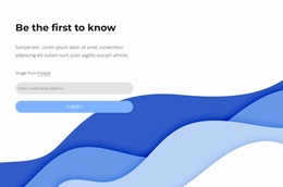
Wave motifs work best when they guide attention rather than fill space. Use curved backgrounds, repeated shapes, coordinated colors, and clear typography to give selected sections a consistent visual rhythm across the site.









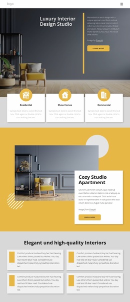

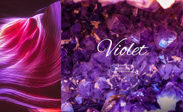


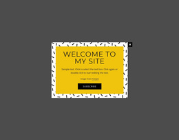

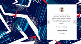


































Other Art & Design Website Designs
Creative Wave Pattern Website Design Ideas for Pages and Blocks
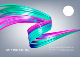
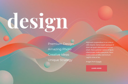
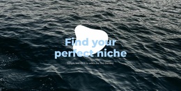
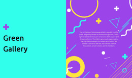
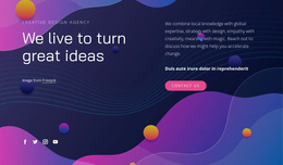
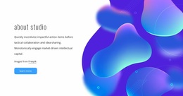
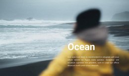
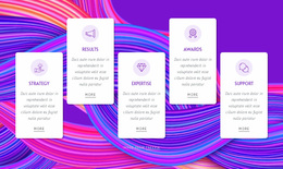
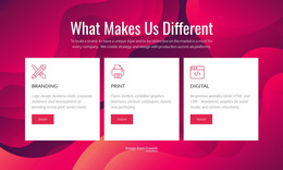
Wave pattern website design encompasses a wide range of looks, from a single soft curve beneath a hero headline to layered bands of color that fill an entire section. Here you can browse page designs and individual blocks built around flowing backgrounds, curved transitions, and abstract shapes. Many of them treat the wave as pure geometry with no link to the ocean, though a few lean openly into a seaside mood.
Common Wave Treatments
Once you start comparing designs, a few treatments keep showing up:
- one large curve that holds the hero and leaves quiet space for the headline;
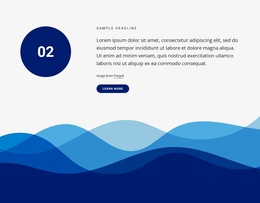
- layered waves in close shades that give a flat background some depth;
- a wave edge at the bottom of a block that softens the step into the next one;
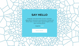
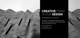
- thin repeating lines that read as texture behind text or photos.
Density sets the mood: one wide, slow curve keeps a composition relaxed, while several tight layers make the same palette feel busy. Scale matters too, because a full-width wave shapes the whole section, while a small corner accent only decorates it. Direction adds its own character: a horizontal swell reads as steady, and a diagonal curve pulls the layout upward. A large wave also leaves negative space, which often becomes a natural home for a heading or an image.
Palette Contrast Around Headlines
Color decides whether a wave becomes the main event or a quiet backdrop. Sharp contrast turns the curve into its own compositional layer, while close tones let it sink back and leave the spotlight to photography.
A long curved edge across the hero needs a clean zone where the headline never touches the slope. Dense patterned backgrounds, in turn, pair best with a simple text area on a solid fill. Theme Colors in Site Settings can apply a shared Color Scheme across project pages, so repeated wave accents stay in one tonal family.
Refining Your Chosen Composition
You can adjust almost everything in a wave design after you pick it. In Nicepage, the Shape Element provides a direct way to place abstract forms inside a composition. With it, you can resize a curve, change its fill, or move it closer to an image. Shifting a wave from behind the text to the lower edge of a block can turn a backdrop into a divider.
When several blocks share one page, check that their waves follow a similar rhythm. Matching softness and related colors make a page look planned, even when each section uses its own variation of the motif.