Video Website Designs
Modern Video Website Design Ideas for Video-Led Sites
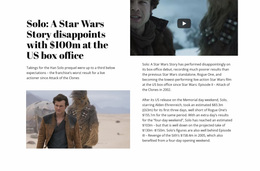
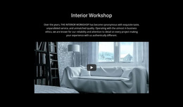
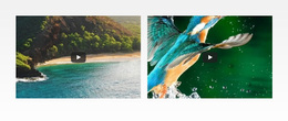
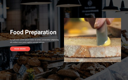
Video Website Design is about how video-led pages look, feel, and hold visual hierarchy across a site. The design challenge is to balance player prominence with poster treatment, typography, grid density, spacing, controls, and visual rhythm so different pages feel related without making every screen identical.
Build a Consistent Visual System Around Video
Treat the site architecture as context, but make the design decisions visible at page level. A strong system defines how poster images are cropped, how large players appear relative to text, how dense repeated video cards can become, and how headings, captions, controls, and whitespace behave from one page to another.
Useful design variables include:
- poster treatment and image cropping;
- player states before, during, and after interaction;
- typography scale around titles, captions, and supporting copy;
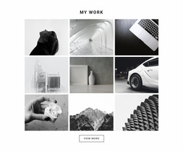
- grid density for repeated video or project cards;
- spacing and visual rhythm between media-heavy and quieter sections;
- consistent alignment and framing across different pages.
These rules create continuity without forcing every page into the same layout. A featured page can use a larger player and more negative space, while a denser collection view can use smaller poster cards and tighter rhythm without breaking the same visual system.
Refine Player States, Posters, and Supporting Typography
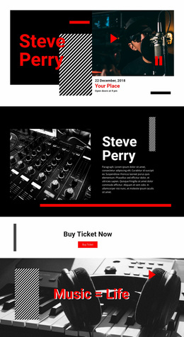
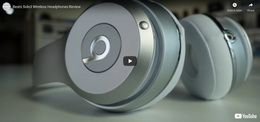
A video-led design needs more than a static player box. The poster treatment should communicate before playback, player states should remain visually clear, and nearby typography should explain the content without competing with the media. Repeated cards need a consistent poster ratio, alignment, grid density, and text rhythm, while feature pages can use larger media, stronger scale contrast, and more generous spacing.
Use visual hierarchy deliberately:
- poster and player first when the clip is the focal content;
- titles and captions second with a controlled typography scale;
- controls and player states that remain visible and understandable;
- alignment and spacing that preserve visual rhythm;
- grid density that changes by context without breaking consistency.
The Nicepage Video Element provides the direct media component for this structure. Place it where the video can carry the section's message, then adjust the surrounding block content and layout in the editor so the media hierarchy remains clear.
Website-design consistency goes beyond styling one control. Nicepage also allows Blocks to be edited for content, layout, colors, and fonts, while Theme Colors and Typography Styles can establish shared visual rules across a project.
Video Section vs Text On Image
A common design mistake is to treat any large visual with a message as the same type of block.
Use Video when watching is the intended content task. The clip, poster, and playback interaction define the section.
Use Text On Image when the message and static image are meant to be read as one visual composition. The image supports the statement rather than becoming content that visitors intentionally play.
A background video does not automatically make a composition a Video section either. If visitors are not expected to watch it as meaningful content, the functional role belongs elsewhere.
Video Website Design Questions
How can a Video section match the colors of the rest of the website?
Nicepage Theme Colors define a Color Scheme used across the pages of a project. Use those shared color choices around the Video section so its supporting text and surrounding visual treatment remain consistent with the broader design.
Can typography stay consistent around video content?
Yes. Nicepage provides a Fonts Scheme and Typography Styles for site pages. These settings can help headings, descriptions, and captions around the video follow the same typography system used elsewhere in the project.
When is a dedicated Video block better than decorative background video?
Choose a dedicated Video block when visitors are expected to watch the clip as primary content, such as a demonstration, explanation, interview, or story. Decorative motion belongs to a different composition when playback itself is not the main user task.
How can a video-led design avoid feeling visually heavy?
Use strong poster images, control grid density, leave enough whitespace around large players, and avoid giving every clip equal visual weight. Reserve the strongest scale and contrast for the media that should dominate the page.
Bring the Video Block Into the Broader Design System
Choose a Video block with the right media emphasis, open it in the Nicepage editor, and replace the example content with the clip and context required for your project. Then refine poster treatment, player states, typography scale, grid density, alignment, spacing, and visual rhythm so the page fits the same design system while keeping playback as the unmistakable focal point.