

Hours CSS Templates
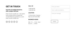
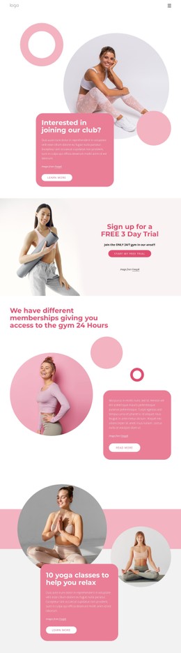
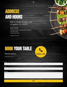
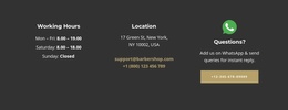
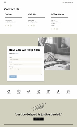
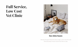
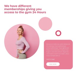
Customers shouldn't have to guess whether a gym's 24-hour access applies on holidays. Hours CSS templates, aligned time ranges, and adaptable columns distinguish routine hours from exceptions.
-
-

-
-
-
-
-
-
-
-
-
-
-
-
-
-
-
-
-
Build Website with no CodingDownload
-







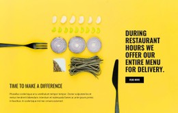
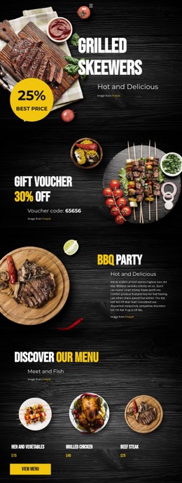

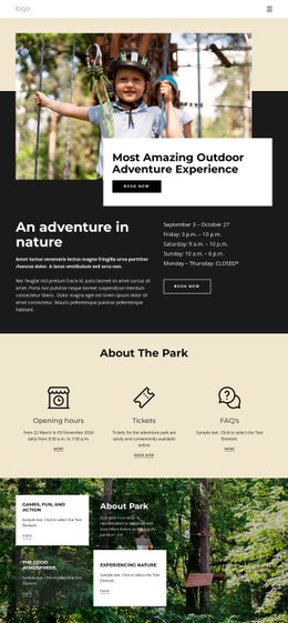
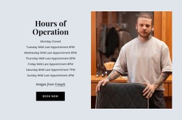











More Website & HTML Templates for Hours












More CSS Templates from Counter Category






Other Counter CSS Templates
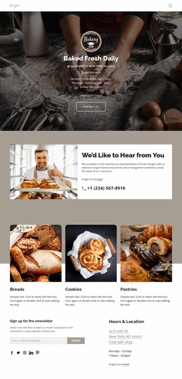
Simple Hours CSS Templates
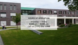
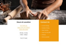
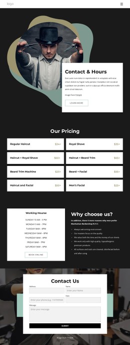
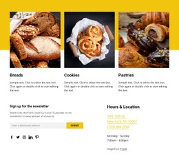
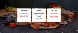
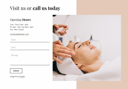
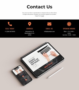
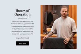
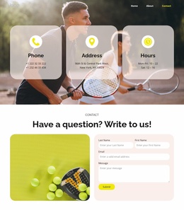
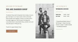
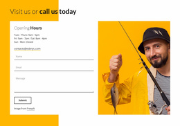
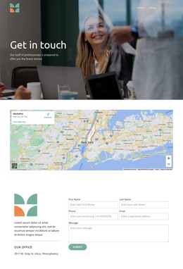
Hours CSS templates give you a ready layout where weekdays, time ranges, and closed days already have their places, so adding a schedule mostly means entering your times and tweaking the styling. Some designs show only the weekly hours. Others pair them with contact details or a location map, and a few are made for businesses open 24 hours.
Picking a Schedule Layout That Suits Your Business
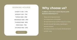
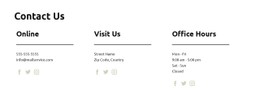
A footer or contact section calls for a compact panel, where Flexbox keeps the hours beside the address and stacks them on narrow screens. When days differ, or some carry two sessions, a fuller layout with one row per day is easier to scan. CSS Grid lines each day up with its range, so nobody has to guess which time belongs to Thursday.
Before settling on a design, check its preview for these signs:
- Each day stays on one line with its time range.
- Closed and By Appointment read clearly even to someone who can't tell red from green.
- A day with two sessions fits without the times breaking apart.
Split Shifts, Overnight Closings, and Appointment Days
A restaurant serving lunch from 11 a.m. to 3 p.m. and dinner from 5 to 10 p.m. needs both sessions on one row with a visible break. If the ranges blur together, a hungry visitor assumes continuous service and turns up at four. A gym open around the clock can say Open 24 hours, while a Friday row of 6 a.m. to 2 a.m. should show that closing falls on Saturday.
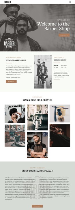
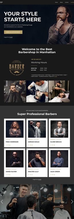
Closed days need the word itself, since a blank cell looks like someone forgot to fill in the row. A barber who takes Mondays by appointment only should write that out too, because the status won't fit a time slot. Put holiday changes in a small dated note, so a Christmas Eve closing doesn't look like a regular week.
Adjusting Phone Views in Nicepage
On a phone, the usual trouble is a line break between opening and closing times, or a range drifting away from its day. Start with Responsive Modes to adjust margins and font sizes for each screen size. For fixes beyond those settings, such as keeping every range on one line, get familiar with Nicepage's Custom CSS feature to apply extra rules to individual elements, a specific page, or a complete site. Check the result in Preview, because the editor doesn't run custom CSS in its editing canvas.
The template makes the hours easy to read, but keeping them current is the owner's job. If your most complicated day still reads correctly on a phone, the layout fits your schedule.