
Date CSS Templates
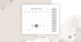
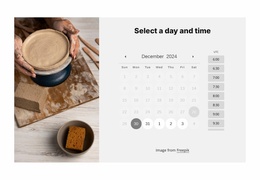
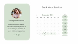
Scheduling interfaces contain many similar labels, numbers, and selectable states. Date-focused CSS styling can separate availability, active choices, weekdays, months, and time slots without crowding the calendar.












More Website & HTML Templates for Date








More CSS Templates from Counter Category
























Other Counter CSS Templates
Flexible Date CSS Templates for Calendar Styling
Styling decides how quickly someone can tell an open day from a booked one. Date CSS templates handle that with styling rules for contrast, spacing, and borders, so visitors see at a glance which dates are interactive. The calendar data sets which days are open, and styling makes that visible.
State Classes Behind Every Click
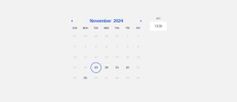
Every interactive date can have a visual state, and a dependable template gives each state its own class:
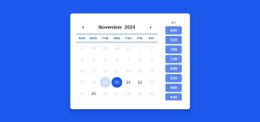
- available dates, with a clear default look plus an active style for the click itself;
- hover and focus states, which show where the mouse or keyboard is pointing before a choice;
- unavailable dates, where lower opacity, softer contrast, and a default cursor signal a closed but legible day;
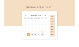
- the selected date, marked by a solid fill or heavier border that survives in grayscale.
Today's date gets a quieter marker, like a thin outline nobody will mistake for a selection. Weekday names and days from neighboring months should appear visually secondary. Separate classes pay off later too, since one edited state style updates every matching cell.
Nicepage's Calendar Element has property groups for Dates, Weekdays, and the Month and Year label. Time Slots get their own group, while Background, Border, and Shadow style the container.
Seven Columns, Little Room
A month view squeezes seven columns into whatever width the container allows, and every cell shrinks with it. Ready templates usually differ in three layout jobs:
- the month grid, where CSS Grid holds seven equal columns and a steady gap;
- time slots, which Flexbox with flex-wrap turns from rows into a stacked list as space runs out;
- event schedules, where CSS Grid aligns date and time columns beside descriptions of any length.
A calendar widget and a full appointment scheduler can share a single palette while using very different spacing. Short weekday names keep the header row from wrapping, and the month title has to fit September as comfortably as May. On phones, a media query can increase each cell's min-width or reduce the padding to maintain a comfortable tap target.
One Appointment Calendar Up Close
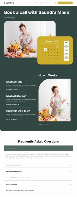
Picture a clinic calendar in a busy month. Closed weekends recede without disappearing, open weekdays invite a click, and the selected Tuesday stays filled. Booked slots look muted beside free ones, and switching to Thursday reapplies the same classes to new slots.
That check works for any template. Look for clear visual hierarchy, strong state contrast, and spacing that survives a crowded month. The better ones also keep dates easy to tap and let you change appearance and interaction states without touching the calendar's content.