
Count CSS Templates













More Website & HTML Templates for Count














More CSS Templates from Counter Category














Other Counter CSS Templates
Design Websites With Functional Count CSS Templates
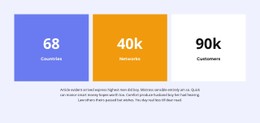
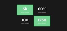
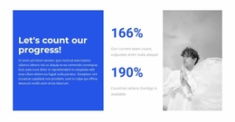
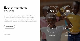
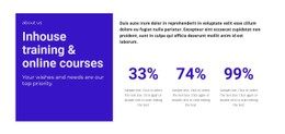
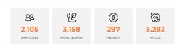
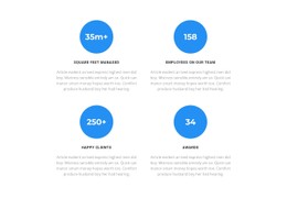
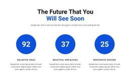
Numbers often help people understand a company before they read the full page. A rising customer total can show that a young business is growing. Fundraising progress gives visitors a quick idea of whether a campaign is close to its goal. Registration figures can also show how much interest an event has received. But large numbers are not always helpful, obviously. When all the numbers are large and presented in a brightly colored box, the page is sure to become hard to read. Count CSS templates help companies design their counters and reports so the numbers don't dominate the site.
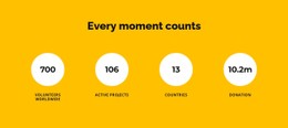
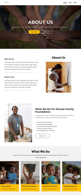
Use cases are actually numerous. Tech firms usually show the number of active users, the number of completed integrations, and the uptime of their services. Charities highlight the funds raised and volunteer work done. They may also show how many people received support. Marketing agencies often use counters to summarize campaign results, while startups often present customer growth or product adoption.
First impressions always matter, no matter the use case. Polls indicate that around 75% of users base their opinion of a company on how its site looks.
Flexible Styling for Statistics and Dashboards
A typical count-based website includes animated counters, progress sections, and performance metrics. Add dashboards, reports, and service statistics on top of that, and there is a lot to organize. Testimonials and calls to action also need to fit into the same visual system.
The main advantages include:
- Flexible typography for numerical content.
- Customizable visual systems for statistics and reports.
- Gorgeous visuals.
- Better spacing between counters and supporting information.
- Stronger emphasis on key business metrics.
- Editable styling components for future updates.
Helping Visitors Understand Important Numbers
A large figure says very little when people do not know what it represents. Five million could mean revenue or transactions. It could just as easily describe users or page views. Percentages can be even more confusing when the time period is missing. Good design should bring attention to the number, but it should also keep the explanation nearby.
And truly, each organization will require its own form of prioritization. For instance, in a technological firm, uptime and transaction volume would be among the highest priorities. Customer numbers would come lower down the line, along with information on product usage. In a charity organization, there is likely to be more focus on contributions and completed projects. And volunteers would have their own section as well.
Improved Visuals for Your Site
Statistics can easily make progress much easier to understand, but they need more than a large font and an animation. Visitors should know what each figure means and why it matters. Nicepage offers useful count CSS templates designed for startups and nonprofits. Get familiar with the selection and create websites where the data supports the message, rather than trying to replace it.