

Hero CSS Templates
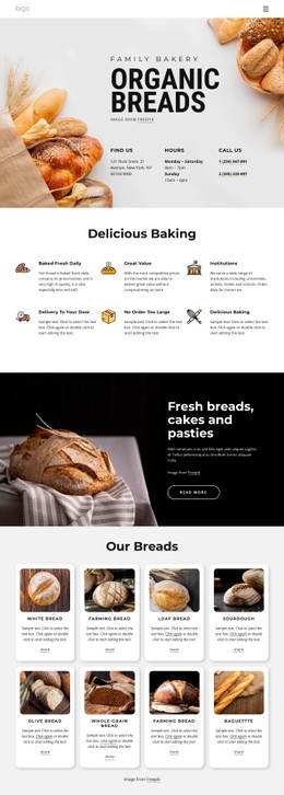
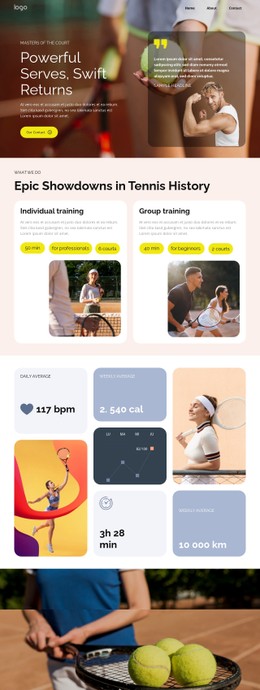
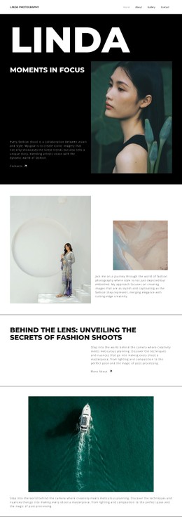
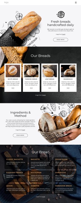
Large background photos and expressive headlines need careful visual balance. Hero CSS templates provide a pre-styled foundation for introductory banners, with adjustable section heights, image positioning, text contrast, and spacing across screen sizes.


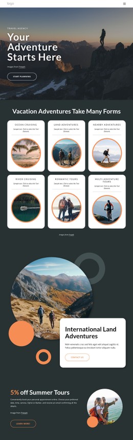
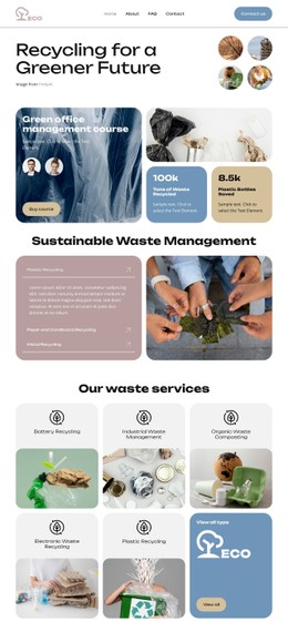



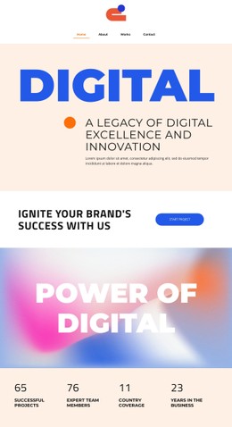
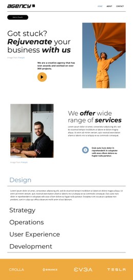










































































Other Team CSS Templates
Customizable Hero CSS Templates
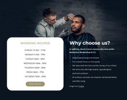
A large hero photograph can lose its impact when a narrow screen crops the main subject or a headline lands on a busy background. Hero CSS templates offer ready-styled alternatives, from a compact image-backed banner to an expansive photographic opening. Compare their image treatment, typography, and contrast with your own creative materials. A design that already balances the foreground and background will usually require fewer styling changes than one chosen solely for its demo photograph.
Background Styling and Text Contrast in Hero Banners
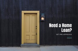
Imagine an architectural photograph with the building entrance on the right. With background-size: cover, a narrow viewport may crop that entrance out of the frame. Changing background-position to right center can keep it in view, provided that the resulting crop leaves enough room for the headline. A gradient overlay can darken the area behind the text without dimming the entire image.
Responsive Hero Dimensions
A banner that looks impressive at desktop height may push its CTA below the visible area on a phone. A flexible minimum height gives the content room to expand, while media queries can reduce excessive spacing on smaller devices. For typography, a declaration such as font-size: clamp(2rem, 5vw, 4rem) lets the headline scale between defined minimum and maximum sizes.
Five visual details are worth checking in the styled previews before choosing a design:
- Choose a background treatment that preserves the intended focal point at narrow widths.
- Compare overlay styles for readable text against your photograph.
- Shortlist typography that accommodates the actual headline length.
- Inspect foreground alignment to see whether the content has room to wrap.
- Favor section heights and padding that keep the main action easy to reach on a phone.
Styling Flexibility
Nicepage supports custom CSS rules for individual elements and pages. A design with nearly suitable styling may only need a dedicated class for a small visual adjustment rather than extensive CSS changes.
The Export Minimal CSS Per Page option creates page-specific stylesheets. Appropriately sized, compressed WebP images may also reduce the resources needed for the opening banner. If the hero image is the Largest Contentful Paint (LCP) element, pay close attention to its file size and loading behavior; compression alone does not guarantee a better LCP score.
When comparing CSS hero designs, test the narrowest screen width with the actual photograph and headline. Favor the design that needs the fewest visual compromises.