
Closed HTML Templates
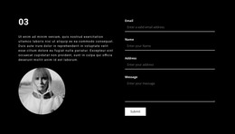
Teams that rely on close collaboration need project proof, personal profiles, and contact details to stay connected at the section level. A prepared HTML base can preserve that relationship across desktop and mobile layouts.
-
-

-
-
-
Free Website Builder SoftwareDownload
-
-
-
-
-














More Website & HTML Templates for Closed


More HTML Templates from Travel & Hotels Category












































Other Travel & Hotels HTML Templates
Closed HTML Templates and the Files Behind Them
Closed HTML Templates are finished pages delivered as files you can open and edit. The design is built, the demo text sits in place, and what remains is editing: your wording, your images, your blocks in the order that suits the project. The format appeals to anyone who plans to work in the source directly or to pass the folder to a developer and let them carry it from there.
What to Open First in the Package
A package can look generous in the preview and turn thin once unpacked. One quick pass through the folder answers most of that:
- the page files, and how many of them are genuinely different from one another;
- the section blocks you would reuse, a hero area or a card row among them;
- the way the code reads when a file is open, which decides how awkward the first edit gets;
- any scripts driving behavior such as a slider, a dropdown menu, or an accordion.
Counting distinct pages beats counting files. Ten pages assembled from the same two layouts amount to a smaller package than the listing suggests.
Replacing Placeholder Copy Without Breaking Anything
Demo content is written to flatter the design. Your headings run longer, your photographs arrive in the wrong proportions, and a paragraph that filled three lines in the preview fills seven in production. A template earns its keep when the blocks tolerate that, so paste your worst case into the busiest section before settling on anything.
Reusable blocks are the other half. Where one card structure repeats down a listing, an eleventh entry is a copy and a quick edit. Where every block was shaped by hand, each addition becomes its own small job.
Stacking Order at Narrow Widths
Wide layouts place an image, a heading, and a column of text side by side. On a phone, the same three drop into a single column, and the order they land in determines whether the page still makes sense. A caption drifting away from its picture, or a button cut off from the sentence explaining it, is the usual symptom.
Nicepage supports Responsive Modes for the whole range of widths, from large screens down to vertical phones. Run the busiest page through them and watch which pairs come apart.
Judged coldly, the choice comes down to a handful of checks. Count the genuinely different pages, then open a file and see how the source reads. After that, it is a question of whether your own material sits comfortably in the layout and whether a phone keeps related pieces together.