

Chair CSS Templates
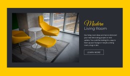
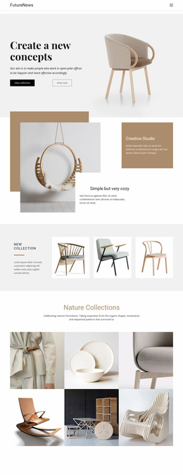
A curved oak chair and a broad upholstered lounge seat cannot share careless image crops. Chair CSS templates let furniture designers tune gallery proportions, label contrast, and mobile card spacing without distorting the products.
-
-

-
-
-
-
-
-
-
-
-
-
-
-
-
-
-
-
-
-
-
-
-
-
-
-
-
-
-
-
-
-
-
-
-
-
-
-
-
-
-
Build Website with no CodingDownload
-
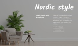
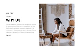
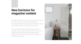




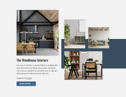


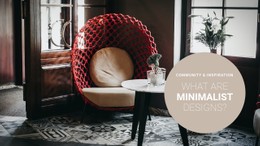



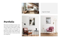

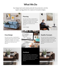








More Website & HTML Templates for Chair


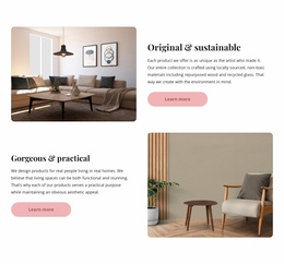
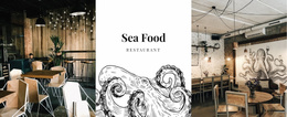


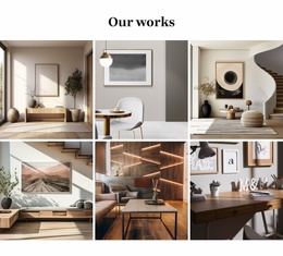
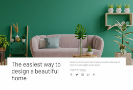
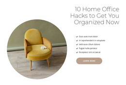
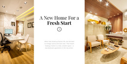
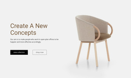
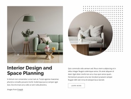
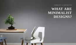
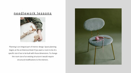



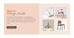
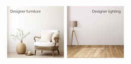









Other Interior CSS Templates
Minimal Chair CSS Templates for Furniture Layouts and Collections
Picking a chair CSS template starts with a ready design whose look suits your collection, then moves to the visual rules you adapt for your own photos. CSS controls each element's size, the space around it, and how it rearranges on smaller screens. A grid of twelve dining chairs and one large shot of a designer armchair call for different layouts.
Judging Demos by Seat Shape
Three common chair types put different demands on a layout:
- A curved oak side chair with a tall back needs a frame with generous height, so the crest rail and feet stay visible.
- A low boucle lounge seat needs a wider frame, since a narrow crop cuts into the arms that define its shape.
- A tubular steel accent chair has thin lines that fade against busy surfaces, so it needs a calm background and clear contrast.
Trouble usually appears when different shapes share one row. Beside a spindle-back dining chair in an identical cell, a low lounge chair floats in space. Dropping your tallest and widest models into a demo like Chairs Trend tells you more than the original product shots.
Styling Photos, Finish Labels, and Hover States
Once your photos replace the demo content, three groups of rules need attention:
- A studio shot on a plain backdrop often works with "object-fit: contain", which keeps the legs and backrest whole, while a room photo can take "cover" if cropping the room is fine.
- A cream chair on a cream surface loses its edges, which a slightly darker background or a thin border fixes better than a heavy shadow.
- The chair name, finish, and caption each need their own size and weight. A soft ": hover" lift and a visible ":focus-visible" outline help, but "natural linen" must stay readable for touch-screen visitors who never hover.
Nicepage accepts Custom CSS at the element, page, and site levels. A dedicated class on collection images can change their fit without touching other blocks, while site-level rules suit shared type styles. The editor canvas does not display Custom CSS results, so open Preview after each change.
Behavior at Narrow Breakpoints
As the screen narrows, a template may drop columns, tighten gaps, and move captions below the photos. On a phone, the pale armchair may suddenly look tiny while the oak chair loses the top of its back. Check the containers and scaling first, then confirm the fix in Preview. A chair CSS template fits when a tall back, wide arms, and a readable material label all hold up on that small screen.