
Cabinet CSS Templates
Cabinet portfolios rely on disciplined image sizes, spacing, finish presentation, and readable service details. Responsive CSS layouts help these visual elements stay balanced while giving designers direct control over grids, typography, and page-specific styling.



More CSS Templates from Interior Category
-

-
-
-
-
-
-
-
-
-
-
-
-
-
-
-
-
-
-
-
-
-
Build Website with no CodingDownload
-
-
-
-
-
-
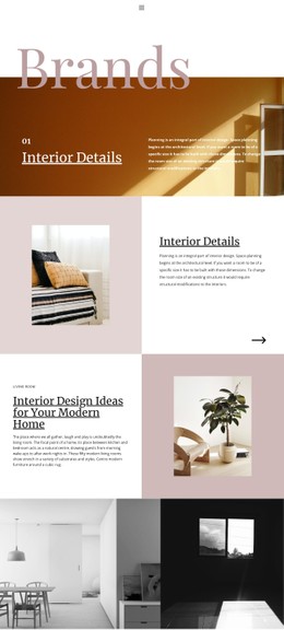
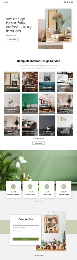
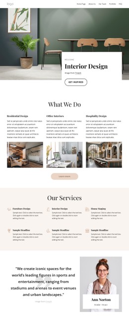
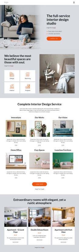













Other Interior CSS Templates
Customizable Cabinet CSS Templates for Precise Visual Control
A painted shaker door and a walnut slab front look nothing alike in person, and a cabinet site has to carry that difference onto a screen. Cabinet CSS templates give you the visual rules behind it, with colors, typography, and spacing that stay consistent from the first kitchen photo to the last finish sample. Because those rules are shared, changing one updates every card that uses it.
Styling Door Swatches With Selected States
Door and finish selectors are the most cabinet-specific component on these sites. A visitor comparing shaker, slab, and raised panel doors needs each option shown at the same size, with a label that reads clearly on both light oak and dark espresso. Component styles worth checking in a demo include:
- swatch tiles with equal dimensions and a visible hover state
- a selected state, such as a thicker border or a soft overlay, that marks the chosen finish
- comparison cards for painted versus natural wood or matte versus gloss
- specification labels for finish, material, and room type
With shared classes behind them, a shop that introduces a new stain color only adds one more tile, and the border, shadow, and label style come with it.
Gallery Ratios That Suit Cabinetry Photos
Cabinet photography comes in awkward shapes. A full kitchen with an island reads best as a wide landscape shot, a tall pantry needs a portrait frame, and a close view of dovetail joinery works as a small square. A good style system handles these with fixed aspect ratios and object fitting, so project cards of different sizes still keep an even rhythm in the grid. Before-and-after layouts are another common case, where two photos of a refaced kitchen need identical cropping to keep the comparison honest.
Breakpoints Keep Finish Libraries Tidy
On a phone, a long finish library can turn into an endless scroll. Breakpoint rules decide how many swatches fit in a row, how much gap sits between them, and when labels drop below the tile. Grid and Flexbox handle most of this work, letting a three-column kitchen gallery fold into two columns on tablets and one column on phones, while the swatch grid stays compact.
Nicepage Responsive Modes let you adjust these visuals for desktops, tablets, and phones. Custom CSS covers cases that visual controls cannot address, such as a special hover effect on hardware thumbnails, and it can apply to a single element or the whole site. A quick way to judge any cabinet CSS template is to open the demo, narrow the window, and see whether project galleries, finish tiles, and service cards maintain a consistent visual language at every width.