
Pricing CSS Templates
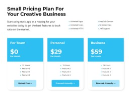
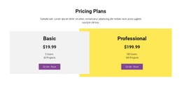
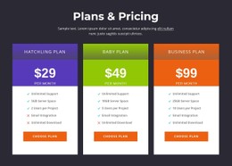
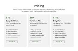
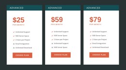
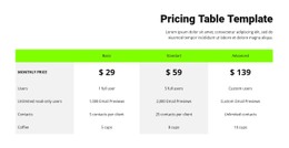
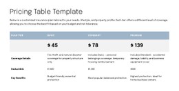
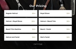
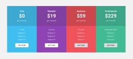
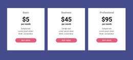
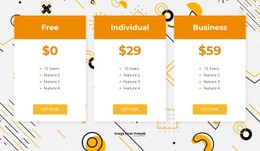
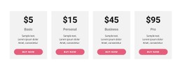
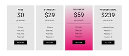
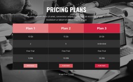
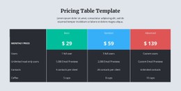
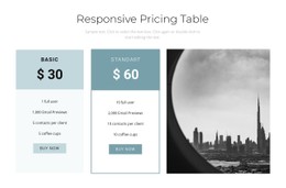
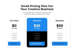
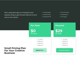
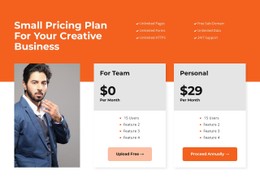
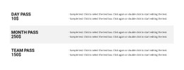
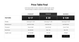
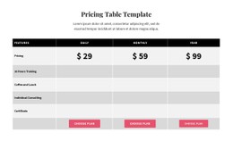
Pricing tables must separate featured plans, costs, billing details, and feature differences at a glance. CSS-based styling gives these elements a reusable visual system through spacing, color, typography, borders, and Grid or Flexbox layouts.

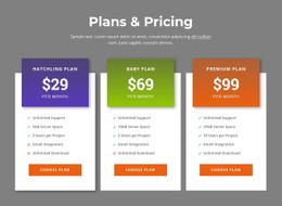

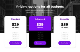
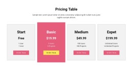
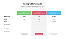
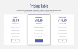
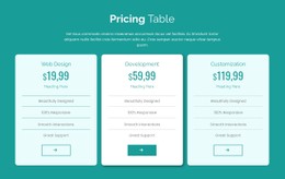
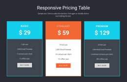
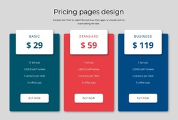
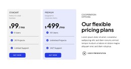
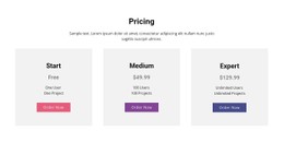
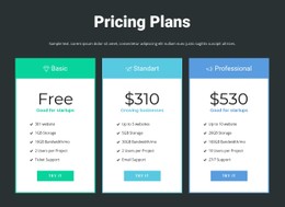

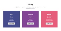
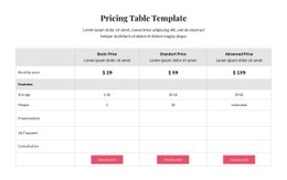

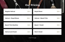
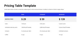
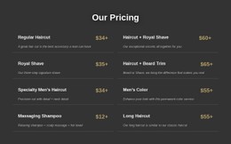
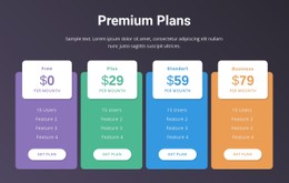
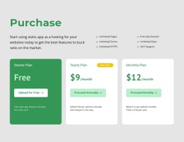
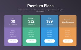
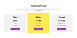
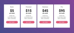
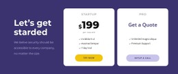

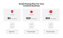

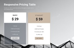
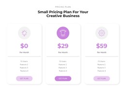

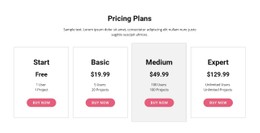
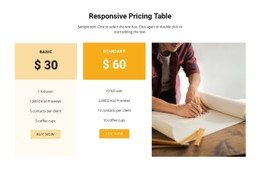
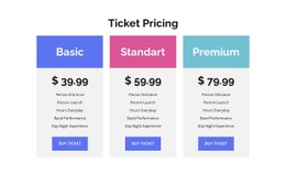


















Other Pricing CSS Templates
Flexible Pricing CSS Templates
Style each pricing tier so customers can spot the price, the billing period, and the main difference between plans before reading a single feature row. Pricing CSS templates give subscription and service businesses repeatable visual rules for price labels, feature rows, and purchase buttons.
Styling Price Figures and Recommended Offers
Each part of a plan deserves its own visual weight. The number has to register first, the billing note later, and a recommended tier often needs stronger contrast than standard options. A practical CSS pricing table handles details that ordinary card layouts never face:
- Separate type sizes for the plan name, the main price, and the billing suffix, so "/month" stays readable next to the number.
- Tight spacing between the amount and its billing note, which keeps "per user" visually tied to "$49".
- A featured tier marked with a border, a background shift, or a small badge applied through a single class.
- Muted text or a subtle icon for unavailable features, so excluded items stay visible and never look included.
Real data tests these rules quickly. A long plan name may wrap onto two lines, a four-digit price can crowd the card, and one tier might carry a longer billing note. A good stylesheet allows wrapping and scales the price down on narrow cards. Nicepage Theme Colors can keep the featured tier on the same brand palette as the rest of the project.
Grid Alignment Across Comparison Columns
Grid suits tables where visitors compare tiers zone by zone. When prices, feature rows, and buttons sit on shared horizontal lines, the eye moves across the columns and sees what changes. Without that alignment, a plan with a longer feature list pushes its button lower than its neighbors.
Flexbox works well for a few independent cards, such as two service packages with different descriptions. Pinning each button to the bottom of its card keeps the calls to action level, and equal heights stop a shorter card from looking weaker.
Breakpoints on Narrow Screens
Three columns that look fine on a wide display get cramped long before phone width. A solid template moves to fewer columns as the comparison tightens, ending with a single stack. The breakpoint should occur when the feature text starts wrapping poorly, and each stacked card must keep its price, features, and button together.
Feature-heavy tables need extra care, because squeezing many rows into narrow columns can make them unreadable. Splitting such a table into tier cards on small screens keeps every row legible.
A pricing stylesheet proves itself when a longer plan name, an extra feature row, or a new billing label fits without visual fixes.