

Medium CSS Templates
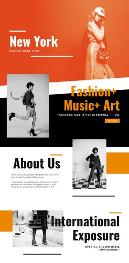
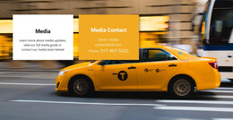
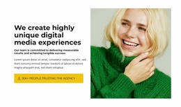
A digital media studio may showcase an apparel launch beside a music promotion, each with different photography. With medium CSS templates, shared caption styling and responsive spacing can connect these campaigns without flattening their creative identities.
-

-
-
-
-
-
-
-
-
-
-
-
-
-
-
-
-
-
-
-
-
-
-
-
-
-
Build Website with no CodingDownload
-
-
-
-



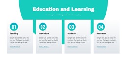
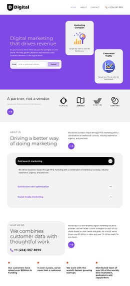

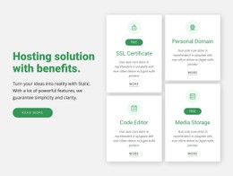













More Website & HTML Templates for Medium





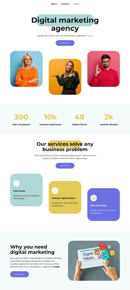
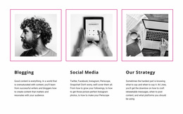
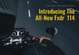
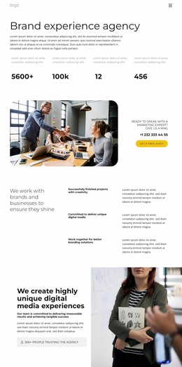


More CSS Templates from Pricing Category
Other Pricing CSS Templates
Flexible Medium CSS Templates for Varied Visual Layouts
Styling is the layer you control most in a CSS template. Colors, type sizes, and spacing come predefined in every design. The same goes for the way blocks rearrange on narrow screens. Designs in the Medium collection range from plain typographic blocks to event layouts built on large photos, so comparing their styling early saves rework later.
How Far Ready Styles Differ
Most visual decisions in these designs fall into three groups:
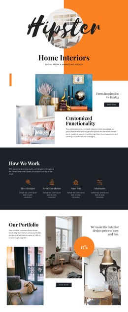
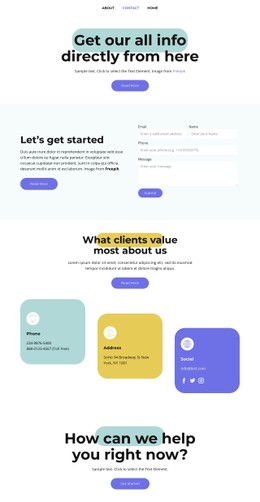
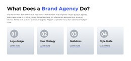
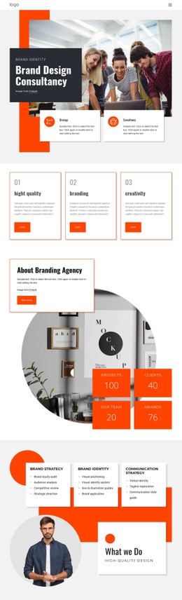
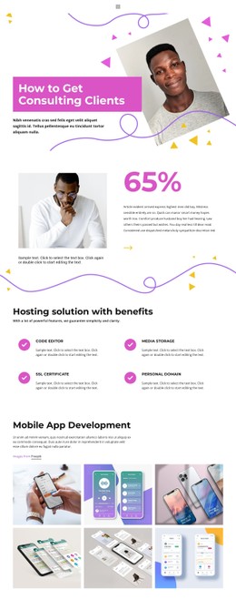
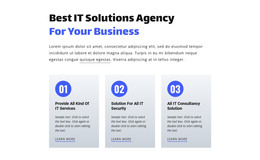
- Color sets most of the mood. Medium Text With Button keeps black text on white with one blue button as the accent, while Fashion & Music fills whole sections with orange.
- Typography shapes the tone just as much. Bold words inside the Medium Text With Button heading add emphasis without extra color, and Fashion & Music leans on condensed headings that read like poster lettering.
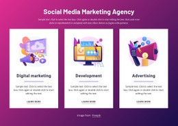
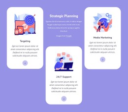
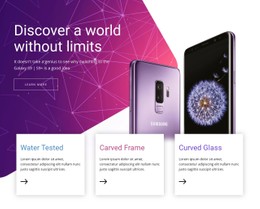
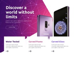
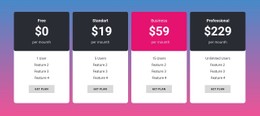
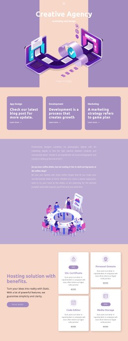
- Cards show how repeated content is handled. Modern Technology Devices sets three white cards with soft shadows over the lower edge of a purple and magenta background.
When Demo Material Is Replaced
A short test with your own material shows how well the styling copes:
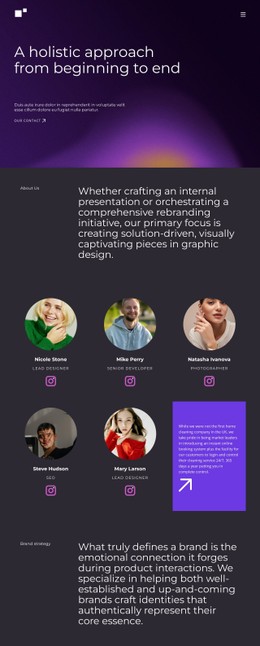
- Replace the demo heading with your longest one. In Medium Text With Button, a heading that wraps onto three lines shifts the balance, so line height and text width may need adjusting.
- Put your own photos behind the text. White lettering that reads well over the Fashion & Music demo photo can fade on a pale image. A darker overlay or a solid band behind the words can bring it back.
- Switch the palette in Theme Colors. Elements that use theme colors follow the change, but a button recolored by hand keeps its old shade.
- Step through Responsive Modes from large screens down to phones. Card gaps and font sizes often need their own values there, and the overlap in Modern Technology Devices deserves a close look.
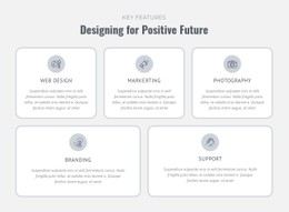
Card rows may rely on CSS Grid or Flexbox, and that choice affects how they wrap when space runs out. In each mode you can adjust sizes and spacing separately.
Custom CSS Covers Missing Settings
Standard controls handle most changes to colors, fonts, and spacing. Custom CSS helps with details that have no setting, such as evening out the line breaks in a long heading. Nicepage accepts custom rules for one element or for the whole site. These rules can clash with the default styles, so check the result in Preview and again on the published site. The right design still looks deliberate after your headings, photos, and palette replace the demo ones, even at phone width.