

Multimedia Website Templates
Production studios need to present video reels, audio programs, and project credits without burying them in one media feed. Multimedia website templates organize each format into dedicated pages and connect finished work to the people and services behind it.
-

-

-
-
-
-
-
-
-
-
-
-
-
-
-
-
-
-
-
Customize Any TemplateDownload
-
-
-
-
-
-
-
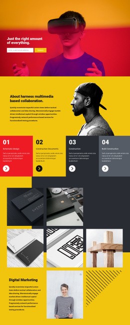


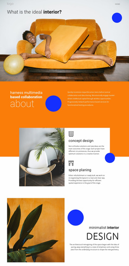








More Website & HTML Templates for Multimedia


More Website Templates from Music & Entertainment Category
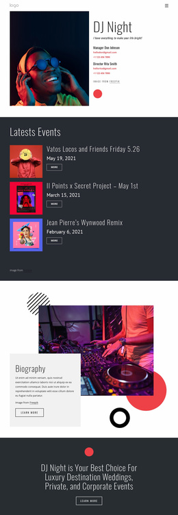
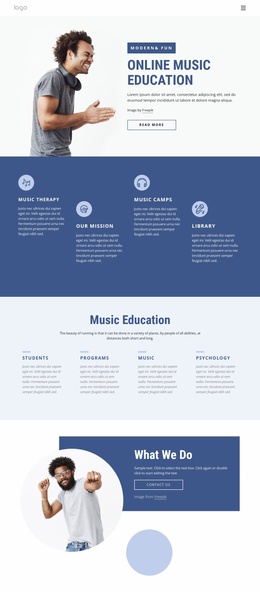

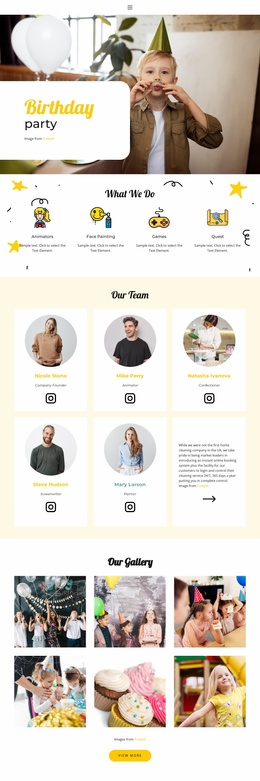
Other Music & Entertainment Website Templates
Innovative Multimedia Website Templates
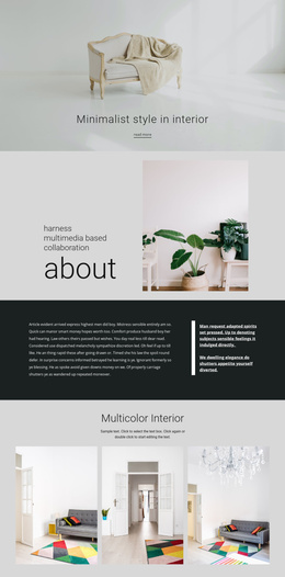
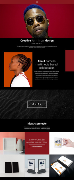
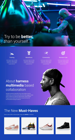
A videographer, a weekly podcast, and a small record label can all call their sites multimedia, yet each needs a different first screen. A reel looks best in a wide frame near the top, while a podcast works better with a list of recent episodes ready to play. Multimedia website templates give you a ready visual layout for these formats, so the choice depends on what you publish most.
Matching the Layout to Your Main Format
Before comparing color schemes, decide which format will carry most of your site. A few common setups line up with template features like this:
- A video portfolio or production company site gains the most from a wide project grid, with the synopsis and credits next to each clip.
- A podcast on a regular schedule needs episode cards that are easy to add one at a time, along with an archive split into seasons.
- A musician or label site often mixes square album covers with wide video previews, so check that the grid shows both shapes without awkward cropping.
- A single documentary or album can live on one scrolling page, while an ongoing series deserves its own section.
Space Beside Each Player
A player with no context leaves visitors guessing, so look at what the template places around it. For a video podcast, a good episode block holds the recording, a few lines about the guest, and a link to the audio version. On the homepage, one featured release is easier to scan than a wall of identical previews.
Follow theAudio Element tutorial to add audio with track and artist information, cover images, and player controls to a release block. The Video Element handles clips from YouTube, Vimeo, or another supported source. You can edit every block visually, so you can move a player or replace a demo cover without breaking the layout.
Planning Ahead for a Growing Archive
A design that looks neat with six demo items can feel cramped at sixty. See how simple it is to add cards and open a section for a new series. Theme Settings keep colors, fonts, and the header consistent as new pages appear. Before you commit, open the phone view in Responsive Modes and scroll through a full project section to check that media cards stay easy to tap.
A common mistake is choosing a template for its impressive demo reel and later finding nowhere to put episode notes. The better pick fits your main format, keeps your visual style recognizable across releases, and helps people find the next video or episode they want.