
Bbc Website Templates
News-heavy projects need clear routes from top stories to categories, individual articles, and media sections. A complete website template provides the page set and navigation needed to keep a growing editorial archive organized.
More Website Templates from Music & Entertainment Category











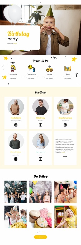
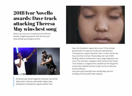
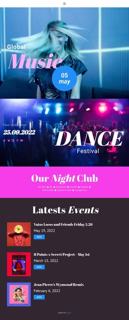








Other Music & Entertainment Website Templates
BBC Website Templates for Editorial Projects
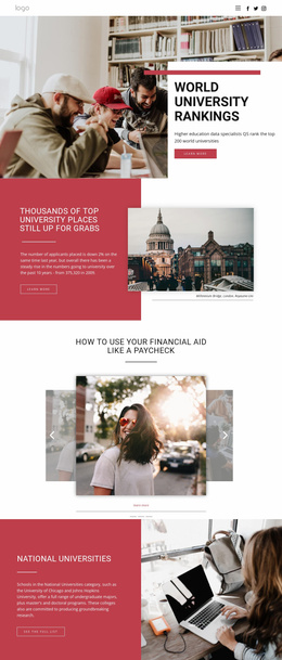
A template set is the real unit of choice here. One front page settles very little, because the same project also needs a section index, a story page, and a place for older coverage to live, all in one visual language. BBC website templates bring that multi-page group of layouts together, with the broadcaster's reading order as the reference: a lead item with a large image, a row of secondary cards beneath it, then a compact strip of coverage for each subject. The resemblance is stylistic, BBC-inspired, with no official tie to the broadcaster.
Plan Page Roles First
Deciding those roles before you build anything saves the most time later. The front page is the easy one to picture, and section indexes are where editorial projects usually fall short. A politics or sports index needs its own lead item and its own ranking of what follows, since readers who land there have already narrowed their interest. Indexes like that are predefined pages of the set, drawn in advance and worth counting before you commit.
The roles a news project normally has to cover:
- a modular front page with lead and secondary blocks;
- section indexes that rank coverage inside one subject;
- story pages with room for media and related links;
- an archive or latest-updates page for the long tail.
Give Every Screen Its Own Job
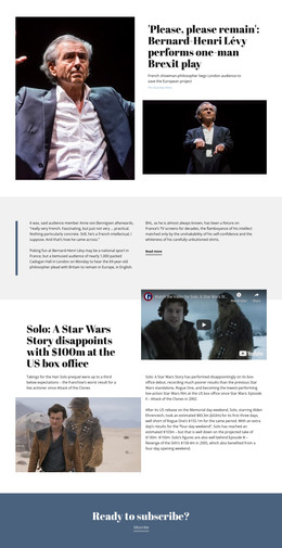
A set earns its keep when those four look and behave differently. The front page sorts many subjects at once; a section index sorts one; and a story page drops the sorting to display a single piece with its headline, deck, and timestamp. The archive page has the plainest job of all, reaching a level of coverage no other screen has room for.
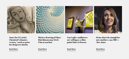
Density belongs to this too. A reader quickly runs down a column of headlines, so cards of similar weight let the eye sort them, while mismatched blocks slow ttheprocess Nicepage's Blog Posts Element can add a group of article cards inside a ready layout when a page calls for it.
Spot Thin Sets in Demos
A live demo quickly reveals the limit. If the section index and the story page end up on a single screen with different words on it, the set is thinner than it looks, and every subject added later inherits that flatness. Counting the distinct layouts is the fastest check, and the archive page is the second, since a busy front page hides how little sits behind it. Site-wide colors, fonts, and the shared header are set once in Nicepage, so the look can mature while the page work stays put.