
Business Card CSS Templates
Your digital business card should match the visual identity of your professional materials. CSS templates help style portraits, names, company details, and contact buttons with consistent typography, balanced spacing, and layouts that adapt to different screens.






























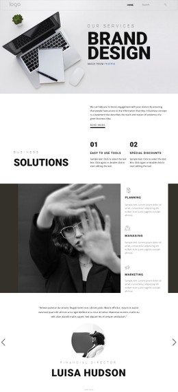

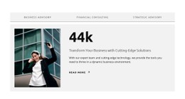

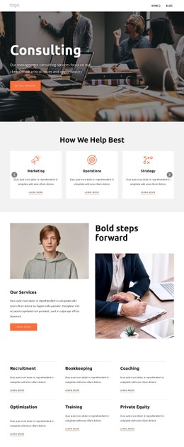
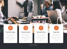



Other Business & Law CSS Templates
Customizable Business Card CSS Templates
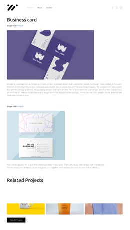
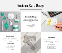
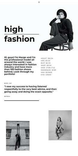
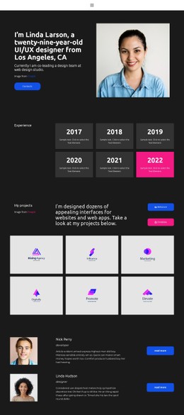
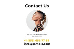
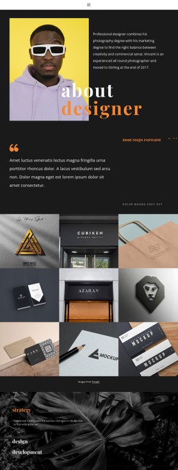
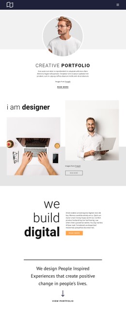
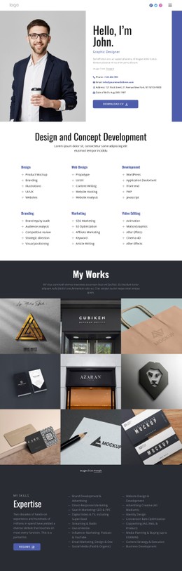
A minimal typographic card, a bold color-backed profile, and a two-sided card-inspired composition create very different first impressions, even when they contain the same contact information. Business card CSS templates are useful when the visual treatment matters as much as the content. The goal is not to add effects everywhere, but to make names, roles, and contact actions feel like parts of one deliberate design.
Compare Visual Styles for Business Card Layouts
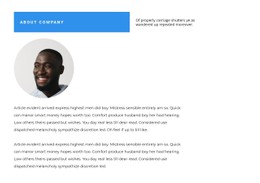
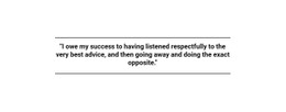
A typography-led design can use a large name, restrained accent color, and generous whitespace to establish hierarchy. A color-panel composition may place a portrait or logo against a contrasting background while keeping contact details on a quieter surface. A two-sided, flip-card-inspired composition can separate a bold identity panel from more detailed contact information, giving the design a distinct front-and-back feel.
When comparing CSS treatments, inspect the details that affect legibility:
- Name and title: maintain a clear size and weight difference without squeezing longer titles.
- Portrait or logo: check cropping and contrast against the card background.
- Contact links: preserve readable spacing and a visible keyboard focus state.
- Background and border: keep sufficient contrast between the card and its surroundings.
- Mobile proportions: ensure the card fits narrow screens without horizontal scrolling.
Card proportions affect these choices. A compact horizontal format emphasizes quick recognition, while a taller profile panel has more room for a portrait and secondary links. Before changing the styling, check whether long names and email addresses fit the intended proportions.
Apply CSS to Individual Card Elements
CSS properties become more useful when tied to specific parts of the design. padding separates contact buttons from nearby text; border-radius can soften the card outline or crop a portrait; and a restrained box-shadow can distinguish the card from its page background. Font weight and line height can give the name prominence without making the job title difficult to read.
You can apply Custom CSS to individual elements or pages when a contact button, card boundary, or portrait needs styling beyond the visual settings. Check page-specific rules against the rest of the design to avoid conflicting overrides.
Keep Card Styling Usable Across Screen Sizes
On a narrow screen, a two-column card may need to stack its portrait and contact details. CSS Grid or Flexbox can support the layout, while media queries adjust spacing and widths as needed. Long email addresses need wrapping rules, and contact controls should retain sufficient separation for touch input. This is a practical layout test, not a reason to introduce complex responsive effects.
Interactive states also deserve attention. Where the chosen design includes linked buttons or clickable cards, : hover can provide a subtle pointer cue and :focus-visible can make keyboard navigation clearer. Neither effect should be the only way to reveal essential contact information.
Before approving a responsive card, check these cases with actual profile details:
- A long professional title wraps without pushing the contact action outside the card.
- The portrait stays recognizable when the layout changes from horizontal to vertical.
- Keyboard focus remains visible against both light and dark card backgrounds.
- The mobile version keeps email and telephone links distinct enough to tap accurately.
Evaluate a business card CSS template with real names, images, and contact details. A successful style holds together when the content changes, not only when the preview uses short placeholder text.