
Scary CSS Templates
Dark horror pages need contrast, spacing, and effects that reinforce suspense without damaging readability. CSS-focused templates help coordinate attraction cards, ticket buttons, typography, and responsive grids while keeping special styling limited to elements that need it.


More CSS Templates from Pets & Animals Category
-

-
-
-
-
-
-
-
-
-
-
-
-
-
-
-
-
-
-
-
-
-
-
-
-
-
-
-
-
-
-
-
-
Build Website with no CodingDownload
-
-
-
-
-
-
-
-
-


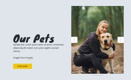

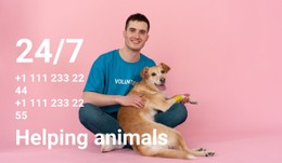
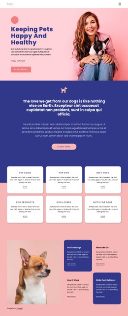


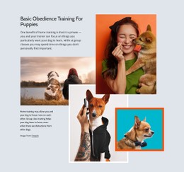
























Other Pets & Animals CSS Templates
Customizable Scary CSS Templates for Horror Styling
Horror lives in small visual decisions, like how a heading tears at its edges, how a card sinks into the dark, or the half-second before a button reacts to a cursor. Scary CSS templates keep those decisions in one reusable set of rules, so a campaign does not turn into a pile of one-off overrides that somebody has to untangle next October.
Reusable Classes Shape Visual Language
A workable horror set stays small enough to hold in your head, and five or six named classes usually carry a whole campaign:
.fog-overlay, a pseudo-element gradient drifting slowly over dark artwork;.glitch-title, a heading with two offset copies driven by keyframes;.flicker-text, an opacity animation timed like a failing bulb;.distressed-card, a teaser block with a torn mask edge and a heavy inner shadow.
Named rules travel well. The same distressed card serves as a room description, a cast member, and a merchandise item, and its colors, spacing, and type sizes can be changed using a small set of variables.
Flicker, Fog, Glitch: Effects Worth Keeping
Restraint separates atmosphere from a headache. Two or three animated components per screen is plenty, and past that, the eye stops resolving anything, so the element you wanted noticed quietly loses its effect.
Transforms and opacity are cheap tools, since transitions on them remain smooth on older phones, while animated shadows and filters cost far more. Gradients and masks build fog, damp stone, and torn paper without a single extra picture. Keyframes deserve names that say what they do, because flicker and drift still make sense a year later while anim2 never does. Reduced motion preferences are worth honoring too, since a visitor who asked their system to calm down should still get the dark mode without the shaking.
Responsive Rules At Narrow Widths
Narrow screens punish decoration first. A three-column grid of teaser cards collapses into one, generous spacing disappears, and a torn heading that looked carved on a monitor turns into noise. Effects should shrink along with the columns, which usually means fewer moving parts, a smaller type scale, and contrast checked against the darkest background in the set.
Nicepage covers much of this through visual controls, and targeted rules handle what standard properties cannot address. The Custom CSS guide describes how to apply classes and custom rules at the element, page, or site level.
A horror set is worth keeping when a new component can join it without a new exception. Drop it in a ticket block, give it the existing card and button classes, and it should already look like it belongs in the dark.