
Pet CSS Templates
Repeated pet services, profiles, and offers can lose visual consistency as a site grows. CSS templates establish reusable layout, spacing, color, and content patterns that keep these sections organized.
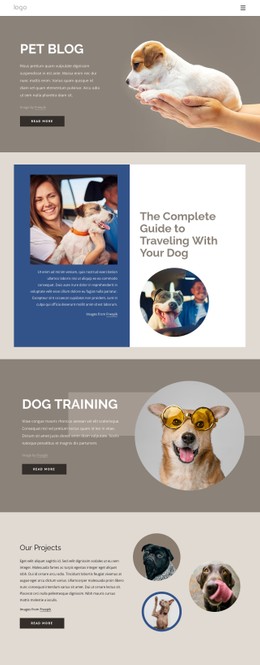
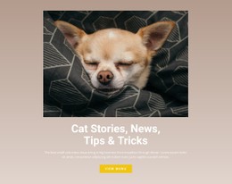
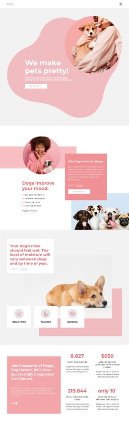



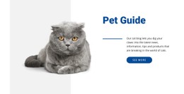
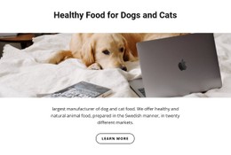
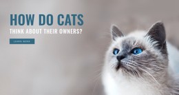







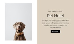
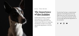
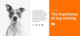
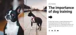
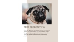
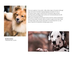
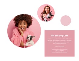
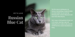


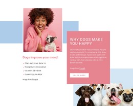
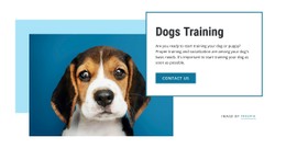
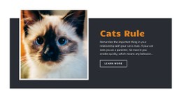
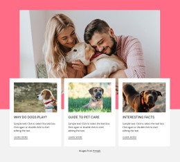








Other Pets & Animals CSS Templates
Clean Pet CSS Templates for Animal Profiles and Service Cards
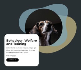
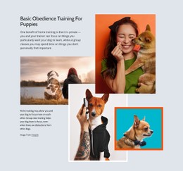
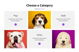
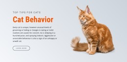
Photos on a shelter site rarely share the same shape. A portrait of a sleeping cat lands next to a wide shot of a dog in the yard, and the cards end up at different heights. A pet CSS template is a ready-made design whose styling already accounts for this. In a good one, image ratios are fixed, and the buttons line up along the bottom of each row, leaving you to work on colors and wording.
Cards Built Around Photos or Prices
Pet designs in this category usually mix a few card types, each with its own styling needs:
- Animal profile cards, where the photo does most of the work and a small badge changes color once a pet is reserved.
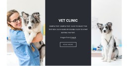
- Vet service cards that lean on text and keep equal heights, so treatments are easy to compare.
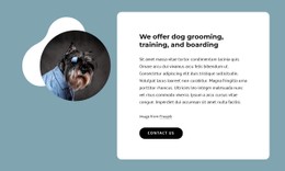
- Grooming package cards with the price as the largest line and the included services in smaller type below.
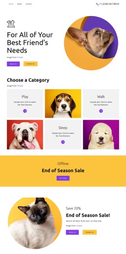
One type scale and one button class keep a photo card for a rescue puppy and a price card for a nail trim visibly related. A dog added next week drops into the same card style with no extra work. Nicepage's Grid Element documentation explains how columns, rows, and gap properties organize content within a block, keeping long rows of adoption cards evenly spaced.
Scrolling a Shelter Listing on Mobile
Nicepage's Responsive Modes preview the design at each breakpoint, and on a shelter listing, three details deserve a close look:
- Long names and breed lines, which should wrap cleanly without pushing the adopt button out of line.
- Portrait photos, which need to keep the animal's face in frame as the card narrows.
- Status badges like Reserved or Adopted, which should stay readable at a glance.
Dropping to fewer columns on a phone is normal. The gaps should shrink too, so the listing still reads as a tidy grid while someone scrolls past dozens of dogs.
Where Accent Colors Earn Their Place
Color does its best work on buttons. A calm palette on the cards leaves room for one strong accent on the Adopt or Book a Visit button. Nicepage lets you set that color scheme once for the whole project. For a single exception, such as a holiday badge on a single grooming offer, Custom CSS applies a rule only to that element.
While browsing the category, picture your own content inside the demo cards. If your adoptable animals, priced services, or grooming photos would fit them without reshaping, the rest comes down to small tweaks.