
Pets CSS Templates
Adoption cards, veterinary services, grooming prices, and pet photos need a consistent visual system. CSS templates provide reusable styling for spacing, colors, grids, typography, and responsive behavior without making page structure the main concern.
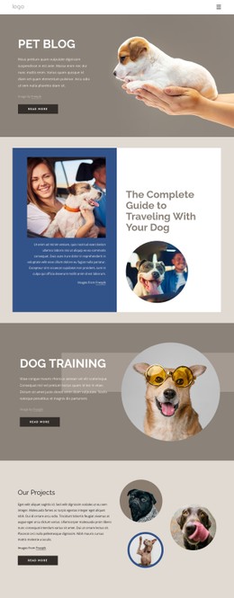

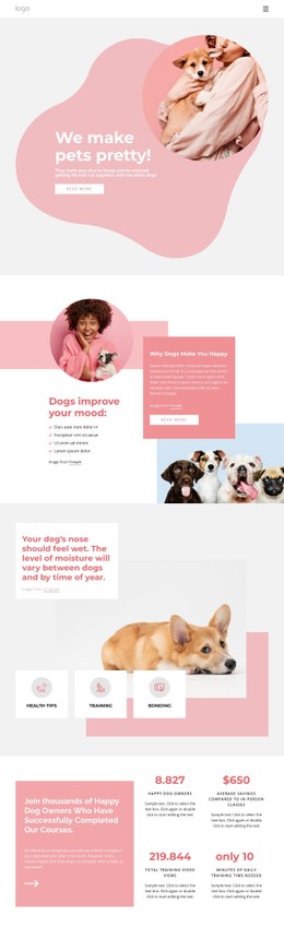
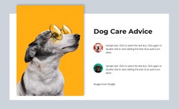

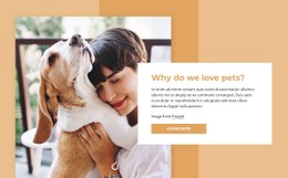

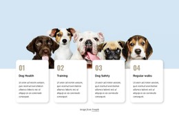

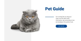




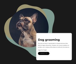
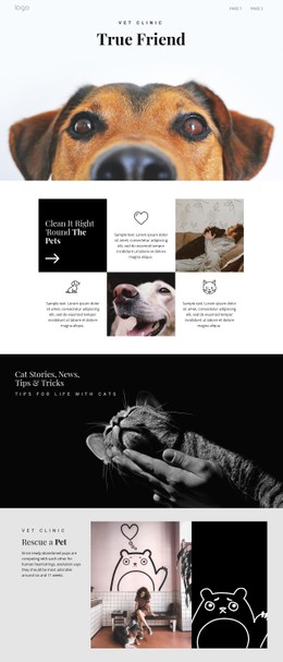

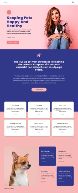







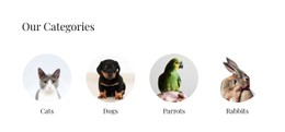
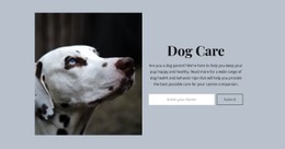
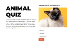
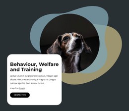
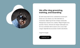
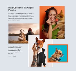

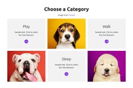


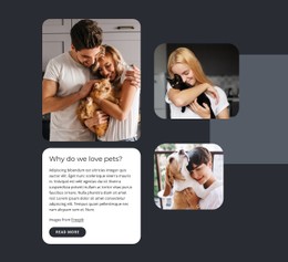
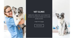















Other Pets & Animals CSS Templates
Flexible Pets CSS Templates for Consistent Pet Website Styling
A pet website usually looks fine on launch day and starts falling apart a month later. When someone adds a grooming package, the card gets slightly different padding. The status label on an adopted dog turns out grey on grey. A pets CSS template arrives as a complete page with the styling layer already worked out, and that layer is what you keep working with while the content changes.
Style the Pet Content That Repeats
Most of a pet site is repetition: the same card shape for every animal, the same block for every service, the same button in a dozen places. CSS Grid and Flexbox decide how those blocks sit together, and reusable classes keep them looking related.
- Use CSS Grid for care packages and price cards whose columns have to line up regardless of the text length.
- Apply Flexbox to compact rows such as opening hours, trainer details, or a phone number beside an address.
- Set shared spacing and border-radius values once, then let every new card inherit them.
- Define image aspect ratios so that before-and-after grooming photos keep the same height across a gallery.
Change a rule in one place, and every block that uses it follows. That is the practical reason to keep the presentation in a styling layer rather than adjust blocks one by one as they appear.
Style Status Labels, Buttons and Mobile Behavior
Some pet content carries meaning that only styling can show. A shelter needs available', ' reserved', and adopted' to read differently at a glance, which is a job for a single class like .pet-status with three modifiers. Booking and inquiry buttons need visible hover and focus states, especially where the request form is the main action on the page. Media queries then decide what happens to all of it on a phone.
- Give adoption status labels enough contrast to stay readable on a photo background.
- Keep hover and focus states consistent across booking buttons, links, and form fields.
- Adjust breakpoint rules for navigation and multi-column sections on narrow screens.
Nicepage also allows custom CSS at the element, page, or site level, so a page-specific class can handle an exception without affecting global styles.
Keep that set small. A handful of reusable rules around the content you publish most often will carry the site further than a long stylesheet full of one-time fixes.