
Sailing HTML Templates
Unlike WordPress themes, sailing HTML templates focus on the markup beneath fleet cards, route sections, course details, and race content. Their reusable structure keeps marine information ordered as wide layouts adapt to tablets and phones.



More HTML Templates from Sports Category





















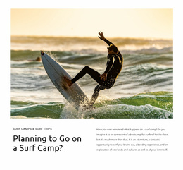
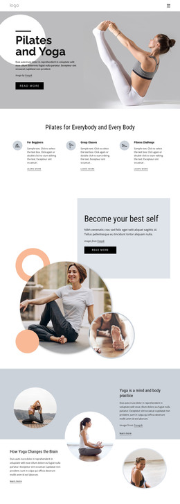










Other Sports HTML Templates
Clean Sailing HTML Templates
A sailing HTML template is a finished front end delivered as a set of files. The pages are laid out, demo yachts sit in the listings, and the forms come ready to point at whatever you use for submissions. Most sets under this heading lean toward charter and rental work, with a fleet listing at the center and destinations, services, and contact details close behind.
What Arrives in a Folder
Before anything else, look at what the package genuinely contains:
- The count of distinct pages, since a fleet listing and a single yacht page are separate jobs;
- The sections you will lean on, among them a gallery, an inquiry form, and a card row;
- The scripts behind anything interactive, such as a slider or a filter on the listing.
A set built around one type of boat turns awkward the moment your fleet mixes a catamaran, a classic ketch and a RIB for day trips.
Fitting Real Yachts Into Demo Slots
The first serious edit tells you most of what you need to know:
- Load your own photographs, which are rarely the proportions the demo was built around;
- Fill a yacht card with real figures for length, berths, and year of build;
- Replace the destination copy where a genuine itinerary runs longer than the placeholder.
Galleries deserve a close look while you are there, because a charter is often sold on twenty photographs of one boat, and a grid that copes with portrait and landscape shots together is worth more than another page in the set.
Vessel details are the awkward part. A card designed for three short lines looks broken once a listing needs draft, engine hours, and a note about the skipper. Try your longest entry before the rest of the work starts, based on that layout.
Wide Images on Narrow Screens
Sailing pages live on wide photography, and wide photography suffers first when everything drops into one column. Watch what becomes of a yacht card when its picture and its figures stop sitting side by side, and whether the inquiry button stays near the boat it belongs to.
Nicepage Responsive Modes cover every width from large desktops down to vertical phones. Use them on the fleet listing first, because that page displays more images per screen than any other page in the set.
Weigh the packages on plain things: the number of distinct pages, the way sections handle your own photographs and figures, and the behavior of the busiest page at phone width. Everything else is taste, and taste you can judge from the preview.