
Residence CSS Templates
Uneven prices, cramped photo previews, and inconsistent badges make a residence portfolio harder to compare. With residence CSS templates, property teams can refine visual hierarchy, contrast, and spacing without restructuring their property content.
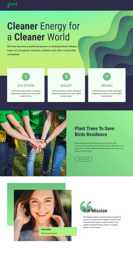
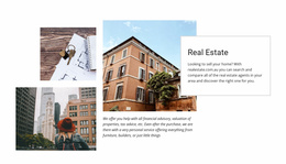

More CSS Templates from Real Estate Category

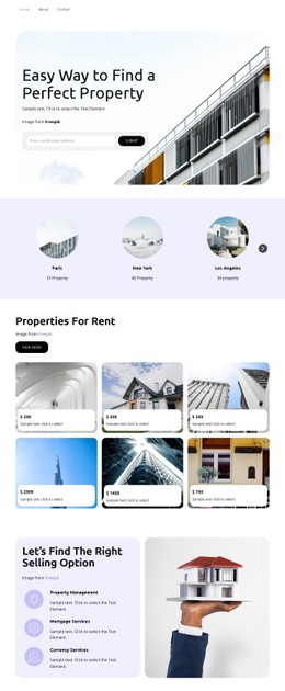
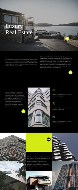


Other Real Estate CSS Templates
Flexible Residence CSS Templates for Property Layouts
The styling of a residence page decides how large the main photo is and whether the price and floor area stand out beside it. Residence CSS templates come with that layer handled, and most designs here are for villas, apartments,, and residential complexes. A villa page can lean on one big image, while several apartment types need matching blocks that are easy to compare.
Common Looks Among Residential Designs
These patterns turn up often in residential designs:
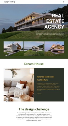
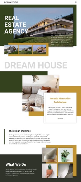
- A single property page with a wide hero photo and interior shots in mixed sizes, showing the rooms and the architecture.
- An even grid of apartment cards where all photos share one aspect ratio and no tall image pushes its unit out of line.
- Cards with visual states, from a hover effect to a muted look you can give a reserved unit.
CSS Grid usually handles gallery and card columns, and Flexbox lines up small details like bedroom counts inside each block. In the preview, cards in one row should share a height, with figures still aligned when one unit lists more features.
Color Accents with Type Contrast
Color works best when it sorts information, giving the main facts, secondary specs, and the contact button their own weight. Type adds a second layer through a bold unit name, plain figures, and lighter photo captions. Utility costs and parking fees deserve better than tiny gray text.
Nicepage Theme Colors set one palette for the project, and switching a preset changes headings, buttons, and accents together. Custom CSS covers what the visual controls cannot, like separate spacing and dividers for the specification panel. Since Nicepage does not run custom CSS inside the editor, these changes show up only in the preview.
How Styling Adapts to Phones
On a phone, a row of residence cards turns into a single column. The rules at each breakpoint should also shrink the gaps and type sizes so the stack doesn't look like a squeezed desktop row. A villa's hero photo needs similar care, since a narrow crop can cut off the house and leave only the garden. Another warning sign is a gallery that fills the screen before the price appears. Long titles such as "Riverside Garden Residences, Building C" should wrap without pushing the figures out of line.
Demo photos are chosen to flatter a design, so judge the styling with your own pictures and figures. A project that pairs one showcase penthouse with a row of smaller units needs a design that handles both.