Mobile CSS Templates


More Website & HTML Templates for Mobile


Other Technology CSS Templates
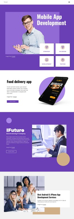
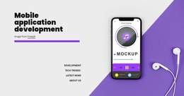
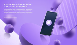
Responsive Mobile CSS Templates for Flexible Design
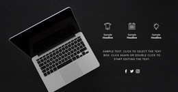
Why do mobile users leave a website in seconds? Mobile CSS template allows for quick creation of websites optimized for viewing on mobiles and tablets. This is the part that sets the styles of various UI elements: buttons, typography, margins, padding, and layout blocks. It becomes especially relevant now, considering that more than 60% of people use mobile devices for web surfing.
Users leave sites with a poor appearance or a long loading speed within 2–3 seconds. The value of such templates lies in time saving for developers, designers, or businessmen who work on building their websites. First of all, there are a huge number of pre-designed templates where everything necessary is prepared beforehand, including menus, product cards, and contact forms. Thus, it is possible to spend less time on creating layouts from scratch – about 30–50% less.
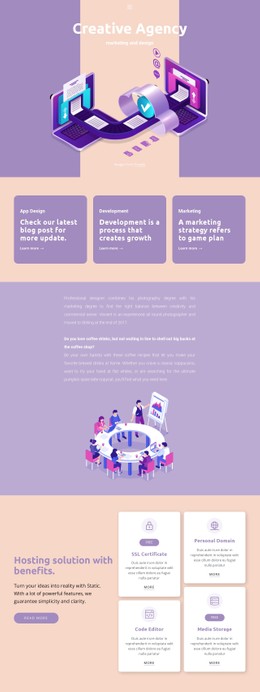
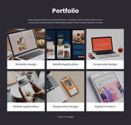
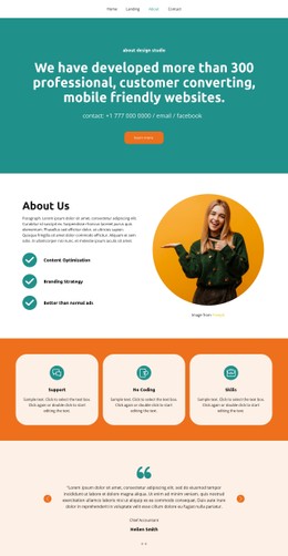
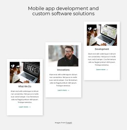
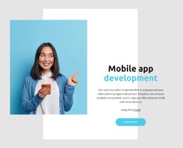
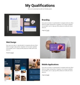
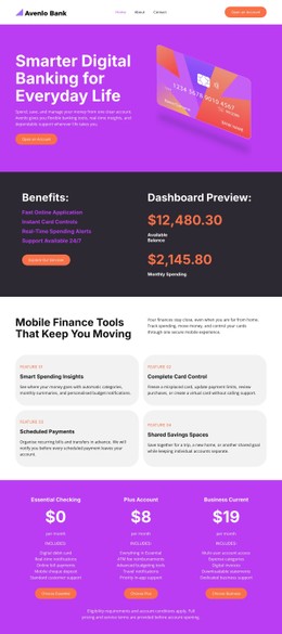
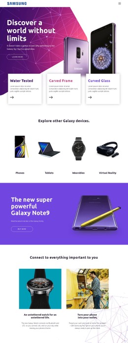
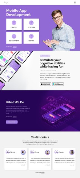
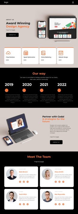
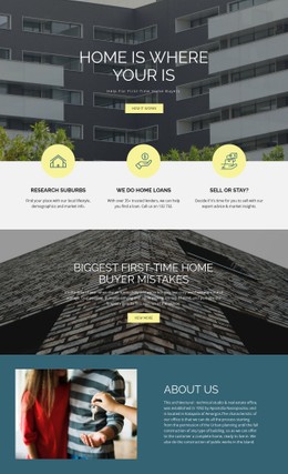
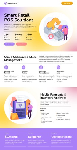
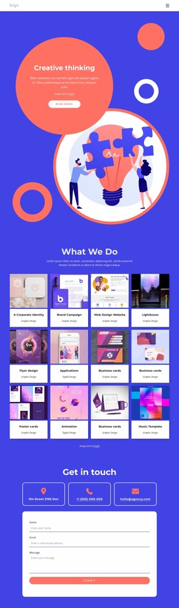
The use of mobile CSS templates is an effective way to address both challenges simultaneously. It provides web developers, web designers, freelancers, and even small business owners with an opportunity to quickly develop visually appealing mobile templates with excellent visual hierarchy. Regardless of whether you are developing a landing page, app, or product presentation website, these templates will help you to structure the content in an efficient manner while ensuring optimal website performance. Nicepage has a library of mobile CSS templates that can be used for customization purposes.
Mobile CSS Styling That Improves UX
In mobile CSS templates, content presentation is the key area of consideration. The well-designed style system positively impacts readability, navigability, and reliability of the site. According to research findings, an improved mobile UX may result in a 200% increase in conversion rates.
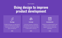
Here is the list of the main features of mobile CSS templates:
- Modern typography
- Adjustment of visual hierarchy
- Lightweight animations
- Responsive blocks
- Fast CSS code
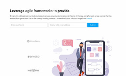
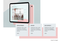
Customizable Mobile Layouts for Real Projects
CSS-powered mobile design provides maximum flexibility since you can modify color schemes, typography, spaces, and other elements without changing the layout at all. This approach comes particularly handy when working on start-ups, agencies, or e-commerce solutions.
Mobiles represent over 60% of the browsing population, and it is necessary to provide seamless navigation to your visitors. Style plays an important role when leading your audience through the content.
Build Better Mobile Interfaces Today
A good visual design can mean a lot. With mobile CSS templates, it is easy to deploy a professional design right away and adjust it to your project.
Browse the gallery, get mobile CSS templates for free, and build an adaptive mobile design that will keep users hooked.