
Icon CSS Templates
Service icons, controls, contact symbols, and feature cues need consistent visual treatment to feel related. CSS-oriented templates provide a styling base for color, scale, spacing, contrast, and repeated interface patterns.























































Other Brands CSS Templates
Functional Icon CSS Templates Styled for Cards and Clickable Controls
Every icon carries a few quiet decisions: how big it is, what shape lies behind it, and what happens when the pointer hovers over it. Icon CSS templates come with those decisions already made. The blocks range from service cards and contact rows to icon buttons. Shared classes style each item in a group consistently, so a new card automatically picks up the same size and color.
Rules Built Into Typical Cards
Blocks in this category usually arrive with rules like these:
- one width and height for every icon in the group, so none looks accidentally larger;
- a filled or bordered circle behind the symbol, or a square with rounded corners;
- a fixed gap between the icon and its heading that keeps rows aligned when titles wrap;
- an accent color linked to the theme palette, so the whole set changes together.
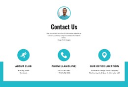
These rules apply equally to SVG icons and icon font glyphs. In a contact row, all channel icons share the same size. The email line can still take a brighter accent if that is your main channel. Line weight matters too, since thin line icons fade on phone screens long before filled ones do.
Repeated Cells and Clickable States
In Nicepage, the Grid Repeater Element repeats the layout and style of its cells. Each column still keeps its own Icon and Text. Change the circle color in one cell, and the rest follow. A static service grid rarely needs more than that. Clickable icons for search, sharing, or closing a panel are different, and the template should define these states:
- a default look that stays calm beside the surrounding text;
- a hover state that shifts the color or background as the pointer arrives;
- an active or focus state for the click itself and for keyboard users;
- a highlighted state that marks the current choice, such as a selected filter.
Recoloring Whole Groups at Once
With Theme Colors in Nicepage Site Settings, switching an accent updates every icon that uses it across the project's pages. Warning and confirmation symbols are better left off that accent, matching their neighbors in size and using their own color. Sizes can also change per Responsive Mode, so a large decorative symbol shrinks on phones. When the visual controls fall short, Custom CSS Code adds a rule to a single element, a single page, or the entire site.
A service grid template can get by with one static icon style. For buttons and toggles, check the states before the palette, since a control that shows no change on click feels broken.