
Blogger CSS Templates
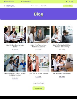
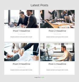
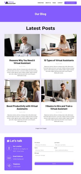
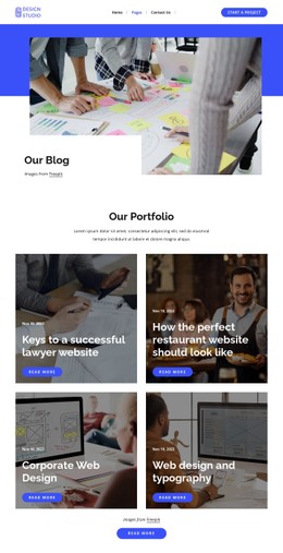
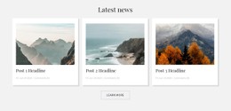
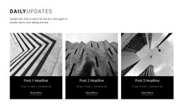
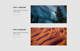
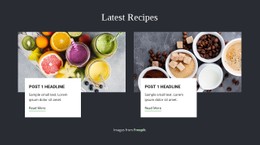
Recipe collections, travel journals, and personal essays require different visual treatments without sacrificing readability. Blogger CSS templates help coordinate article previews, typography, image proportions, and responsive columns through adjustable styling rules.




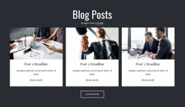
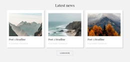
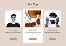
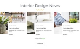



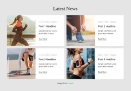

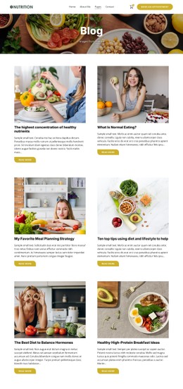
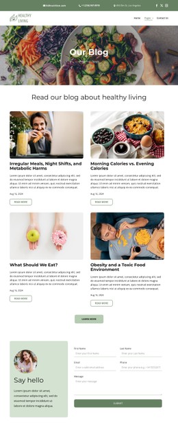
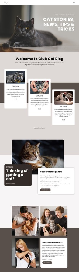





More Website & HTML Templates for Blogger


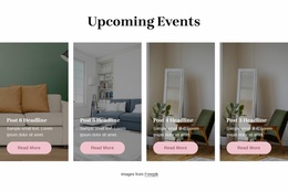
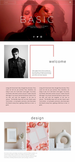
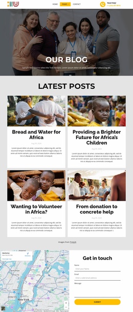
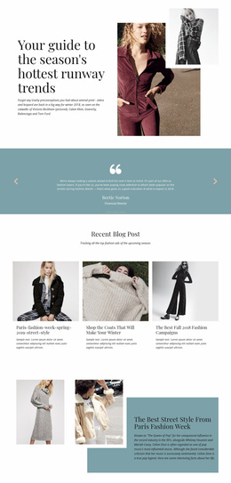
More CSS Templates from Blog Posts Category
Other Blog Posts CSS Templates
Customizable Blogger CSS Templates for Editorial Styling
Give your blog a consistent visual identity through CSS layouts that suit your articles, photographs, and editorial style. Blogger CSS templates provide a practical foundation for writers who want greater control over post cards, reading columns, typography, and responsive presentation. A recipe blogger may prefer large food photographs and compact ingredient previews, while a travel writer may need spacious editorial layouts for destination stories. The right CSS foundation supports these differences without sacrificing clarity across the publication.
Responsive CSS Layouts for Blog Post Collections
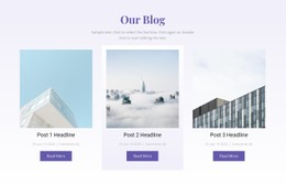
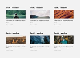
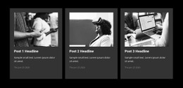
Article collections often contain different image sizes, headline lengths, and excerpt formats. CSS controls how these elements appear together and helps maintain predictable spacing throughout a blog.
When customizing a grid-based design, grid-template-columns can define the number and width of post columns, while gap sets the distance between cards. A max-width constraint can keep the collection from stretching too far across a large monitor. For image-heavy cards, object-fit may control how photographs fill a fixed frame. Media queries can then change column counts at narrower widths. These are examples of CSS techniques to consider, not a claim about how every Nicepage template is implemented.
Test awkward cases rather than only ideal sample content: a headline that wraps to four lines, a portrait photo inside a landscape card, and two columns that become cramped on a tablet. Adjust the relevant rules only after inspecting the actual design.
Clean Typography and Consistent Editorial Details
Blog typography influences how comfortably readers move through long articles. Font size, line height, paragraph spacing, and content width should work together, not compete for attention.
Start with the reading column: limit line length with an appropriate max-width, set a comfortable line-height, and give consecutive paragraphs enough margin to remain distinct. Long headings need wrapping rules that do not push metadata or images out of alignment.
Style block quotations so they are distinguishable without overwhelming the text, and keep image captions close to their photographs. Dates and bylines should have a clear hierarchy below the article title. Check these details with real long-form content, not just a short placeholder paragraph.
Advanced CSS Control for Individual Blog Elements
Ready-made CSS styling does not always cover every editorial requirement. Bloggers may want different border treatments for featured posts, additional spacing around quotations, or unique styles for selected content categories.
Nicepage supports these adjustments through Custom CSS, which allows styling rules to be applied to individual elements, specific pages, or the entire website. This lets you refine selected editorial components without redesigning unrelated sections.
Test custom CSS in page previews and across screen sizes, since new rules can conflict with existing styles.
A practical blogger CSS template should balance distinctive presentation with predictable behavior. Prioritize readable article typography, adaptable post grids, consistent visual details, and targeted CSS adjustments. These elements provide a styling foundation that remains useful as a blog introduces new topics and content formats.