
Schedule CSS Templates
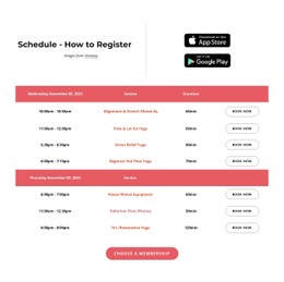
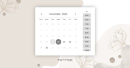
When yoga, Pilates, and mobility classes share a weekly grid, equally sized blocks conceal important differences in duration and room. Schedule CSS templates use visual hierarchy and adaptable styles to make the timetable easier to scan.


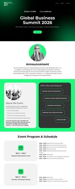
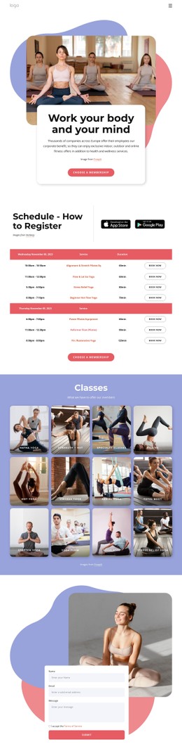
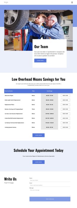




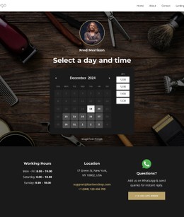
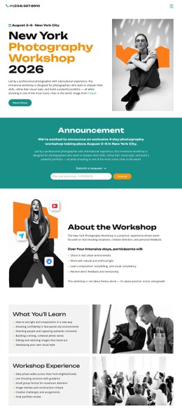

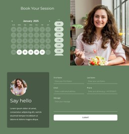
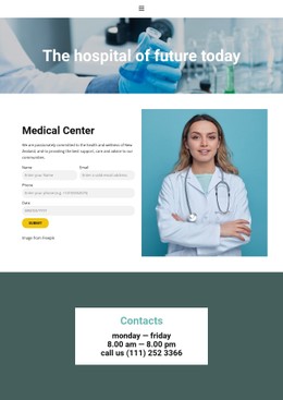
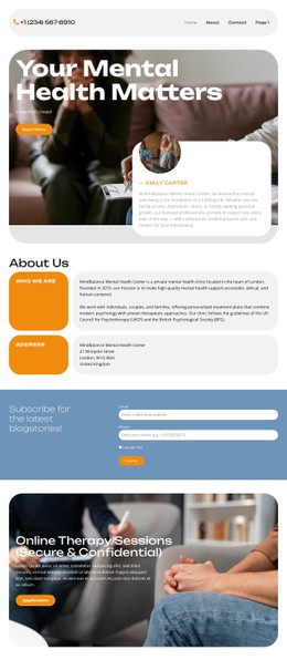
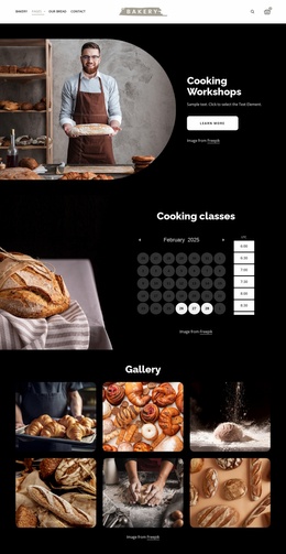
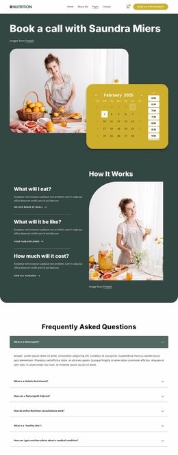
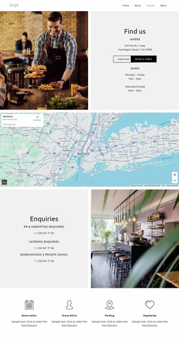
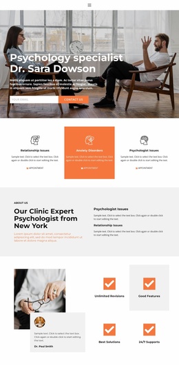
More CSS Templates from Calendar & Booking Category
Other Calendar & Booking CSS Templates
Flexible Schedule CSS Templates
Two schedules can hold identical sessions and still differ in how fast someone finds a free hour. In one, start times stand out and each day forms a clear column, while in the other, rows of gray boxes blur a morning appointment into an evening one. A ready schedule CSS template usually includes time grids, calendar cells, and event blocks that share a single style set. A class timetable then scans by day, and booking slots stay distinct.
Visual Formats That Fit Busy Weeks
Ready schedule designs tend to follow a few visual patterns:
- Time grids with day columns and hour rows, where a longer session can take more space.
- Event cards of equal size that print the duration inside each one.
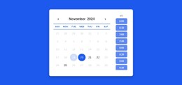
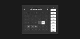
- Appointment slot bands that make open and taken times easy to compare.
Daily event count matters more than any color choice. A layout that looks airy with five events can become a wall of text with twenty, so try each candidate with your busiest day. Long titles add pressure too, since "Yoga" and "Beginner Reformer Pilates Workshop" should both stay readable in one grid. Watch how lines wrap and whether the gap between neighbors still shows which hour each block belongs to. CSS Grid usually handles days and hours, while Flexbox arranges the details inside each card.
Tuning the Design Inside Nicepage
Adapting a chosen template in Nicepage usually goes in this order:
- Start with the visual controls for colors, fonts, and element sizes.
- Use Responsive Modes to rearrange the layout for tablets and phones.
- Add Custom CSS to an element, a page, or the whole site when built-in settings stop short.
- Open the preview to see those rules at work, since the editor does not run custom code.
Phones are where most schedule designs show their weak spots. Five- or seven-day columns rarely survive on a narrow screen. Look for a design that can stack days or switch to a single scrolling day, with labels attached to every block.
Status Marks and a Final Comparison
A canceled session, a changed time, and an unavailable slot should each have a text label next to its color to help visitors with color vision differences. A green "open" slot is still only a visual cue, and real booking needs its own system.
When a few templates make the shortlist, load the same busy week into each. Compare how readable the times are and how events of different lengths share the grid, then let the phone preview have the final word.