

Menu CSS Templates
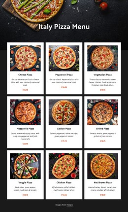
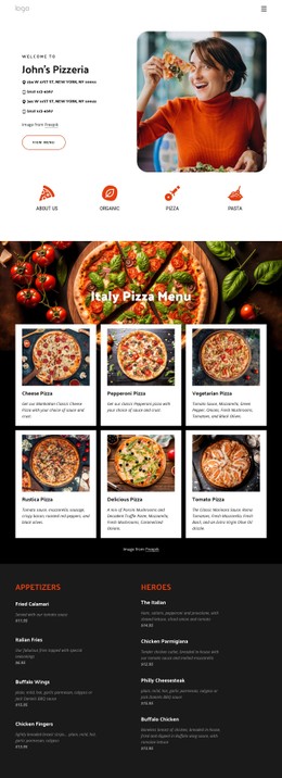
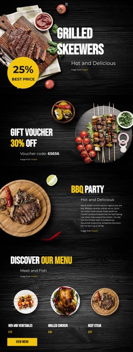
Restaurant menus rely on balanced typography, clear price alignment, and distinct food categories to remain readable. CSS templates provide styling foundations for café menus, restaurant specials, and beverage lists, with flexible layouts that adapt to desktop and mobile screens.
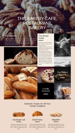


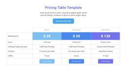

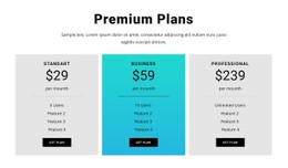
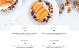
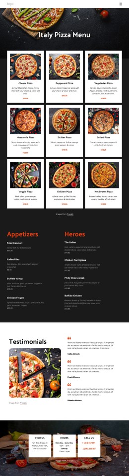

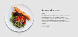
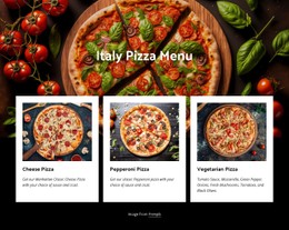






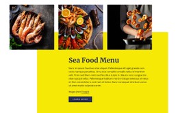
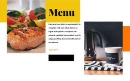
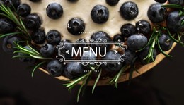
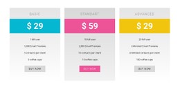
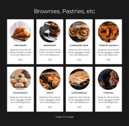

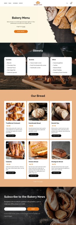
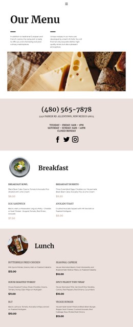






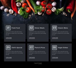
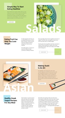
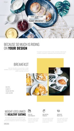



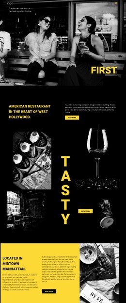
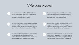
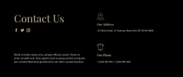
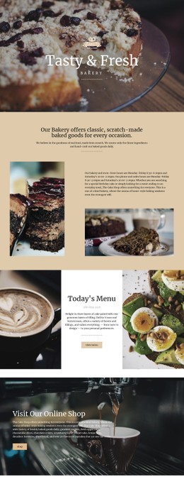

Other Food & Restaurant CSS Templates
Customizable Menu CSS Templates for Restaurant Styling
Menu CSS templates help turn an ordinary list of dishes into a readable, recognizable restaurant presentation. The content may already include every name, description, and price; the challenge is displaying it consistently. CSS controls the visual rhythm, from spacing between courses to the contrast of a featured special.
CSS Styling for Food Categories and Menu Prices
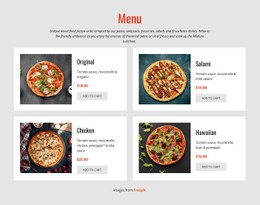
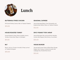
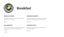
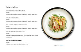
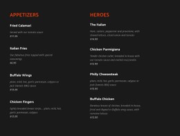
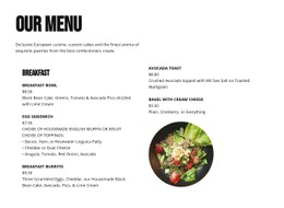
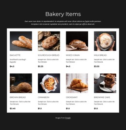
A menu with varied dish-name lengths often looks uneven when prices are positioned manually. CSS Grid can give each item a flexible name column and a price column sized to its content, keeping $9 and $19.50 aligned without forcing titles to fit fixed widths. Flexbox can arrange the contents of compact dish cards or align a small label beside a featured item. Neither technique requires changing the meaning of the underlying food information.
Use a clear hierarchy: category titles should be more prominent than item descriptions, while prices must remain easy to locate. Consistent line height, vertical gaps, and borders can separate categories without boxing in every dish. Hover effects may help with clickable items, but a printed-style food list should remain legible without them.
Custom CSS for Different Restaurant Styles
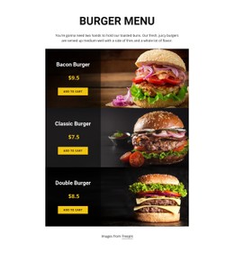
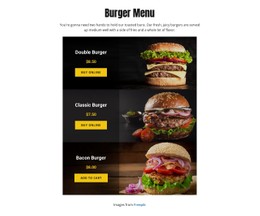
A minimalist coffee shop might use warm neutrals, modest category headings, and generous whitespace around espresso and pastry entries. A burger restaurant could use high-contrast headings, bold combo prices, and colorful promotional badges, as long as the labels remain readable. A fine-dining restaurant often benefits from restrained typography, delicate dividers, and carefully spaced descriptions of multi-course dishes. These are different design choices applied to the same basic information.
For a concrete refinement, change a two-column dish list from equal-width columns to a flexible name column and a narrow, right-aligned price column. Long names then wrap naturally without pushing every price to a different position. Nicepage supports custom CSS for styling refinements beyond the standard visual controls.
Responsive CSS Layouts for Mobile Food Menus
Media queries can switch a multi-column menu into a single column at a suitable viewport width. They can also reduce oversized headings, adjust item gaps, and prevent prices from being squeezed against long descriptions. Flexbox cards may stack their image and text, while Grid can preserve a close name-and-price relationship.
You can use Nicepage Responsive Modes to inspect menu layouts at different screen sizes. Check the longest dish name and price, not just the shortest sample: these expose problems sooner. A strong CSS menu template is one whose typography, alignment, and mobile behavior still work when the real restaurant content replaces placeholders.