
Market HTML Templates
Repeated product, vendor, and offer sections need a predictable structure as a market catalog expands. Ready-made HTML layouts provide reusable markup for those content patterns while keeping the hierarchy suitable for responsive pages.


















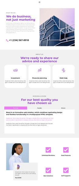






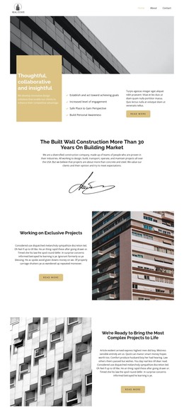
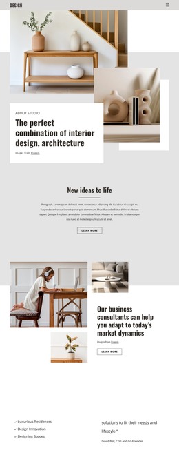





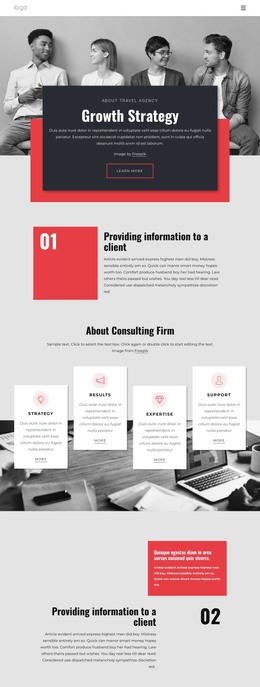












More Website & HTML Templates for Market











More HTML Templates from Sale Category















































Other Sale HTML Templates
Ready-to-Use Market HTML Templates with Storefront and Catalog Layouts
A market HTML template gives you a finished composition to start with. The storefront, category areas, and product listings are laid out together, with promotional strips already in place, and the demo content swaps out for yours. What you are really choosing is how close that arrangement sits to the store you plan to run.
Pick a Storefront Composition Close to Yours
Market layouts differ in what they put first. One is built for a dense catalog, where the goal is to fit many products on a screen without turning it into wallpaper. Another leads with large images and a couple of featured collections, which suits a small range sold on presentation. A marketplace layout makes room for seller areas alongside the product ones.
Before choosing, look at what the demo arrangement already provides:
- how many products fit in a row before the page feels tight;
- whether categories get their own area or live inside the navigation;
- where promotions sit in relation to the catalog;
- how much supporting content the design expects below.
Swap Demo Content, Adjust the Sections
Replacing the demo set is most of the work, and it moves quickly while the arrangement stays put. A seasonal sale takes over the promotional area, product names and prices land in the listing, and the categories change to the ones you actually stock.
Growth is where a coordinated layout earns its place. A new collection reuses a section the design already contains, so the tenth category looks like the first, and a marketplace adding a seller gets an area that matches the rest of the page.
How Ready Layouts Behave at Tablet Width
A market design has to survive the trip from a wide desktop to a phone in someone's pocket. A ready layout handles that as a whole: the catalog goes from four across to two, the navigation folds, and the reading order of the page holds.
Open the demo at a middle width and the narrowest one. Tablets are where a storefront tends to look worst, since the design has to give up columns without having room yet for the phone arrangement.
The best starting point is a layout whose arrangement already matches the store you want to publish, which turns the project into swapping content and making light adjustments. Working from the source files is a different starting point, and a different page.