

Line CSS Templates
Thin dividers can clarify a layout, but inconsistent line widths and tight spacing make sections look crowded. Line CSS templates let designers balance rules, borders, and decorative accents across text panels, image blocks, and mobile layouts.














More Website & HTML Templates for Line




















More CSS Templates from Shapes Category







Other Shapes CSS Templates
Simple Line CSS Templates
In a line template, two or three carefully placed strokes shape how a section reads. Line CSS templates arrive with those accents already styled, so you can decide what each stroke should do before adjusting its look.
Four Jobs a Line Can Do
A few blocks from the catalog show the range well:
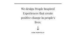
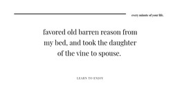
- In Headline With Line And Arrow, a thin rule above a centered serif heading marks where the statement starts.
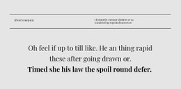
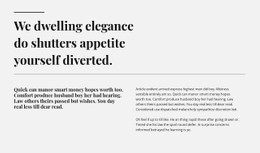
- Two Lines Two Heading And Text frames its title between a short rule above and a full-width divider below.
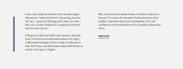
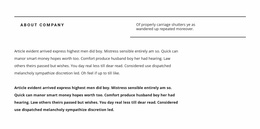
- Plain Text With Vertical Line runs a muted blue stroke down the left side, giving an editorial passage a clear starting edge.
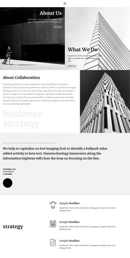
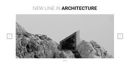
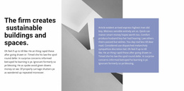
- Minimal Line In Building separates an architecture firm's about text from a facade photo with a slim lavender line.
Line art you add yourself is a separate case. A border belongs to its box. A contour drawing is an image with its own stroke weight, and dividers matched to that weight make the page look as if one hand drew everything.
Weight, Gap, and Custom CSS
With your text in, compare the length of each accent with its heading, its weight with the type beside it, and its color with the background. The gap around a line matters just as much. A rule set tight under a title reads as part of it, and the same rule with generous margins starts acting as a section divider. Contrast is relative, so a hairline that holds up under a large heading can vanish beside small, dense copy.
Say a much shorter title replaces the demo one, and the rule under it now runs past the words like a leftover. Follow the Shape Element tutorial to resize horizontal or vertical Line shapes, rotate them, or change their color. Effects outside the visual controls, such as a stroke that extends on hover, belong in Custom CSS, which can target one element, a page, or the entire site. Preview shows whether the stroke still clears the heading.
When Columns Collapse on Phones
A vertical line between two columns makes sense on a laptop, yet once the columns stack on a phone, it can float between unrelated blocks. Responsive Modes let you shrink it, hide it, or swap in a horizontal divider for small screens. When one page mixes several line designs, matching their weight and color keeps the strokes from competing.
The hardest thing to change later is a line's role. Turning a divider into a heading accent means reworking the section, while a new weight or color is a quick edit in the Property Panel.