The Shape is a Layout Element that emphasizes particular parts, adding diversity to web design.
See Also
Add Shapes
You can add the Shape Elements from the Quick Access Pane. Open the Add Panel, click Shape, and select the Shape Element.
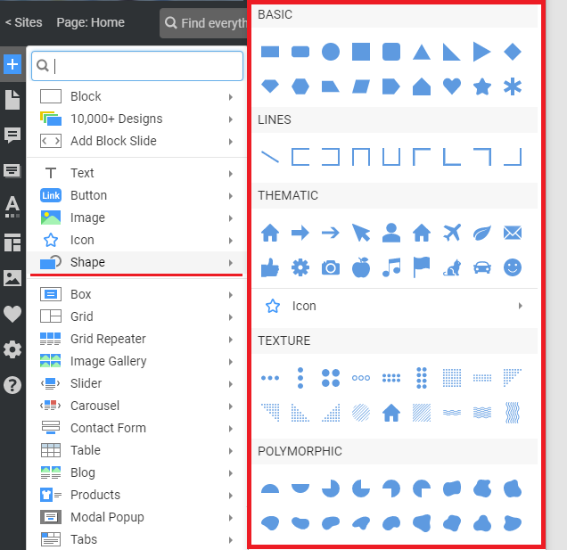
Shape Types
There are different Shape types, including Basic, Thematic, Polymorphic, and Line. Basic Shapes are the most common and widely used forms in website design.

Thematic
Basic shapes are also popular symbols found on websites.

Polymorphic
Polymorphic shapes have variable forms that visually imitate the liquid stains.

Lines
In web design, Horizontal Lines add relaxation and calm, whereas vertical Lines create more separation and distinction.

Textures

Link To Icons
You can also access Icons from the Shape section of the Add Panel.
Shape Blocks
There are also many preset and designer-made Blocks built using the Shapes.

Move And Resize
Move the Shape Element by clicking and dragging it to the destination. Dragging the markers, you can easily modify the Shape in the Block Editor.

Convert Shape To Box
Turn your Shape into a box element by clicking on the small round Plus Icon at the center of the Shape Element and adding Elements, such as icons, Texts, and Buttons.

Shape Context Toolbar
In the Shape Context Toolbar, you can quickly edit Shape Color, Border Width, Border Color, and add a Hyperlink.

Click the Fill Icon with the color bar to change the Shape Color or select No Color. Quickly set the Width and Color, or choose no color for the Shape Border.
You can also add a hyperlink to your Shape in the Context Toolbar.
Shape Properties
You can modify all supported Shape Properties in the Property Panel.

Multi-Selected Shape Properties
You can set the properties of the multi-selected shape elements, such as Background, Border, Transparency, Animation, etc.

Rotate Shape
You can spin the Rotate property for the Image and Shape Elements by a custom angle.

You can also rotate Lines.

Shape Size
You can edit the Width and Height of the Shape Element.

Lock Shape Proportions
You can also Lock Proportions for any Shape, such as a square or Circle, to prevent breaking.
Shape Margins
Enter the values in the Property Panel to set the top, bottom, left, and right margins for the shape element.

Shape Styles
You can apply the Styles to a Shape.

Shape Background
You can set the No Background, Color Background, or Gradient Background using the Property Panel. You can use the Theme, Additional Colors, or add new ones. You can access the Theme Colors from the Color Picker dialog.

NOTE: The Fill option is inactive in the Gradient Background section of the Context Toolbar.
Shape Border
Set the Color and Width for the Shape Border. You can use the Theme, Additional Colors, or add new ones.

Shape Form Presets And Radius
You can choose the Form Presets setting to set the rounding for the corners of rectangles or convert them to a Circle. You can edit the Radius for the rounded corners of the Rectangles.

Custom Shape Border And Radius
You can set the Border and Radius for each side of the Rectangular Shapes.

Shape Shadow
Click on the checkbox to enable the shadow shape element. You can use the Shadow Presets or customize the Shadow Shadow Settings Tab by modifying the Positions, Blur, Spread, Transparency, and Color parameters.
NOTE: You can use the Shadow, Rectangular, and Circle Shapes.

Shape, Flip, And Rotate
You can flip and rotate the Shape Elements along the axis, making them upside down or facing a particular side.

Shape Transparency
Adjust the Shape Transparency to make it more or less visible. You can use it to create a natural hover effect in web design.

Link Shape
You can link the Shape Element to transfer to a Page, Block, Post, connect to a File, Phone Number, or Email, or raise a Modal Popup.
Responsive Modes
You can change the Shape Size for all Mobile Views.