
Join Website Templates
Organizations that invite members, volunteers, partners, or applicants need different pages for benefits, roles, requirements, and the joining process. A coordinated website template keeps those routes connected through shared navigation while leaving room for new participation options.



























Other Contact Form Website Templates
Join Website Templates for Clubs, Courses, and Teams
A yoga studio filling its next beginner group, a language school collecting registrations, a company building a Join Our Team section: the job is the same for all three. Someone should grasp the invitation quickly and accept it without having to hunt for the form. Join Website Templates gives you a predesigned starting point, from the opening screen to the closing button. Some are compact enough to publish the same evening, while others leave room for programs, schedules, and stories from people who already joined.
What People Are Actually Signing Up For
The word join covers promises of very different weight. A newsletter costs an email address and a few seconds. Enrolling in a paid course, applying to a volunteer team, or requesting membership in a professional body is a bigger step, and the design has to earn it.
That difference decides what a design needs room for:
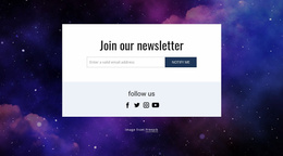
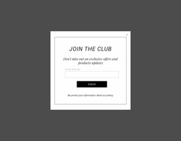
- quick signup, where a headline and a single field carry the whole idea;
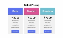
- club or class enrollment, with schedule, pricing and a short registration form;
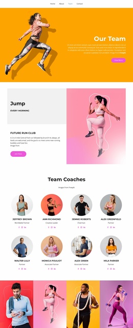
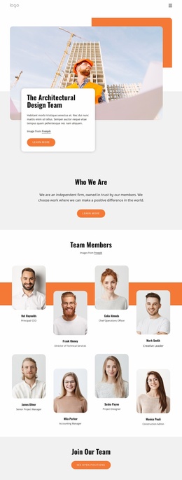
- team recruitment, where open roles sit next to an application form;
- affiliate or partner programs, which explain terms before anyone commits.
The heavier the commitment, the more a design has to say before the form appears.
Forms, Buttons, and Proof
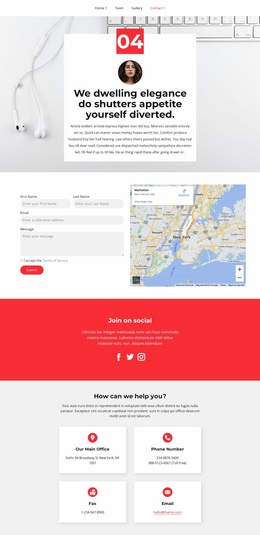
Ask for the least you can get away with. A newsletter block does fine with an email field, while a course needs little more than a name and a contact. A team application can reasonably ask for a portfolio link, because whoever fills it in already expects to invest something. In Nicepage, form entries can go to your email or to Leads, so an application does not go unnoticed.
The wording of the button deserves the same care. "Join Us" sounds social, and "Sign Up" sounds quick. Register hints at a schedule, while Apply Now signals selection. Pick one verb and keep it consistent across the design, rather than mixing all four.
A common weak spot shows up on the second screen. The top sells the idea well, and then the form arrives with nothing around it: no member count, no quote, no photo of the group itself. Proof belongs where the decision happens.
Matching a Design to Your Offer
Join programs rarely remain fixed. A club can introduce a youth category, an association can open regional chapters, and a nonprofit can add ambassador or volunteer roles. Those additions should expand the existing information architecture rather than create an increasingly crowded top-level menu. Nicepage Page Folders provide a way to organize related pages and subpages in the Pages Panel. A growing membership project can therefore group related participation destinations while preserving a clearer project structure.
Start with what people are joining and how much they need to read before they act. A low-commitment offer suits a compact layout with one strong screen and a visible form. A selective program suits a roomier format, where requirements, stories, and common questions have space to breathe. Before you settle on one, open its demo on a phone and scroll to the form, since that part decides whether anyone finishes.