Flex Website Templates


Other Sports Website Templates
Unique Flex Website Templates
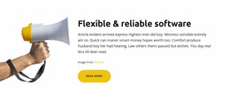
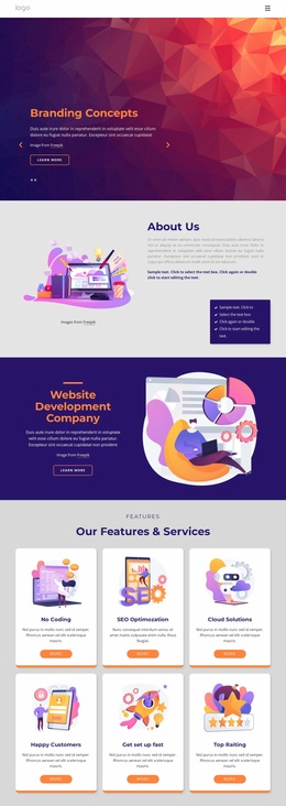
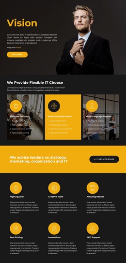
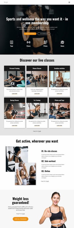
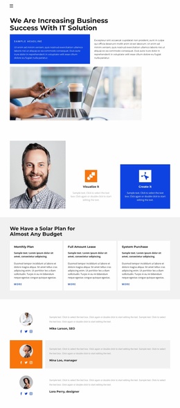
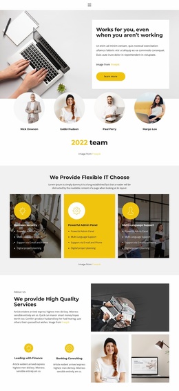
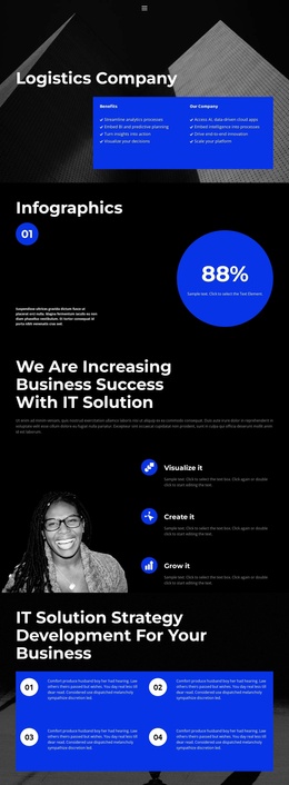
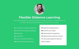
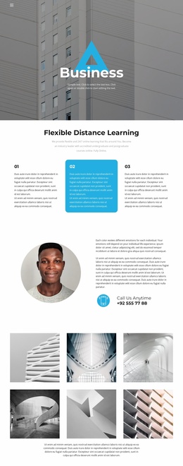
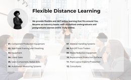
Everybody today expects a better browsing experience and versatile user interaction. Flex website templates help create scalable portals. Those often feature organized content structure and optimized performance. These layouts include adaptive homepage systems and well-structured frontend organization. They facilitate website building and enable site visitors to achieve an aesthetically appealing design and a fast-loading browsing experience on their smart devices or PCs. The flexible structure also makes websites more user-friendly, as visitors can access different parts of the website immediately.
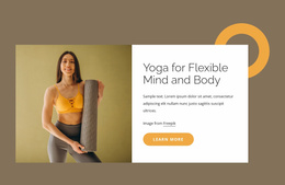
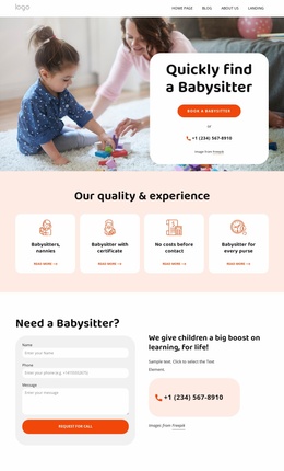
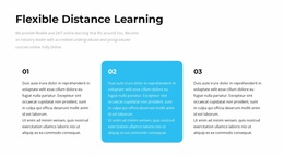
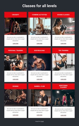
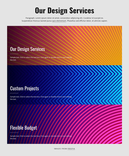
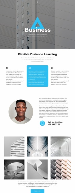
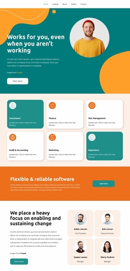
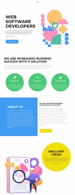
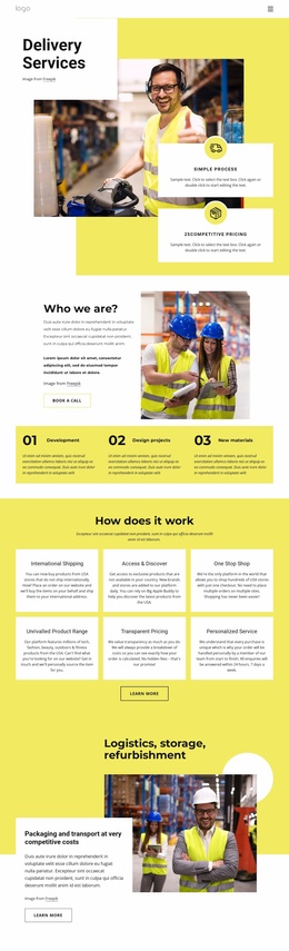
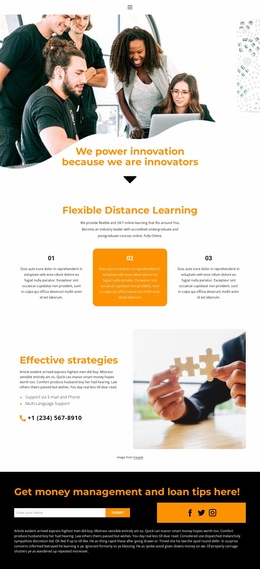
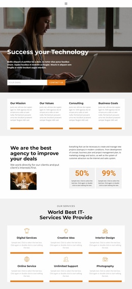
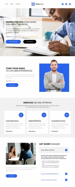
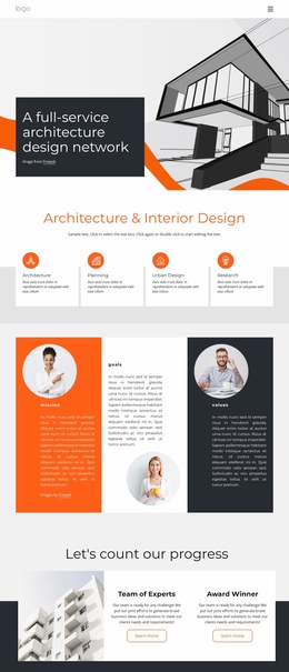
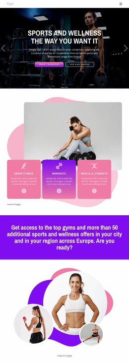
Their main concern is usually functional frontend systems and effective web page design. For example, a technical product seller site can leverage flexible, grid-based website designs to make its offerings more visible and easier to use on mobile devices.
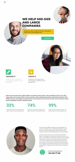
Site designs are becoming much more adaptive to support responsive interfaces and interactions. Mobile-friendliness is the new norm. And this doesn’t come as a surprise: data indicates that over 60% of global web traffic comes from smartphones and tablets.
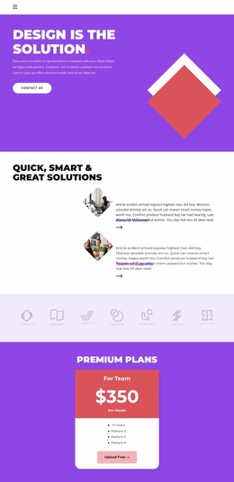
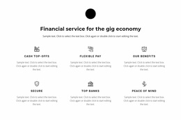
Why Use Adaptable Website Structures for All Types of Platforms
These solutions simplify website development in multiple ways. You can now easily launch your site in just a few minutes. As long as you have content ready, of course. There’s no need to have any professional experience in web design or development, either. Everything is as user-friendly as it gets.
There are other capabilities. Let’s check them out:
- A mobile-first design.
- Versatile content systems.
- Short launch times.
- Dynamic grids for responsive content management.
- SEO-friendly design for stronger online visibility.
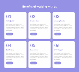
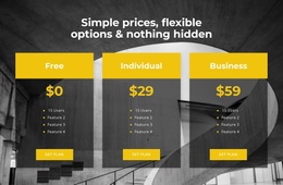
Better Flexibility for Improved UX
You don’t even have to hire a professional web designer to build your portal. Everything is easy and straightforward. And these features are highly customizable: you can experiment with UI elements and structure with ease. Speaking of the latter, this format is also really scalable. You can easily add new sections or expand content without breaking the overall functionality.
Additional benefits of this approach include:
- Cleaner visuals for readable content.
- Better content hierarchy for frontend organization.
- Adaptive UI systems for branding consistency.
- A structure that easily scales well.
- Customizable multifunctional content blocks.
Build a Website That Offers Flexibility
Adaptive visual designs are expected on contemporary websites. For this reason, a flexible layout and scalable frontend hierarchy are absolutely necessary to enhance accessibility and engagement. And that’s something that your visitors will surely appreciate.
This format allows organizations to enhance their presentation and UX. It can also improve conversion rates. Look through a variety of flex website templates, adjust adaptive website sections, and make your websites responsive and modern.