
Europe Website Designs
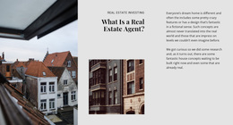
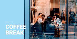
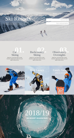
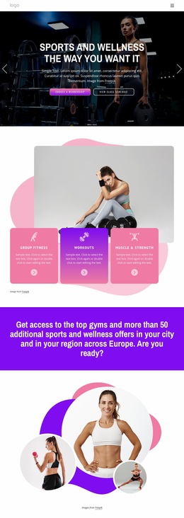
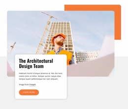
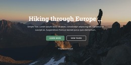
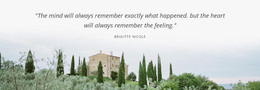
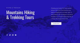
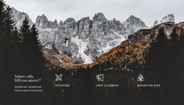
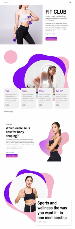
An architectural city guide should feel different from an Alpine trekking brand. Europe website design uses purposeful photography, tonal palettes, and considered typography to express both destinations clearly while keeping the visitor's attention on the experience.
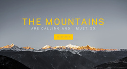
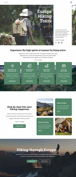


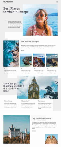
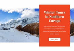







More Website & HTML Templates for Europe







More Website Designs from Travel & Hotels Category




Other Travel & Hotels Website Designs
Creative Europe Website Design Ideas
Europe website design covers far more than travel. A museum in Ghent, a regional bus operator, and a law firm in Vienna are all European projects. A cobblestone hero image would suit only the first, if at all. The visuals must carry the organization's identity, its audience's habits, and its place on the map.
Audience First, Scenery Second
Visitors to the bus operator's site want to check a timetable or buy a ticket, so a compact first screen with clear actions beats a panorama. Geography and industry pull apart too, and the Vienna law firm gains little from Baroque ornament. A calm interface with wide margins speaks to its precision. Long legal paragraphs also read best in a narrow column.
Three opening compositions come up again and again:
- A full-width photograph with a quiet area for the headline, suited to hotels and venues
- Text beside an illustration or a tight photo crop, so a studio can explain its work
- A compact header with search and task buttons, common for transport and municipal services
Multilingual Type on Every Screen
Each new language changes the layout. Services becomes Dienstleistungen in German, so menus and buttons need spare width. Many decorative fonts lack letters like the Czech ř or the Polish ł, and the missing glyph then shows up in a fallback font halfway through a headline. The language switcher and region selector work best as quiet controls, set apart from the main menu. The accent color can then stay reserved for one action, such as booking. Nicepage's Color Scheme and Font Presets keep regional pages consistent even when their photos differ.
On a phone, a few details decide whether the composition holds:
- Stacked columns keep the main message ahead of secondary content
- Display headings shrink without splitting long German compounds
- The main button stays visible without scrolling
Inside a Flemish Museum Network
Take a group of small museums in Flanders. The opening screen shows one current exhibition with a short headline and a single ticket button. The language switch in the top bar offers Nederlands, Français, and English. Every museum card uses the same image ratio, so the grid reads as one family. A serif heading font hints at the collections, while a plain sans serif keeps opening days easy to scan.
After five seconds on the homepage, a stranger should know what the organization does and where to click next. Good Europe website design keeps that clarity through to the smallest contact page.