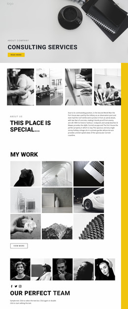
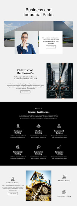
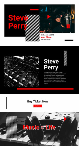
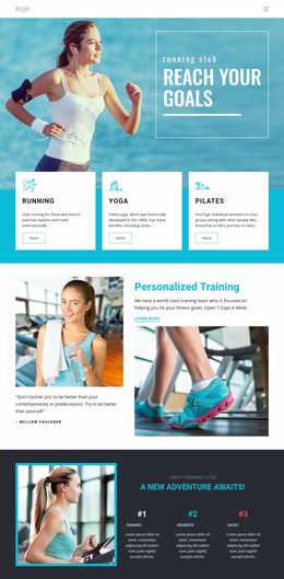
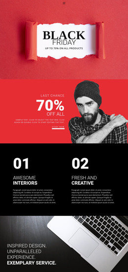
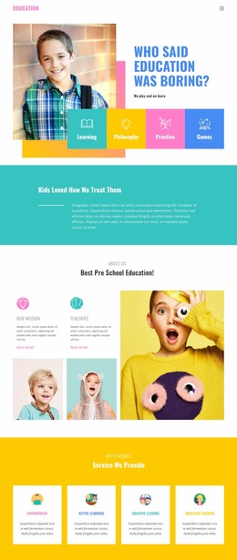
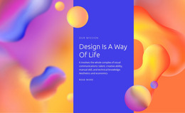
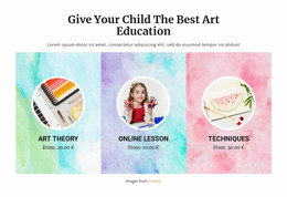
370 Fashion & Beauty Website Mockups

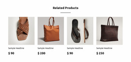
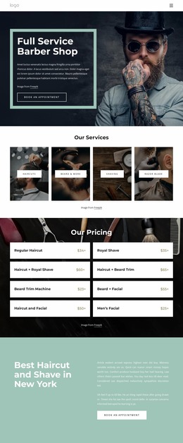
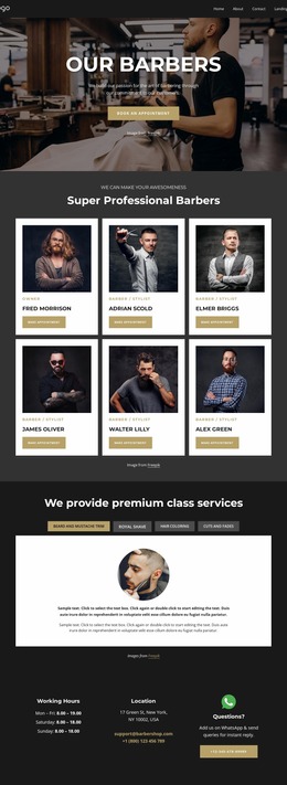
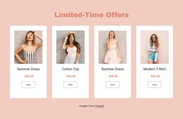
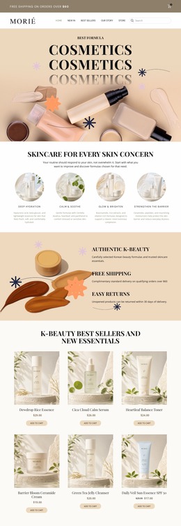
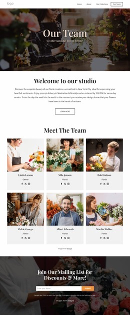
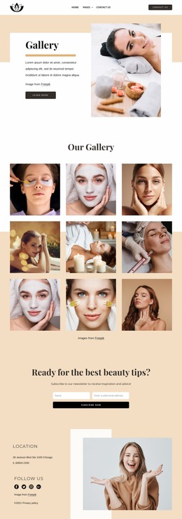

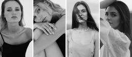
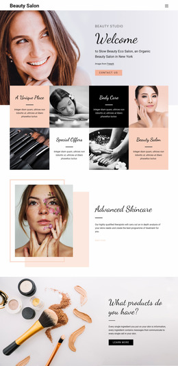
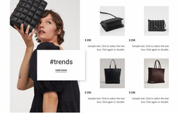
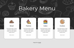


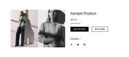
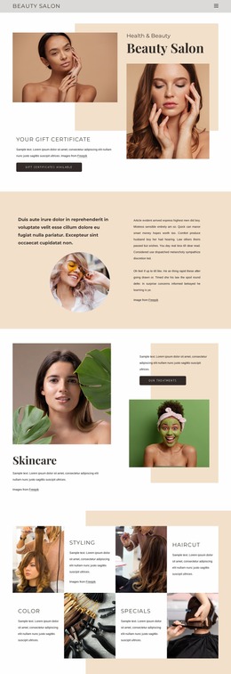
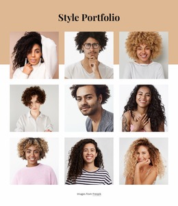
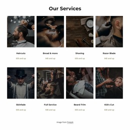
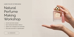
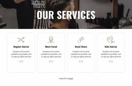
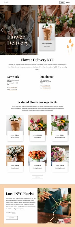
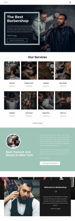
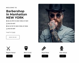
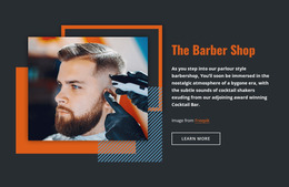
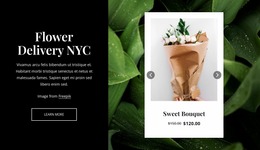
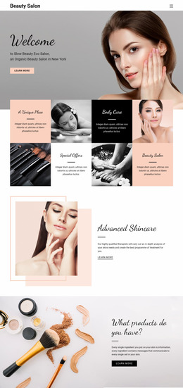
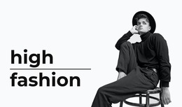
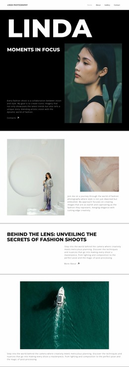
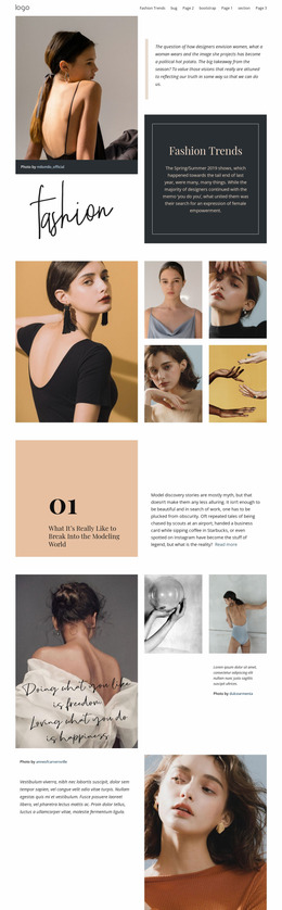
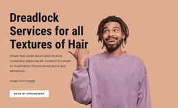
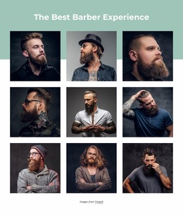
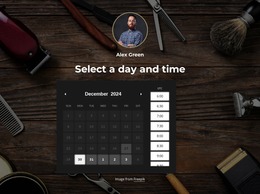
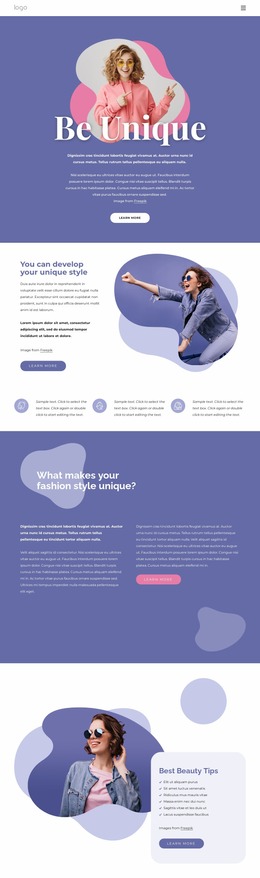
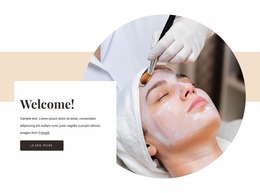
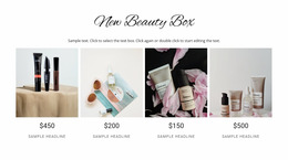
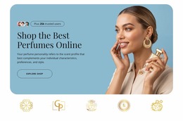
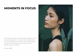
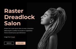
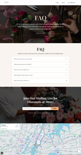
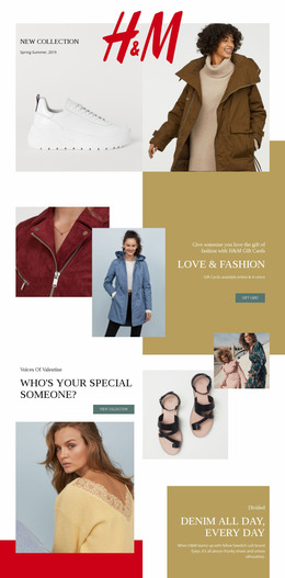
Creative Fashion & Beauty Website Mockup Designs
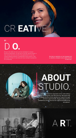
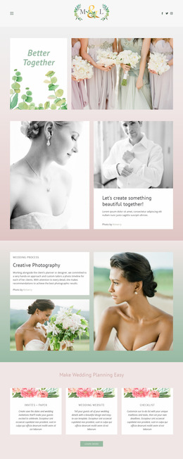
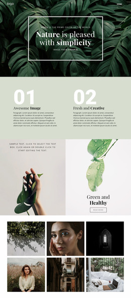
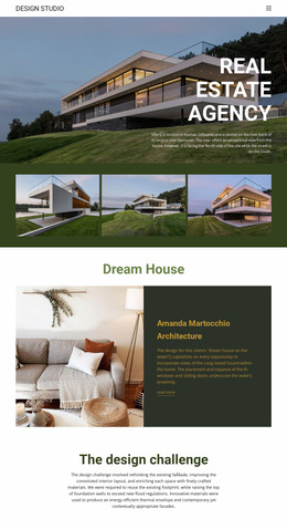
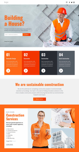
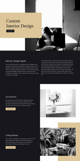
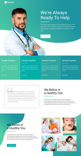
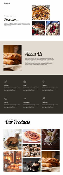
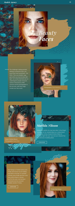
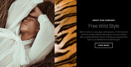
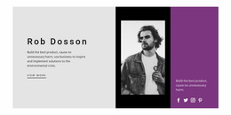
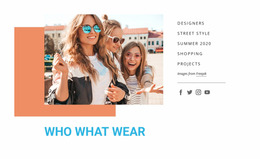
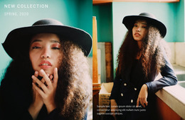
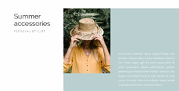
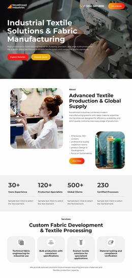
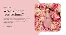
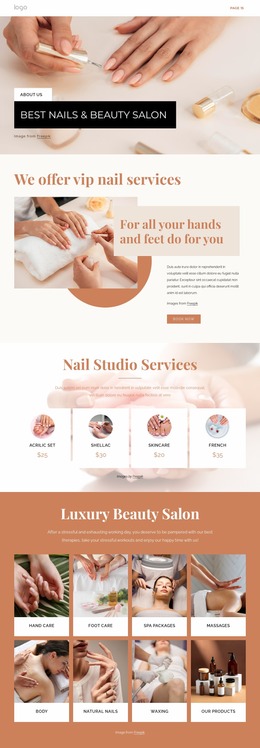
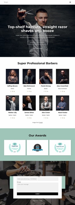
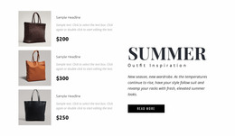
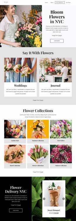
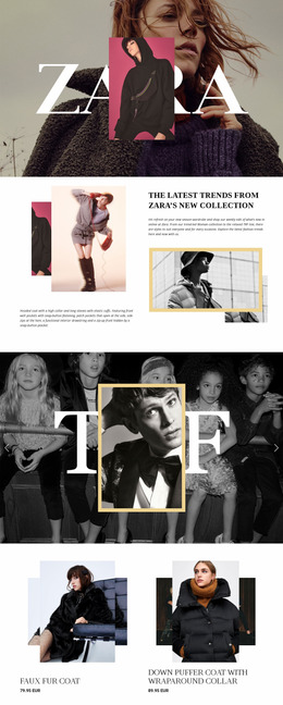
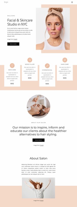
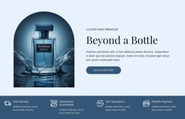
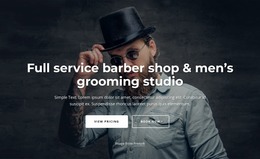
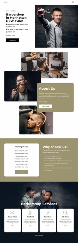
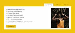
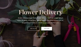
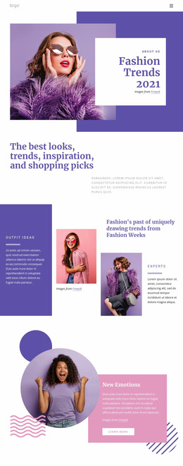
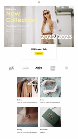
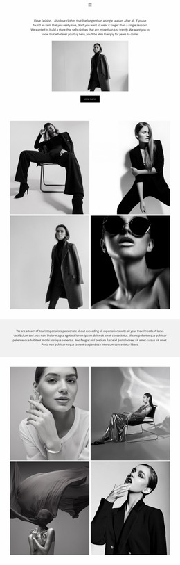
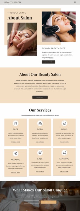
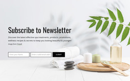
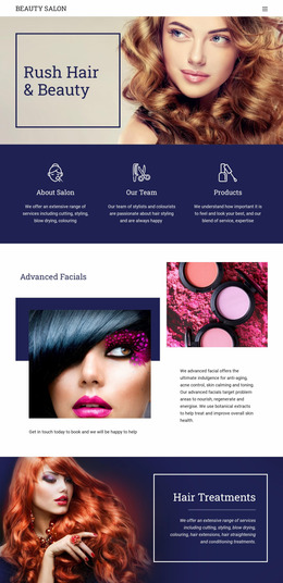
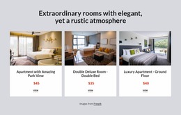
A Fashion & Beauty Website Mockup shows how a website is expected to look before the final site is built. It gives boutiques, salons, spas, and cosmetics brands a visual reference for hierarchy, typography, imagery, spacing, and responsive direction, while still making important design decisions easy to change.
What Does a Fashion & Beauty Website Mockup Represent?
A website mockup is a visual representation of a proposed interface. It normally sits between an early structural wireframe and the finished working website.
A wireframe focuses mainly on structure: where the hero, navigation, product areas, services, testimonials, forms, and other content blocks should appear. Visual styling is intentionally limited.
A mockup adds the visual direction. It shows typography, color relationships, photography, image scale, spacing, card treatment, buttons, and the overall composition. The goal is to evaluate what the website will look like before development or final implementation begins.
A finished website goes further by adding working navigation, responsive behavior, forms, interactions, real content, and the technical setup required for publication.
Keeping these stages separate can prevent teams from treating every early design decision as final.
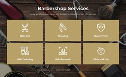
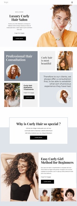
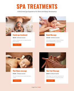
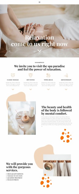
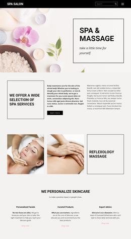
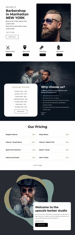
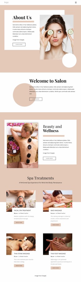
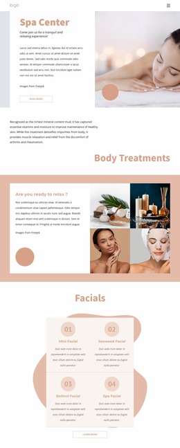
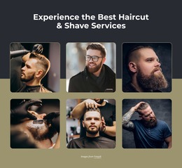
For early content planning, a jewelry website concept can help frame product-focused screens, while hair salon layouts and spa website ideas offer references for service hierarchy. These examples are useful as visual inputs, but the mockup should still be judged by how clearly it communicates the proposed interface before production.
Compare Desktop and Mobile Concepts Before Implementation
A fashion or beauty mockup should not exist solely as a single large desktop composition. The same visual direction often needs a second interpretation for smaller screens.
Desktop mockups can show wide campaign photography, multi-column collections, and larger editorial spacing. Mobile mockups reveal different problems: oversized typography, cropped images, long service cards, or calls to action that move too far down the page.
Testing both views early makes it easier to decide which elements must remain visually dominant and which can become more compact.
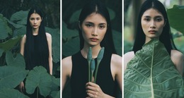
Image scale is especially important for fashion and beauty projects. A photograph that looks balanced in a wide desktop hero may become ineffective when cropped vertically for mobile. Comparing those states before implementation helps teams choose different crops, reposition text, or adjust the relative size of image and copy.
Use Mockups for Client Approval and Design Comparison
Mockups are useful when several visual directions are still possible.
For example, a client chooses between two homepage concepts before development begins. The first uses a full-width fashion photograph with minimal typography. The second uses a smaller hero image followed immediately by featured collections. Both can contain the same content, but the visual emphasis is different.
Instead of discussing those alternatives only in abstract terms, the team can present both mockups, compare hierarchy and image scale, and approve one direction before spending time on final implementation.
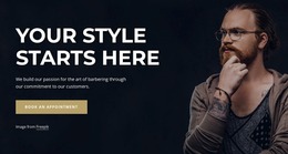
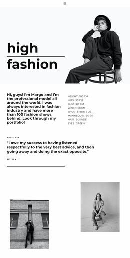
Alternative hero compositions are particularly useful to test because the opening screen often establishes the strongest impression of a fashion or beauty brand. Teams can compare centered and asymmetrical typography, different photography crops, or image-first and text-first compositions before committing to one layout.
This makes the mockup a communication tool as much as a design artifact.
Supporting Nicepage Controls for Fashion & Beauty Mockups
Nicepage can support the visual preparation of a mockup without making product features the focus of the process.
- Theme Colors help keep proposed color relationships consistent while different compositions are compared.
- Font Scheme provides shared typography choices so alternative layouts can be evaluated without changing the whole type system each time.
- Image Gallery Element can support concepts that need several collection, treatment, or portfolio images inside one visual area.
- Edit Mobile Views allows the approved direction to be examined across desktop, tablet, and phone layouts. The Responsive Modes guide explains the available responsive views.
These controls are useful after the main questions have been defined: what the concept should communicate, which composition is stronger, and how the approved direction should adapt across screen sizes.
Present the Design Concept Before Building the Final Site
A strong mockup should make the proposed visual direction easy to discuss.
Show the intended hero treatment, image scale, typography, spacing, content hierarchy, and important page sections. Prepare desktop and mobile interpretations where those decisions change significantly. If several directions remain possible, present clear alternatives rather than mixing them into one compromise layout.
Client approval at this stage gives both designers and developers a stronger reference for the final website.
Flexible Fashion & Beauty Mockup Questions
Can I adjust a fashion or beauty mockup for different screen sizes?
Yes. Nicepage supports Responsive Modes for Large Screens, Desktops, Laptops, Tablets, and Horizontal or Vertical Phones. Reviewing these views at the mockup stage helps identify issues with image cropping, spacing, and hierarchy before final implementation.
Can I keep colors consistent across a beauty brand website mockup?
Yes. Theme Colors in Site Settings apply a global Color Scheme across the pages of a Nicepage Project, which helps different mockup screens follow the same proposed brand palette.
How can I prototype repeated salon services or beauty product cards?
Use the Grid Repeater Element. Design one item structure, then reuse the same styling and positioning while changing the text and images for each service, specialist, product, or collection.
Shape and Approve the Visual Concept
Define the structure first, then turn it into a visual proposal with real typography, photography, spacing, and hierarchy. Compare desktop and mobile states, test important image crops, and present alternative homepage directions when the choice is not yet clear.
Once the client or internal team approves the mockup, the selected concept can become the visual reference for the working fashion or beauty website.