Tabs Website Mockups
-
-

-
-
-
-
-
-
-
-
-
-
-
-
-
-
-
-
-
-
-
Customize Any TemplateDownload
-
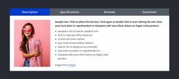
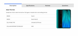
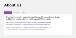
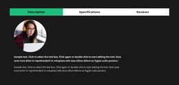
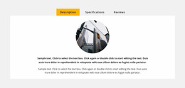

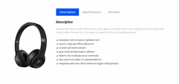
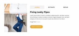
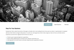
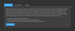
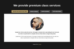
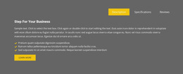
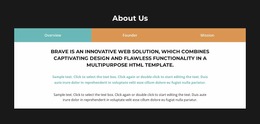
Responsive Tabs Website Mockup Blocks for Cross-Screen Preview
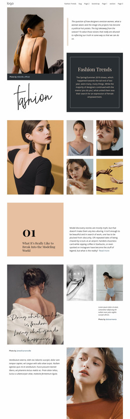
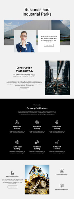
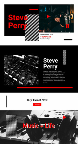
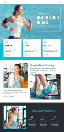
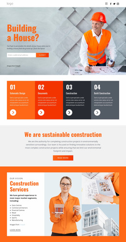
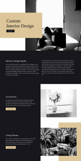
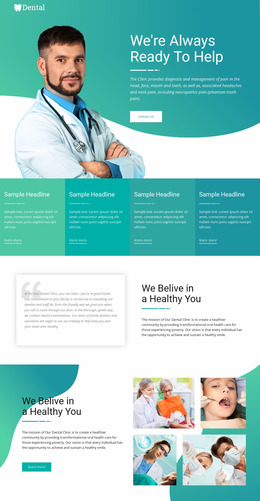
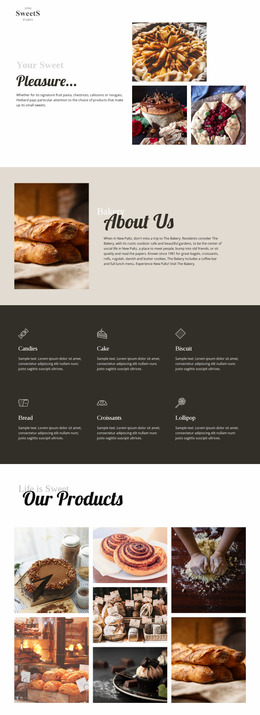
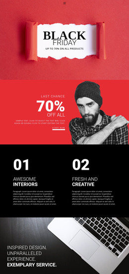
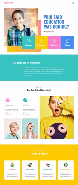
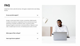
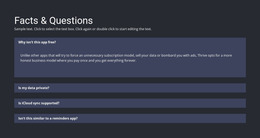
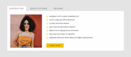
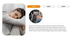
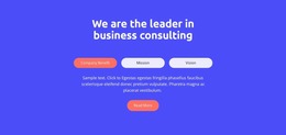
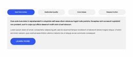
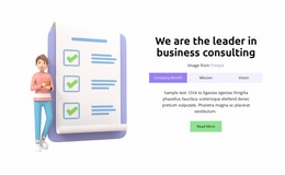
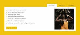
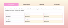
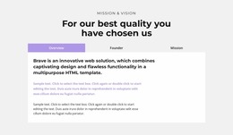
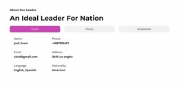
A Tabs Website Mockup is most useful before the section is treated as finished. It gives you a visual preview of how tab controls, the selected view, and panel content will appear together on realistic screen sizes. Instead of judging the block only inside the editor, you can review the section as part of a desktop, tablet, or phone presentation and catch layout problems early.
The mockup stage is especially helpful when a Tabs block contains long labels, mixed media, uneven panel lengths, or a strong active-state treatment. Those details can look balanced in isolation but feel crowded once the section is shown in a real page context.
What Should a Tabs Mockup Preview?
A useful mockup should show more than the basic switching model. Review the visual result as if the section were already placed on the page.
Check:
- control width and label length at realistic viewport sizes;
- active-state visibility without making the selected tab overpower the panel;
- panel height and content density when different tabs contain different amounts of information;
- image, text, and spacing balance inside the visible panel;
- the transition to nearby page sections above and below the Tabs block.
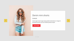
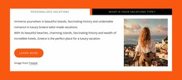
Each panel can include text, images, product information, or mixed elements. What matters in the mockup is whether the section still reads as one coordinated composition rather than a row of controls sitting above an unrelated content box.
Nicepage Tabs block designs provide ready-made starting points that can be adapted before this visual review.
Compare Desktop, Tablet, and Phone Presentation
Mockups become more useful when the same block is compared across several screen contexts. A horizontal control row that feels comfortable on a desktop can become dense on a phone, while a large media panel can dominate the page once the layout narrows.
Nicepage Responsive Modes lets you review the layout across Large Screens, Desktops, Laptops, Tablets, and phone views. During that review, focus on the parts most likely to change:
- whether labels still fit or need a different arrangement;
- whether spacing remains proportional;
- whether media and text keep the intended hierarchy;
- whether the active panel still looks connected to the selected tab.
A mockup does not need to imitate a full interactive prototype. Its job is pre-production visual review: show how the section presents itself before the final page composition is approved.
Use Device Context to Catch Visual Problems Earlier
A strong presentation can include the Tabs section inside a browser frame, tablet view, or mobile screen preview. Device context helps answer practical questions that are harder to notice in a flat editor view.
For example, a phone mockup can reveal that:
- labels are too long for the available width;
- the panel starts too far below the controls;
- a tall image pushes supporting text too far down;
- the selected state is too subtle at a smaller size.
On a larger screen, the opposite problem may appear: controls can look too small, a panel can feel empty, or excessive outer spacing can disconnect the block from the rest of the page.
Keep the Mockup Focused on the Tabs Section
Tabs and Accordion can both reduce visible content, but a mockup should not spend much space comparing the two. Use Tabs when parallel views need one stable content area; use Accordion when the page depends on vertical scan-and-reveal behavior.
For the mockup itself, concentrate on presentation quality, screen context, and readiness for final placement.
Tabs Website Mockup FAQ
Can I Review a Tabs Section at Different Screen Sizes in Nicepage?
Yes. Nicepage Responsive Modes provide Large Screen, Desktop, Laptop, Tablet, and phone views so that the same Tabs composition can be checked at different available widths before final placement.
What Should I Check First in a Tabs Mockup?
Start with label fit, active-state clarity, panel height, content density, and the spacing around the whole block. These details are most likely to shift the visual balance across screen sizes.
Can I Start With a Pre-Designed Tabs Block?
Yes. Nicepage includes designer-made Tabs block designs. Add a suitable design, adapt its labels and panel content, then review the result in the screen contexts that matter for the project.
Does a Tabs Mockup Need to Show Every Panel at Once?
No. A mockup can focus on the active state and use additional frames or screen examples to show other panels. The goal is to review the visual presentation without turning the section into a long stacked layout.
Review the Block Before Final Placement
Choose a Tabs design that matches the number and type of views you need, adapt the content, and preview the section in realistic screen contexts. Compare label fit, panel balance, active-state clarity, and the relationship to surrounding sections. A good mockup should make it easy to decide whether the block is ready for production or still needs layout changes.