110 Slider Website Mockups





























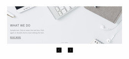


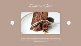
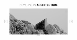
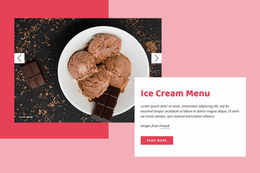



























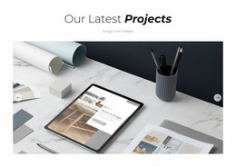
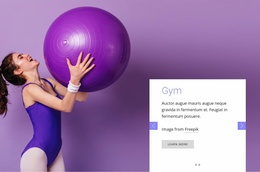
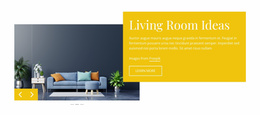
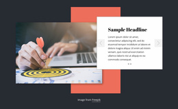
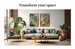
Professional Slider Website Mockup Designs for Cross-Screen Visual Review
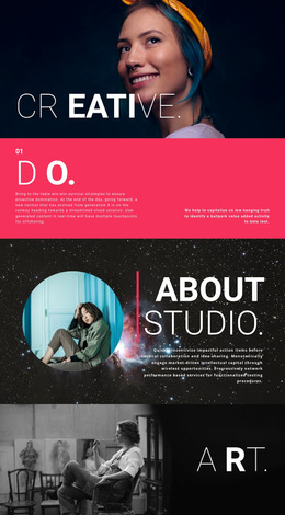
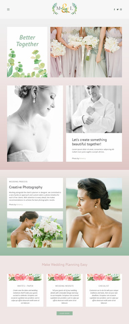
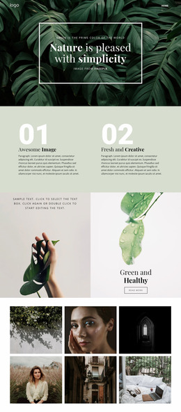
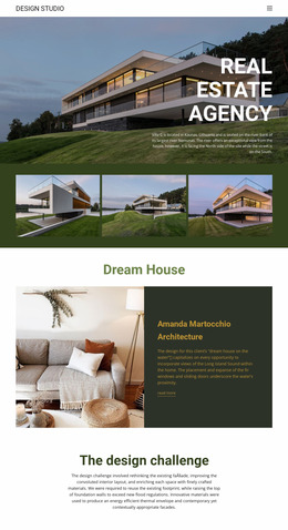
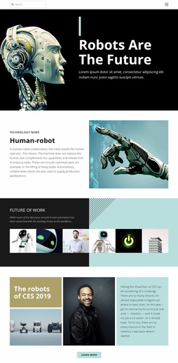
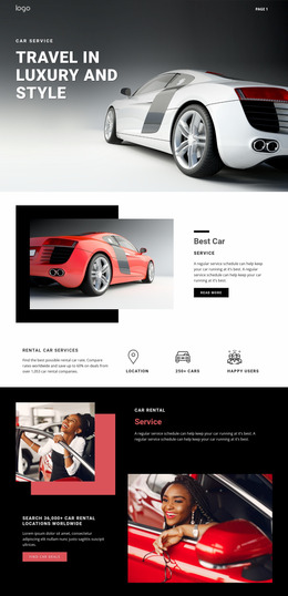
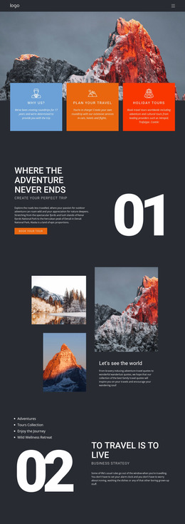
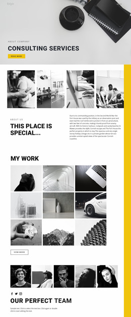
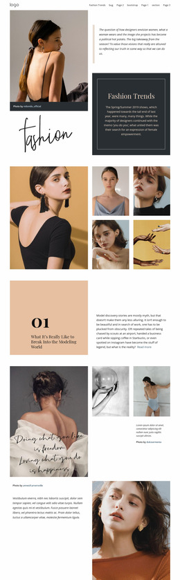
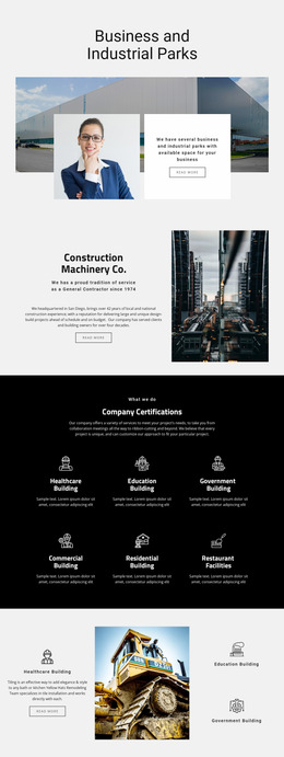
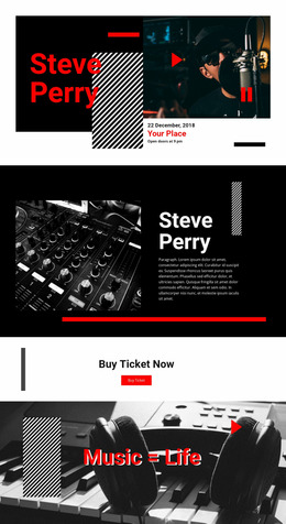
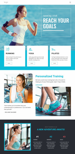
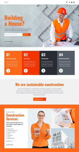
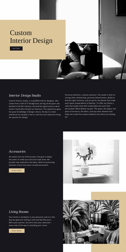
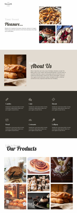
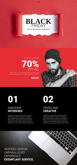
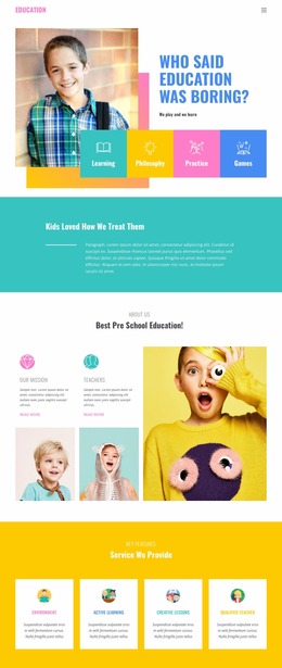
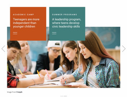
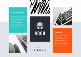
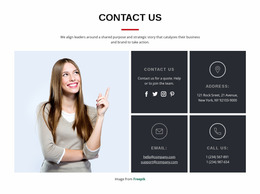
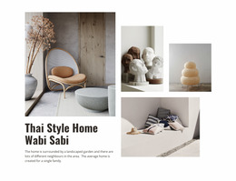
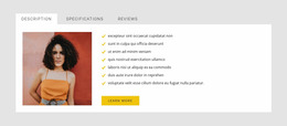
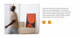
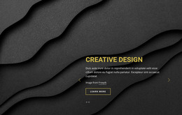
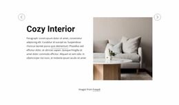
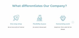
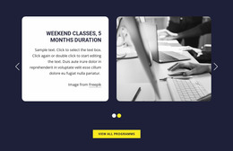
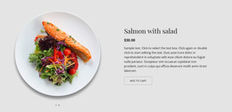
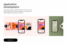
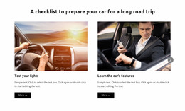
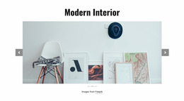
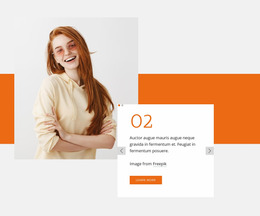
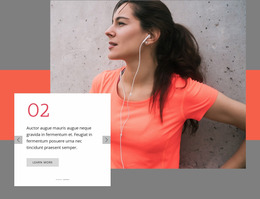
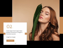
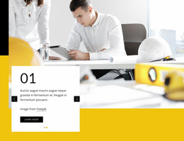
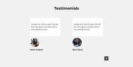
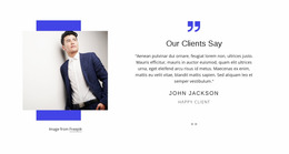
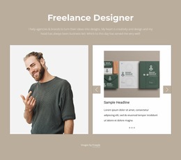
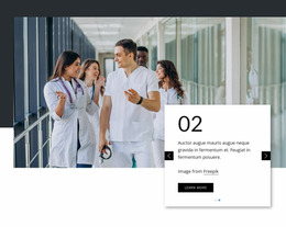
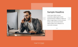
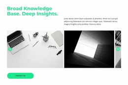
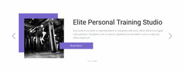
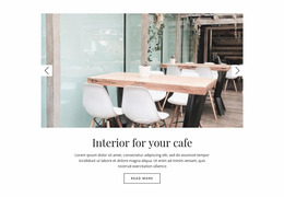
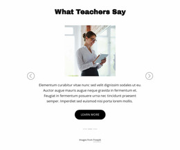
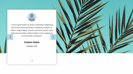
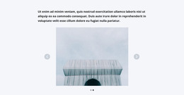
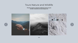
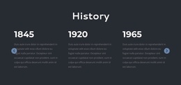
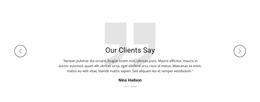
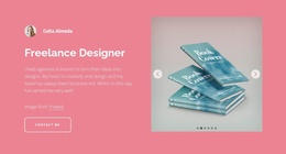
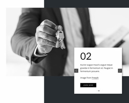
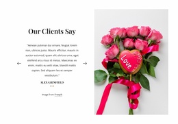
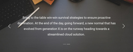
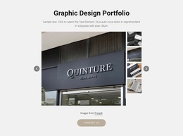
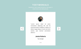
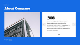
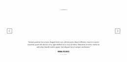
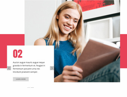
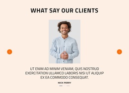
Slider Website Mockup designs offer visual starting points for comparing how a finished Slider section will look on a page. Browse examples with image-led, text-led, or mixed-content slides, then judge how the chosen composition presents several states on desktop, tablet, and mobile. The mockup is useful because it shows an existing arrangement you can evaluate before adapting it.
Unlike a static image collection, a slider introduces content one slide at a time. This means the first slide, subsequent content states, and navigation controls all require visual attention. A composition that looks clear on a wide screen may become crowded when the same section is viewed at a narrower width.
What Should You Evaluate in a Slider Mockup?
Compare available Slider mockups by the composition they already show, not by an isolated hero image. A useful design gives you a realistic starting arrangement for slide content and navigation.
The most important details include:
- Image scale and cropping — whether the main subject stays visible within the slide.
- Headline placement — how text interacts with images, backgrounds, and available space.
- Navigation visibility — whether arrows and slide indicators remain easy to recognize.
- Content density — how much information appears before a slide feels crowded.
- Visual consistency — whether different slides belong to the same section design.
Review several slides rather than judging the layout from the opening state alone. A short headline may fit comfortably over an image, while a longer message could require different spacing or a separate text area.
The strongest mockups preserve a consistent browsing experience without forcing every slide to contain identical content.
Compare Ready-Made Slider Mockups Across Screens
The Slider Element in Nicepage supports slide-based layouts with content elements, navigation controls, and transition settings. These features provide the structure needed to evaluate different visual arrangements.
For responsive review, Nicepage also provides Responsive Modes, allowing the section to be examined at different screen widths.
When selecting an example, compare its presentation across views:
- Desktop: Check the balance between large imagery, headlines, and navigation.
- Tablet: Review text wrapping, image proportions, and spacing around controls.
- Mobile: Examine whether the main message remains visible without competing with arrows, indicators, or oversized images.
A mobile composition does not need to reproduce every desktop proportion. Preserving the hierarchy of the slide is more important than keeping identical element positions.
For slides containing overlaid text, also check contrast and focal points. An image that provides a suitable background on desktop may place important visual details directly behind the headline on a phone.
Compare Slide States Before Finalizing the Layout
A slider may look convincing in its initial state while becoming inconsistent as visitors move through the sequence.
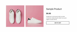
For example, a featured-content slider might begin with a large product image and short headline. The following slide could contain a longer description and a button. Both need to fit within the same slider structure without making the controls appear misplaced or unexpectedly changing the visual balance.
When comparing ready-made mockup designs, look at short and long headlines, light and dark imagery, and different slide combinations. A design with suitable proportions will need fewer visual changes after selection.
This evaluation is particularly useful for product highlights, testimonials, promotional messages, and editorial features where several slides share one content area.
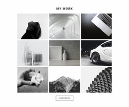
A regular Slider differs from a Full Width Slider because its presentation does not depend on occupying the entire available section width. It can fit within a smaller area on the page. A Gallery, meanwhile, emphasizes browsing a collection of visual items rather than moving through distinct slide compositions.
These differences help determine whether the selected block matches the intended presentation.
Slider Website Mockup FAQ
What is the main purpose of a Slider Website Mockup?
It helps evaluate the visual presentation of a slider section across different screen sizes. The review focuses on slide composition, image scale, text hierarchy, navigation placement, and consistency between content states.
Can I compare slider layouts for desktop and mobile in Nicepage?
Yes. Nicepage provides Responsive Modes for reviewing and adjusting layouts at different screen widths. This helps identify whether images, headlines, buttons, and navigation controls remain appropriately arranged in the slider section.
Should every slide use the same layout in a website mockup?
Not necessarily. Individual slides can contain different content arrangements, but they should maintain a recognizable visual relationship. Consistent navigation, typography, and spacing help the sequence feel connected even when images and messages change.
Refine Your Slider Mockup With Nicepage
Choose a prepared Slider mockup whose full sequence already resembles the intended page section. Its images and text can then be personalized in Nicepage, with the same design assessed across screen widths.
The goal is a balanced slider section that remains visually clear as both its content and available screen space change.