Video Website Mockups



Advanced Video Website Mockups for Presentation and Design Validation
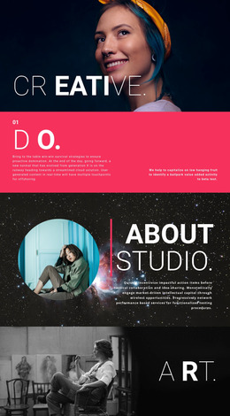
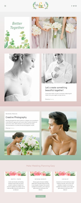
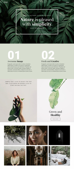
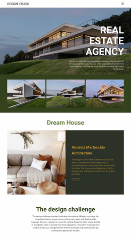
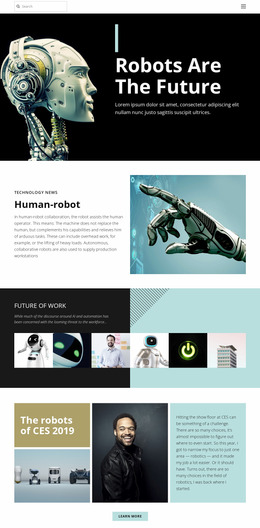
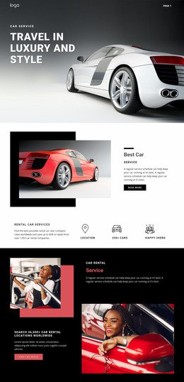
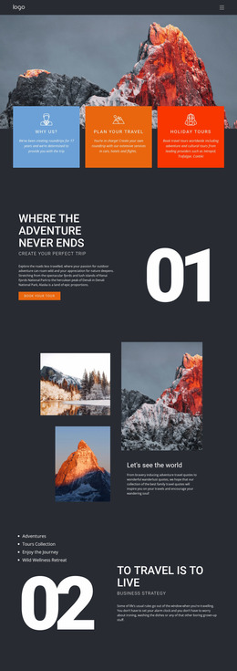
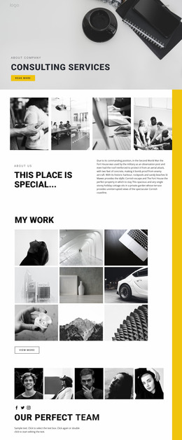
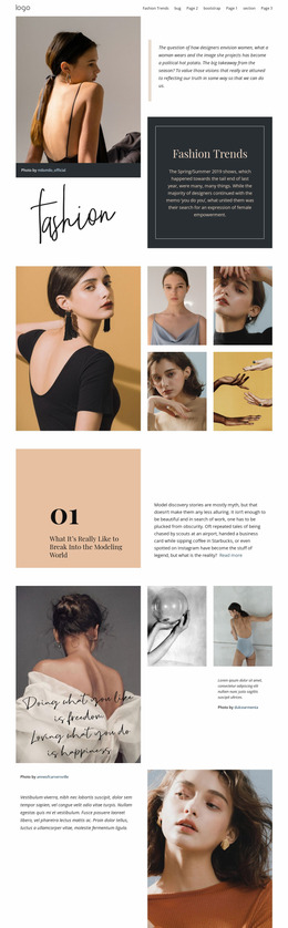
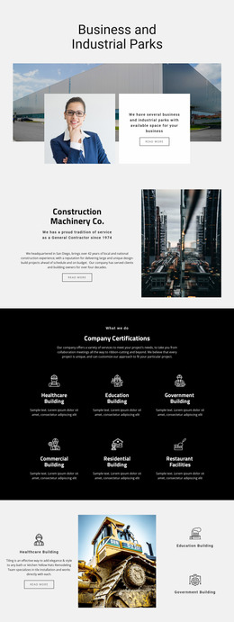
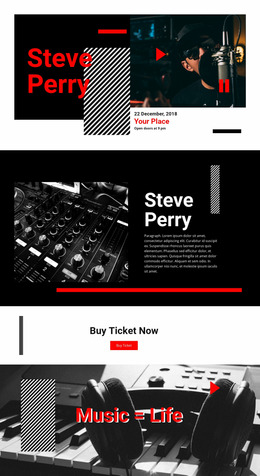
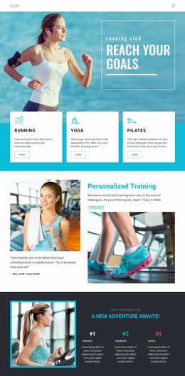
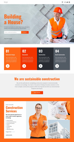
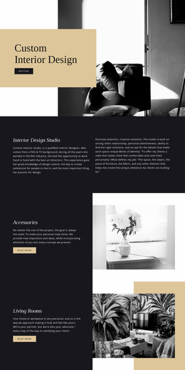
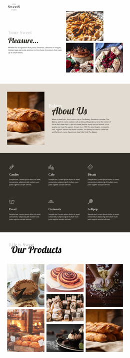
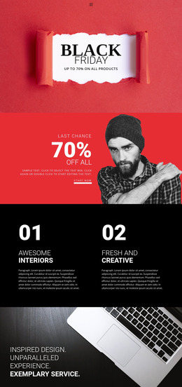
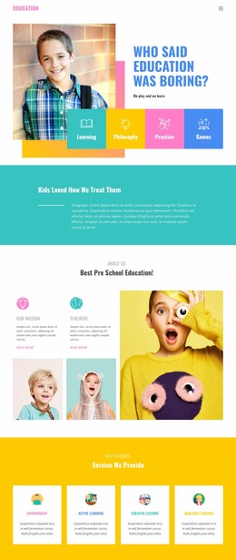
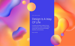
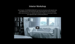
A video website mockup shows how a video-led website is expected to look before final implementation. It can place a home page, portfolio, player view, or campaign screen inside a browser, desktop, tablet, or phone presentation so a client or team can evaluate the visual direction in context. The mockup is therefore a communication and validation artifact, not only a responsive QA view of one Video block.
Use Mockups to Present Video Website Concepts
A useful presentation can show more than one state. A desktop browser mockup may communicate the overall home-page composition, while a phone screen can show how a project detail or featured clip will feel in a narrower format. For a production or portfolio site, a sequence of mockups can also demonstrate the path from a project grid to a video detail page.
Use mockups to review:
- client-facing visual direction before implementation;
- browser or device presentation for key screens;
- poster, player, and surrounding-content balance;
- navigation and page relationships in a video-oriented concept;
- design consistency between home, portfolio, and detail views.
This makes the mockup useful for approval and design validation without pretending that the static presentation is a working video prototype.
Check Cross-Screen Variants After the Main Mockup Direction
Once the main presentation direction is clear, compare how the same key screens adapt across widths. A large desktop composition may use a wide showreel and adjacent project information, while a phone version may stack the poster, title, and supporting details. This responsive check supports the mockup; it is not the suffix's entire purpose.
Nicepage Responsive Modes provide views for Large Screens, Desktops, Laptops, Tablets, and horizontal or vertical phones. Use the Responsive Modes to compare the same section across those widths and evaluate how the media-to-text relationship changes.
Pay particular attention to:
- the visible scale of the video or poster;
- the amount of supporting copy near the media;
- spacing between the player and contextual text;
- whether the section still feels video-first;
- alternative arrangements when the available width becomes tighter.
The objective is visual review, not an automatic prototype or wireframe workflow.
Video Mockup or Gallery Presentation?
Video and Gallery are both media-oriented blocks, but their review criteria differ.
A Video section should be evaluated around one primary viewing experience. Player prominence, poster scale, playback context, and supporting information define the hierarchy.
A Gallery is designed for browsing a collection. Its evaluation centers more on relationships between several images or media items, repeated spacing, and collection density.
This distinction becomes especially useful during mockup review. If several visual items deserve comparable attention, the section may be moving toward Gallery behavior. If one clip remains the content visitors are expected to watch, Video is the clearer functional model.
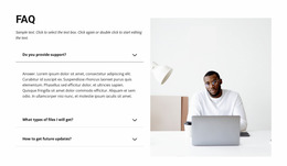
Video Website Mockup Questions
Can I review a Video section on different screen sizes in Nicepage?
Yes. Responsive Modes provide views for large screens, Desktops, Laptops, Tablets, and horizontal or vertical phones so that you can review the same Video section at different widths.
What should I compare between responsive Video mockups?
Compare player or poster scale, supporting-text density, spacing, and the overall media hierarchy. The video should continue to read as the section's primary content rather than becoming visually secondary.
Is every section with moving imagery a Video website mockup?
No. A dedicated Video section is defined by intentional viewing. Decorative background motion may support another layout without making playback the primary content task.
Is a Video website mockup the same as a working prototype?
No. A mockup primarily communicates visual direction and screen presentation. It can show player states, device views, and page relationships, but a static mockup alone doesn't reproduce real playback or navigation behavior.
What screens are most useful in a client presentation?
Show the screens that explain the concept with the least repetition: usually a home or featured-video view, a collection or portfolio view, and an individual video or project detail screen. Add a mobile presentation when cross-screen behavior is important for approval.
Present and Validate the Video Website Concept
Prepare a focused set of website mockups that explain the concept across its key screens rather than reviewing one isolated Video block. Present the home or featured-video view, a portfolio or library screen, and an individual video or project page in the browser or device contexts most relevant to the project. Use desktop and mobile variants where they help the client or team validate navigation, hierarchy, media presentation, and overall visual direction before implementation.