Tiles Website Mockups

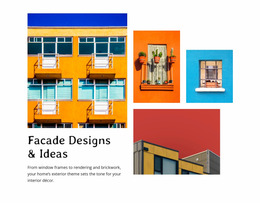
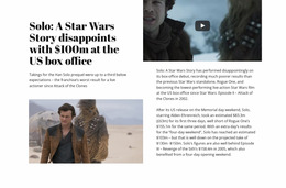
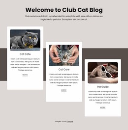
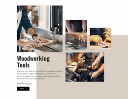

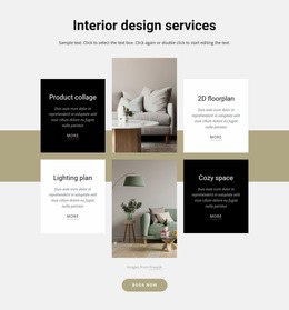




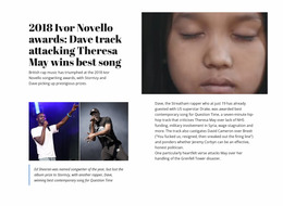
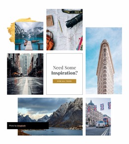
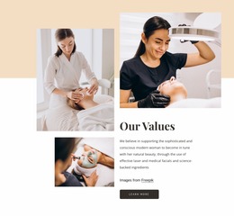
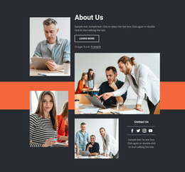

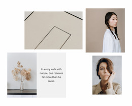
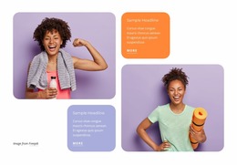
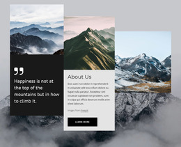

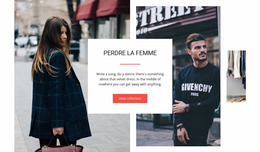
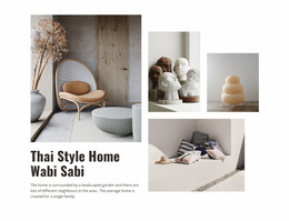
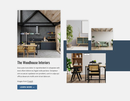
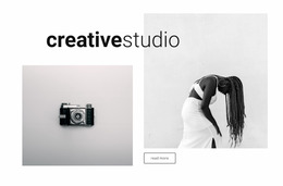



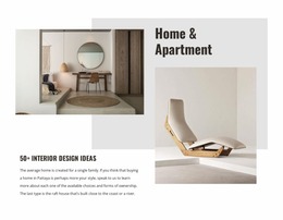
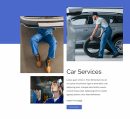


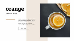
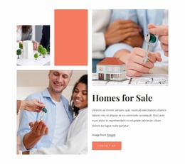
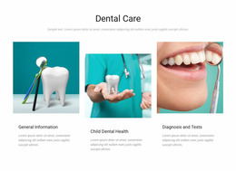



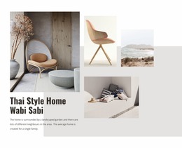
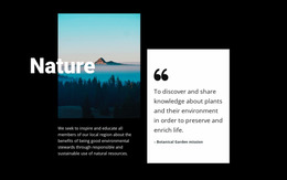
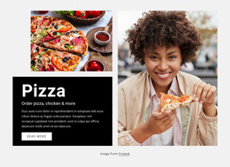


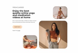

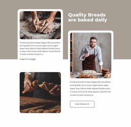

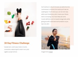

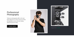

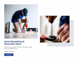

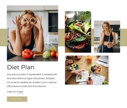

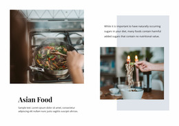
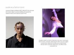


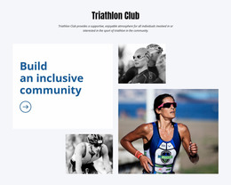
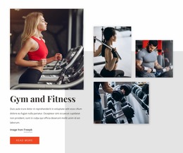
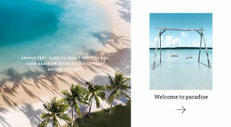
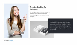





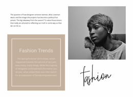
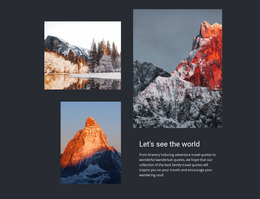
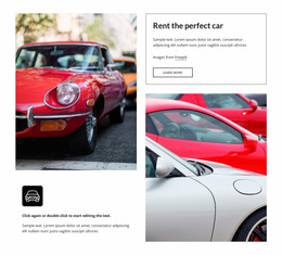
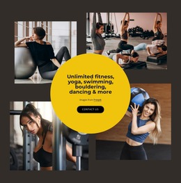

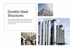
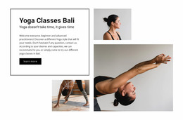
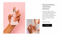
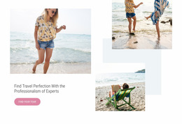



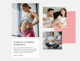
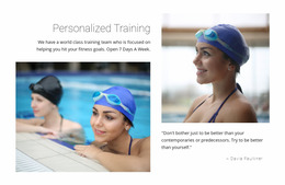
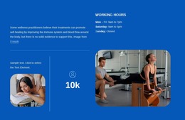
Responsive Tiles Website Mockups for Cross-Screen Visual Review
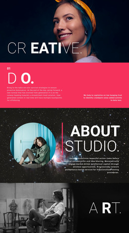
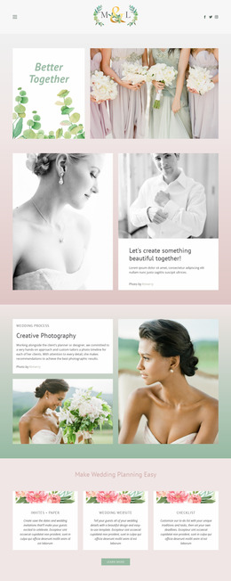
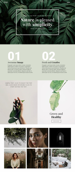
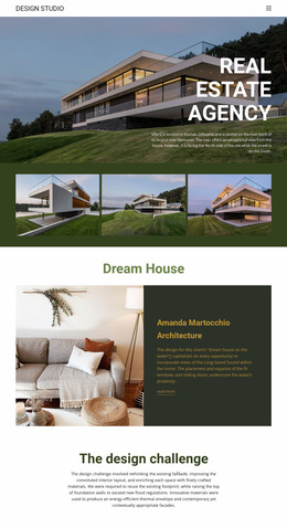
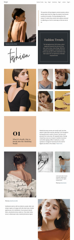
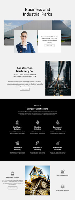
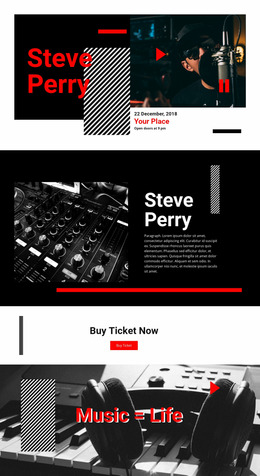
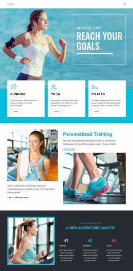
A Tiles website mockup is useful before integration when you need to preview a composition, present a direction, or compare alternatives before the section is finalized.
Review Hierarchy, Density, and Panel Proportions
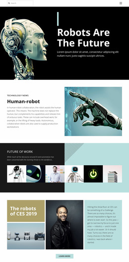
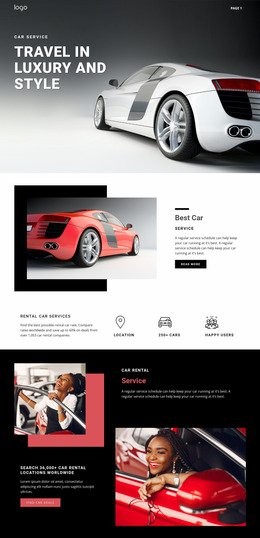
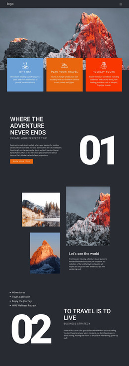
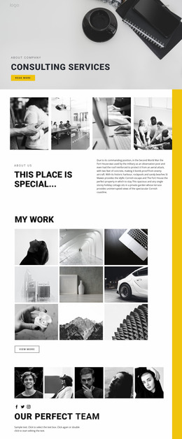
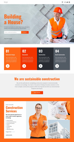
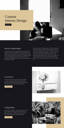
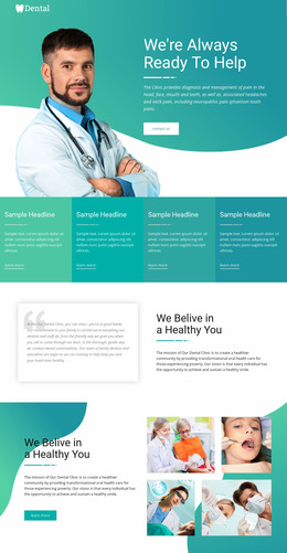
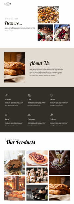
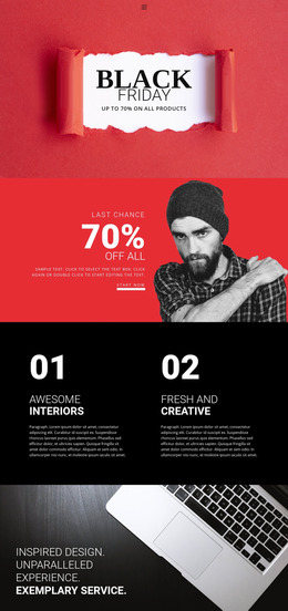
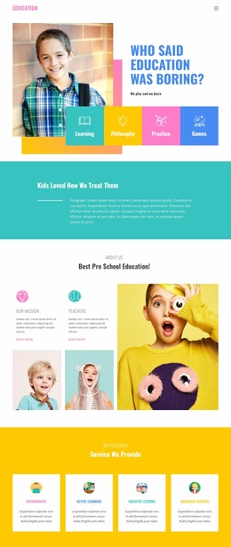
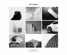
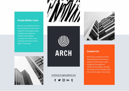
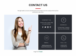
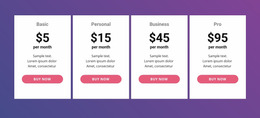
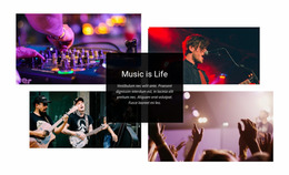
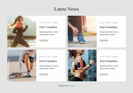
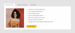
Use the mockup to judge the decisions that are hardest to evaluate from content alone: which panel receives emphasis, whether image-to-text balance feels appropriate, how dense the section appears, and whether mixed panel proportions still create a clear composition.
Useful review points include:
- visual hierarchy between primary and supporting tiles;
- panel proportions and the amount of space they create;
- image-to-text balance inside compact panels;
- content density when several choices sit close together;
- responsive behavior when the same composition is shown at narrower widths.
These checks make the mockup useful as a practical review artifact rather than a repeated explanation of what Tiles are.
Flexible Tile Review Across Screen Sizes
A composition that looks clear at desktop width may become crowded when several visually strong tiles compete for limited space. Website mockup review should therefore compare how tile size, text amount, visual emphasis, and spacing behave as the available width changes.
Nicepage Responsive Modes support Large Screens, Desktops, Laptops, Tablets, and horizontal or vertical phone views. Use the Responsive Modes to inspect the same tile section at different widths and refine the layout where its hierarchy becomes unclear.
Compare whether prominent tiles remain intentional, shorter labels stay readable, and image-backed panels preserve enough room for their identifying content. The goal is to see whether the composition remains convincing at different widths and to present that direction clearly before it is integrated into the page.
Compare Alternative Modular Tile Arrangements
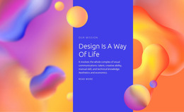
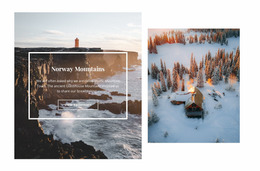
Mockups are also useful for testing alternative compositions before settling on one direction. A large feature tile may work beside smaller supporting choices on a wide screen, while a narrower view may need a simpler sequence with fewer competing focal areas.
The Grid Element can provide the spatial structure for arranging content in cells. Its Grid Element workflow can support a Tiles composition, but regular rows and columns do not define the category by themselves. Each panel must still work as a distinct visual choice.
When comparing mockup alternatives, vary one or two visible decisions at a time:
- panel proportions and which tile receives emphasis;
- image crops and text density;
- the order of choices;
- stacking behavior in narrower previews.
This makes differences between compositions easier to present and evaluate.
Present a Tiles Direction Before Integration
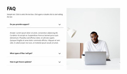
A mockup can also clarify the intended design for reviewers or collaborators. Show the same content in one or two credible arrangements rather than many minor variants, and make the differences visible through panel proportions, emphasis, ordering, or responsive treatment.
The goal is to make the proposed Tiles direction easy to evaluate before the layout becomes part of the finished page.
Tiles Website Mockup FAQ
Can a Tiles mockup be used to present a design direction?
Yes. A mockup can clearly show panel proportions, imagery, emphasis, and responsive treatment so the direction can be reviewed before integration.
Can I review Tile layouts at different screen sizes in Nicepage?
Yes. Nicepage Responsive Modes support large screens, desktops, Laptops, Tablets, and horizontal or vertical phone views so that you can review and adjust the section for different widths.
Is a Tiles website mockup automatically a working prototype?
No. The mockup angle is visual evaluation and responsive presentation. It helps assess hierarchy, density, and arrangement but should not be treated as automatic prototype functionality.
Can a Tiles mockup compare more than one composition?
Yes. You can prepare alternative arrangements with different panel proportions, imagery, emphasis, or order and compare which direction communicates the choices more clearly.
Review the Tile Choices Before Integration
Choose a Tiles block whose visual structure fits the number and importance of your options, adapt its imagery and labels in the Nicepage editor, then compare the section in Responsive Modes. Refine panel hierarchy, density, and arrangement until each tile remains a clear visual choice across the screen sizes relevant to the project.