Zara Website Mockup
Edit Template Offline
2. Create new page and search for id 21448
Edit Template Online
Create Awesome Websites


Free Nicepage Builder
Keywords
Large Images, Layered Portraits, and Dense Product Areas Need Visual Review
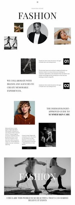
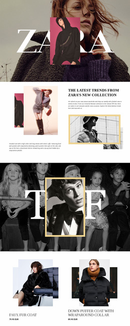
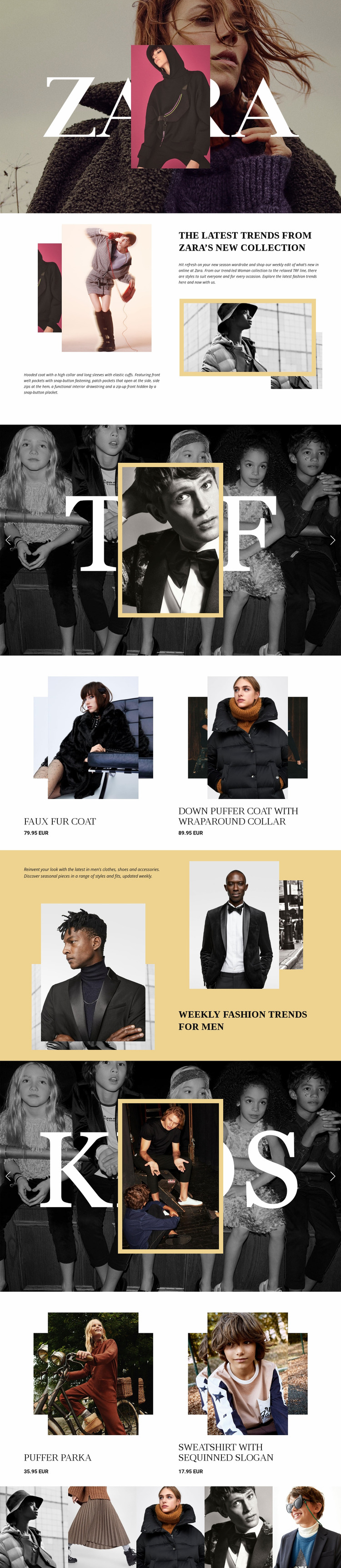
The most important mockup review points come from the design’s dependence on image scale. The opening hero spans the page width and places a centered portrait over a fashion photograph beneath the large ZARA wordmark. At narrower widths, the relationship between the wordmark, portrait, image crop, and surrounding space should be checked carefully so the focal layers remain understandable rather than competing for the same area.
The split editorial sections create a different set of review conditions. Women’s content uses stacked product imagery beside text and a framed photograph, while the men’s section places descriptive copy among layered menswear images. These arrangements need attention to text width, image cropping, column balance, and vertical spacing as the available screen width changes. The TRF and KIDS sliders add broad photographic surfaces, controls, and indicators that should remain visible without overwhelming the category labels.
The paired product blocks and final five-image strip also deserve separate inspection. Product names and displayed prices need enough room beside or beneath their imagery, while the closing gallery may become visually dense when five adjacent photographs are compressed. Nicepage’s verified Responsive Modes capability can be used as a review bridge for comparing these areas across screen sizes, but the central question remains visual: whether the image hierarchy, typography, spacing, controls, and product information retain their intended relationships.
Customize with Nicepage
Open this ready-made template in the Website Mockup Builder and customize it visually in the Nicepage editor. Replace demo content, edit page sections, and adapt the design to your project without rebuilding the template from scratch.
Preview and Refine This Website Mockup
Review the Design Across Devices
Use Responsive Modes to see how the website design appears on Large Screens, Desktops, Laptops, Tablets, and Phones. Switch between the available views to compare the same layout at different screen widths and review how typography, images, spacing, navigation, and other content adapt to each device.
Adapt the Mockup for Different Screens
Nicepage provides responsive web design tools for adjusting individual device views when the initial layout needs refinement. You can customize Mobile Views separately, change element sizes and positions, adapt Grids, Lists, and Galleries, and hide selected Elements or Blocks on particular screen sizes. This makes it possible to develop a responsive website mockup instead of evaluating the design at only one fixed desktop size.
Preview the Website Without Editing Controls
Use Live Page / Preview to review the design with the editing interface removed from view. Instant Preview can hide the Page Navigator, Property Panel, selections, and frames, making it easier to evaluate the overall presentation, content hierarchy, and responsive layout as a visitor would see them.
This workflow makes the template useful as a responsive website mockup for visualizing, comparing, and refining how the same website design will appear across different screen sizes.