Counter Website Mockups















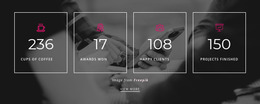


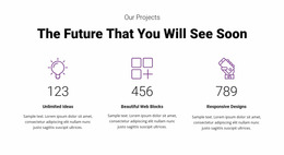

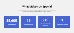


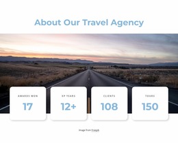



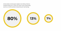

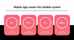


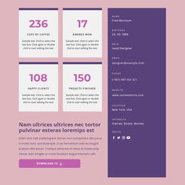
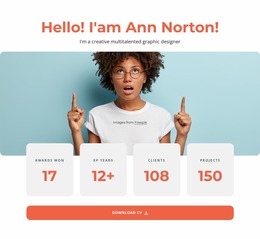

















Clean Counter Website Mockup Sections for Metric Hierarchy and Screen Previews
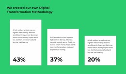
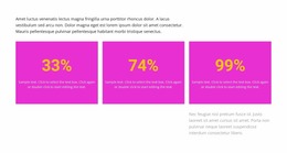
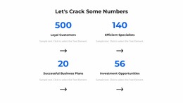
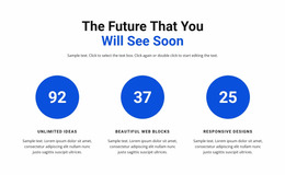
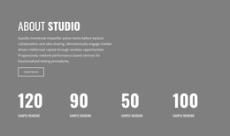
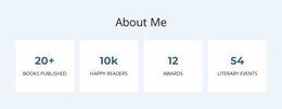
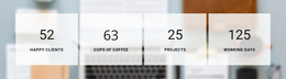
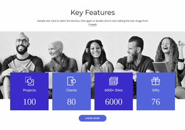
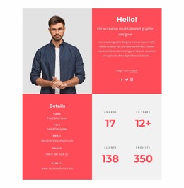
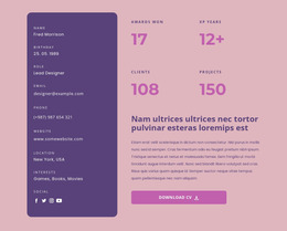
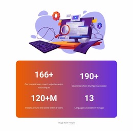
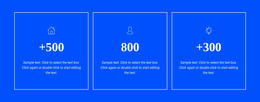
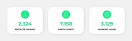
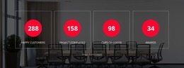
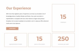
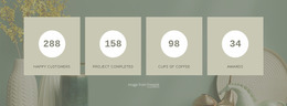
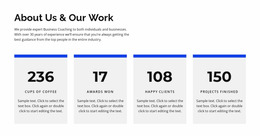
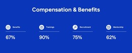
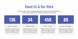
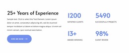
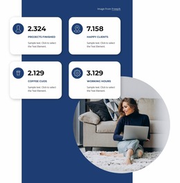
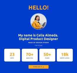
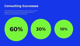
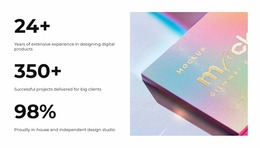
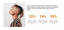
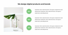
A Counter Website Mockup is a review-stage layout, used to test numerical highlights before final design decisions and implementation. Prominent numbers, concise labels, and consistent spacing make achievements or totals easy to recognize. Reviewing these elements across different screen sizes reveals whether the statistics remain clear or need adjustments to their visual hierarchy.
How Can You Evaluate a Counter Section Mockup?
A Counter section mockup should make the meaning of each number immediately apparent. The primary review task is checking whether visitors can identify the figures, understand their labels, and distinguish individual metrics without additional explanation.
Start with a desktop mockup and a phone-width version of the same Counter section. Check both before committing to a final design. Begin with the relationship between numerical values and their descriptions. A large figure may attract attention, but its label must remain close enough to explain what the number measures.
Use a repeatable mockup checklist:
- Value length: Replace placeholders with two-, four-, and six-digit totals.
- Label wrapping: Note unexpected line breaks and clipped units.
- Desktop/mobile comparison: Check the same content in wide and narrow layouts.
- Readability result: Record whether each number still matches its label.
Use the same example content in both versions so a spacing problem cannot be mistaken for a difference in data.
When information requires detailed comparisons rather than isolated highlights, a separate data presentation section may be more appropriate.
Reviewing Metric Grouping with Responsive Counter Layouts
A mockup should reveal failure cases before implementation. Use the same figures and labels in each candidate arrangement so the comparison is fair.
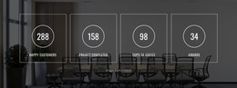
A horizontal counter band can communicate several related metrics efficiently on wider screens. On smaller screens, the same arrangement should be reviewed for crowded figures, narrow labels, and inconsistent spacing.
The native Counter Element can later provide animation, but the mockup should first establish whether the figures fit.
Its visual settings include alignment, width, margins, and typography, while animation duration and delay can be adjusted separately.
At the mockup stage, prioritize static legibility and content fit; preview animation separately when testing the working block. Movement should draw attention to the figures without making the labels difficult to follow.
Checking Numerical Hierarchy Across Screen Sizes
A counter layout that looks balanced on a desktop may need different spacing or text sizes on a phone. Responsive evaluation helps identify these issues before the section becomes part of the final page composition.
Nicepage supports Responsive Modes, allowing layouts and element properties to be reviewed and adjusted for large screens, desktops, laptops, tablets, and phones.
For a Counter section, this review should focus on three practical questions.
First, are the numerical values still prominent at smaller widths? Second, can visitors read every label without confusing it with another metric? Third, does the arrangement leave enough space between individual counters?
Compare alternative groupings when necessary. Fewer counters per row may improve readability, while a more compact arrangement may suit a section containing only two related figures.
Record pass/fail findings at each width: for example, four counters fit on desktop, but a long label wraps into the next metric on a phone. Use that finding to revise the proposed mobile arrangement before finalizing the design.
From Counter Mockup to Final Page Design
A mockup helps you compare options, not just admire a finished composition. Website Design covers the final visual direction; the mockup stage checks whether that direction survives real numbers, labels, and screen widths.
A Table is designed for detailed relationships between rows and columns. A Features section gives priority to descriptive benefits, while numbers may only support those explanations.
Counters can also summarize milestones without explaining their chronological order. When the sequence of events matters more than the total, a timeline section provides a more suitable content structure.
Expert Tip: Record the exact value or label that breaks the proposed layout. A specific failure is easier to fix than a general impression that mobile looks crowded.
Counter Website Mockup FAQ
Which placeholder values can hide a weak Counter mockup?
Uniform two-digit figures. Replace them with realistic short and long values to reveal wrapping and alignment problems.
What should I compare between desktop and phone mockups?
Check grouping, clipped numbers, label wrapping, and whether each label still reads as part of its corresponding value.
Does a static mockup prove that counting animation works?
No. A mockup can validate visual fit; the working Counter should be checked separately in Preview.
How should I record problems found during review?
Identify the screen width, the affected metric, and the observed issue so the design can be adjusted before approval.
Is a Counter mockup a finished website layout?
No. It is a review-stage representation used to evaluate the numerical section before final implementation.
Review Your Counter Design Before Finalizing the Section
Evaluate the Counter mockup with realistic numbers and labels in both desktop and mobile versions. Document wrapping, clipping, and grouping problems, then select the version that passes those checks before the final website design is approved.