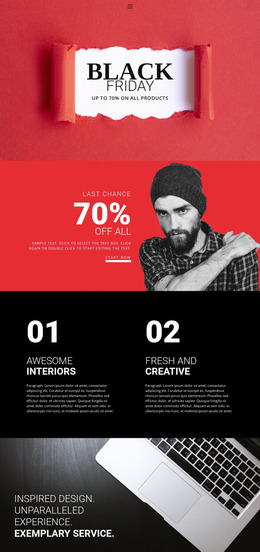
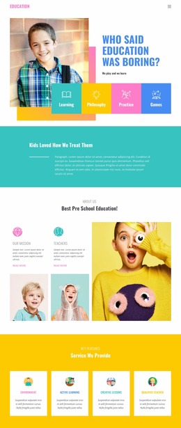
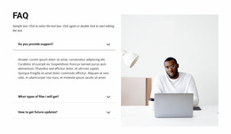
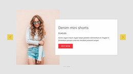
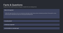
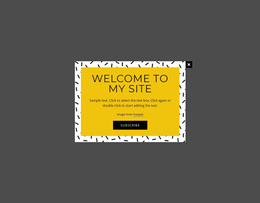
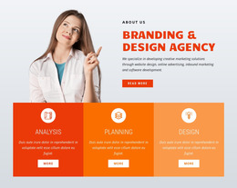
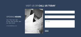
370 Contacts Website Mockups
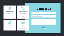
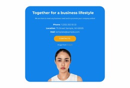
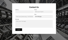
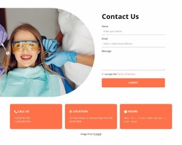
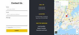
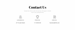
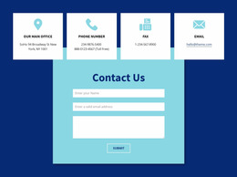
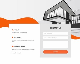
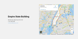

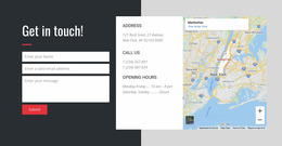
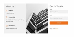
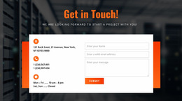
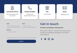
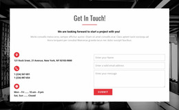
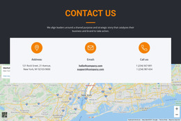
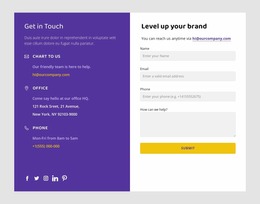
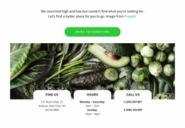
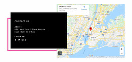
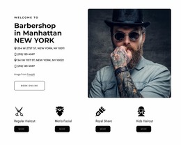

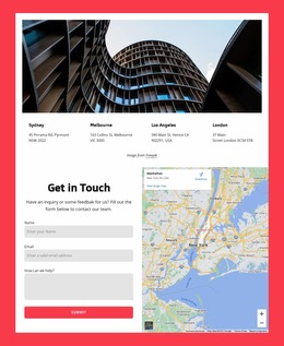
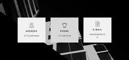
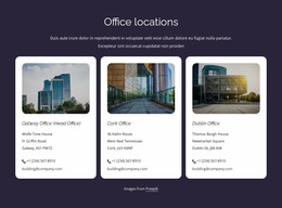
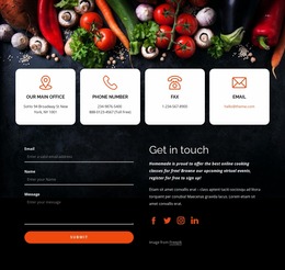
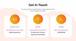
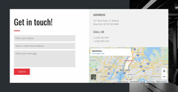
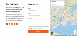
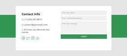
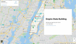
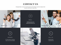
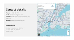

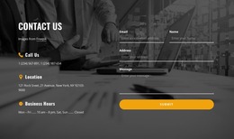

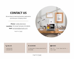

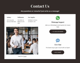
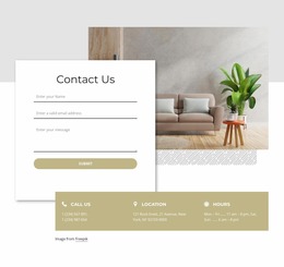
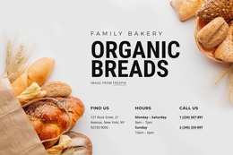
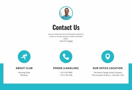
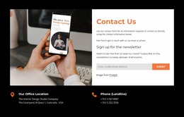
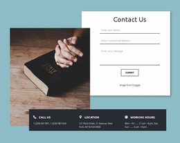
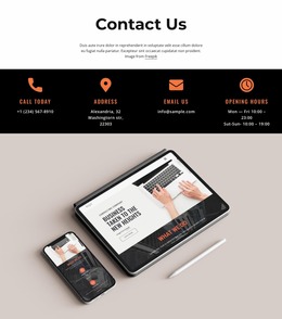
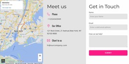
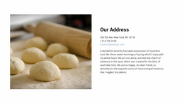
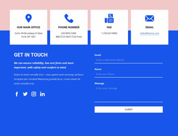

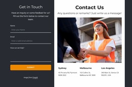
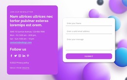
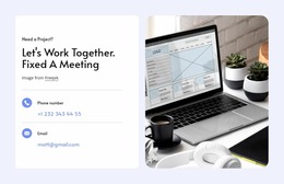

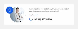
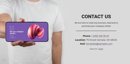
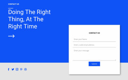

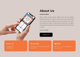


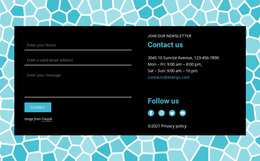
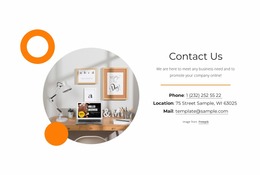

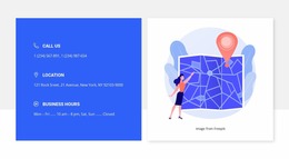
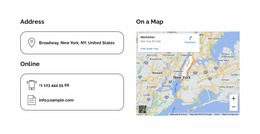
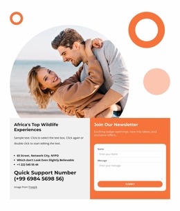
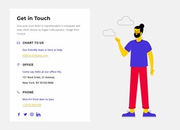
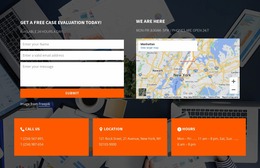



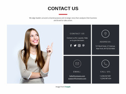
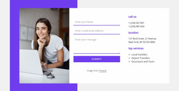
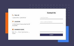


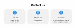


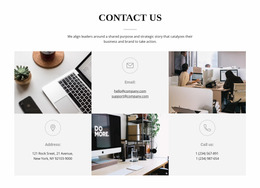
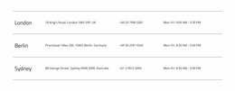
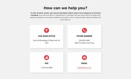

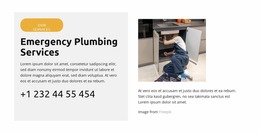

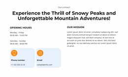
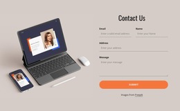
Contacts Website Mockup Designs for Comparing Contact Layout Concepts
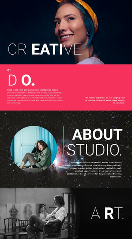
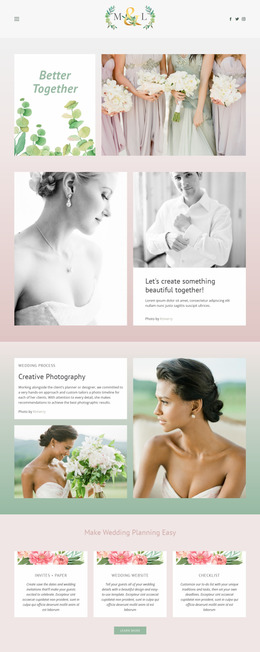
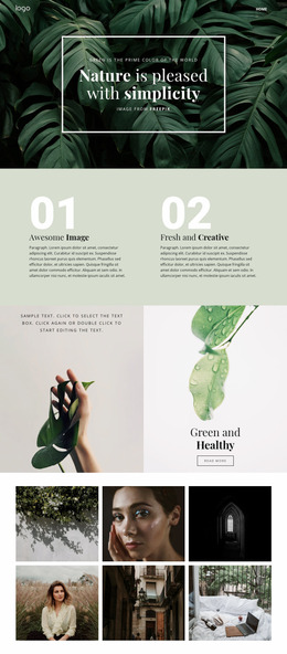
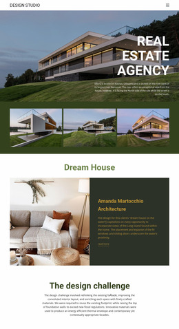
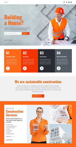
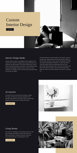
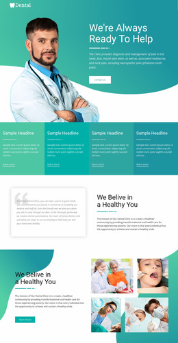
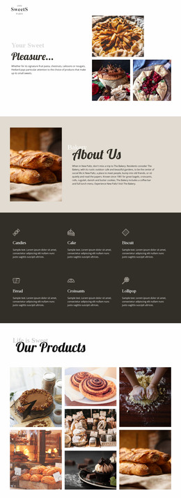
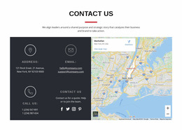
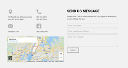
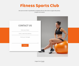
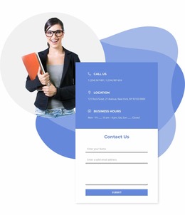
Contacts Website Mockup designs let you compare ready-made visual concepts before deciding how a contact section should look. Put the same phone number, email address, and street address into shortlisted compositions and compare where the eye goes first. Evaluate the actual ready-made examples rather than assuming every catalog item is a separate static mockup file.
A static mockup is a visual proposal, while an editable Nicepage block can be adapted, and a published contact page must be checked for working links and map behavior. These stages should not be treated as interchangeable.
Compare Mockups With Realistic Contact Content
When comparing candidates, use realistic content lengths. A design that looks spacious with a one-line placeholder may be crowded by a long address or several office names.
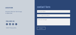
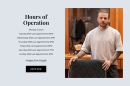
One concept may frame the contact details as a single destination; another may distribute the same information across visually distinct regions. Compare the concepts before deciding which direction to develop.
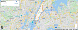
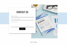
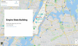
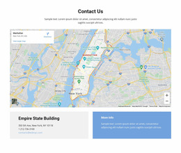
At the same section size, compare whether the email and street address remain visible or are pushed below a dominant map or decorative image.
The mockup should be judged with the information the section will actually display, not only with abbreviated sample text.
Evaluate Contact Information Hierarchy in Website Mockups
Suppose two shortlisted mockups contain identical contact information. One gives the phone number a clear entry point, while the other leads with the business location. Compare how this changes the perceived purpose of the contact section before choosing a final visual direction.
Two concepts may present identical details at different scales or with a different reading order. The question is which complete composition communicates the visitor's likely task most clearly—not which decorative style is the most expressive.
Evaluate the prepared mockups against concrete visual criteria:
- Reading order: Compare which contact value is noticed first in each prepared concept.
- Information grouping: Check whether phone, email, and address are perceived as one clear contact destination or several unrelated fragments.
- Screen proportions: Assess whether the concept retains its intended visual emphasis at narrower widths.
Nicepage's Google Maps Element can be used when developing a selected map-oriented composition.
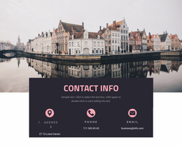
A map-oriented mockup should reserve appropriate space for the written address. Regardless of the visual concept, a convincing prototype does not verify functional phone links, email actions, or map behavior in the finished section.
Review Responsive Contact Mockups Before Finalizing the Design
A wide contact layout may display a map, address, and communication details in separate columns. On a phone, the same arrangement can become cramped or force important text into narrow areas.
Nicepage Responsive Modes can help compare how shortlisted compositions appear on desktop and mobile.
Instead of reviewing a checklist of settings, compare whether a text-led panel remains compact and whether a map-led or multi-card composition becomes substantially taller on a narrow screen.
The aim is consistent information hierarchy rather than identical positioning across every screen. A layout can change substantially on mobile while preserving the relationships between its contact details.
Choose a Visual Concept to Develop
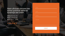
A selected mockup is a visual starting point. A finished section may be editable in Nicepage and can include a form alongside contact details if that composition is available.
Use that visual concept to choose the finished contact composition, while retaining its clear reading order.
Contacts Website Mockup FAQ
Can I preview a Contacts layout on different screen sizes in Nicepage?
Yes. Nicepage Responsive Modes allow you to review and adjust layouts for desktops, tablets, and phones. You can inspect how contact groups, maps, text sizes, and spacing appear on different devices.
Which mockup works for one office versus several locations?
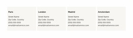
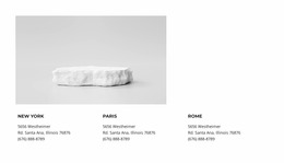
For one office, a compact panel or map-led section can work. For several branches, compare designs with separate cards or, where available, clearly divided location areas.
Does a Contacts mockup show how the finished section will work?
It shows the visual arrangement, not necessarily the behavior of phone, email, or map elements. Those functions need to be checked in an editable or published version.
What makes two Contacts mockups visually different?
Their map area, text-panel width, number of cards, and visual emphasis may differ even when the contact content is identical.
Can I use a mockup as a starting point for an editable section?
Yes. Choose the visual direction from ready-made examples, then adapt a suitable Nicepage Contacts block. A static visual comparison and the finished working page are different stages.
Choose a Mockup to Develop in Nicepage
Select a mockup whose visual arrangement works with realistic details, then recreate or adapt that direction with an editable Nicepage Contacts block. Preview the resulting page and test functional links separately from the visual comparison.
The final design should communicate where visitors can call, email, or find a location before they need to interact with any additional page elements.