Modal Popup Website Mockups
-
-

-
-
-
-
-
-
-
-
-
-
-
-
-
-
-
-
-
-
-
Customize Any TemplateDownload
-
-
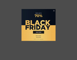
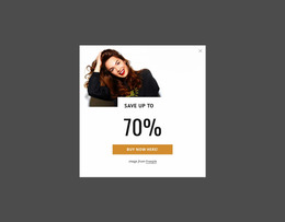
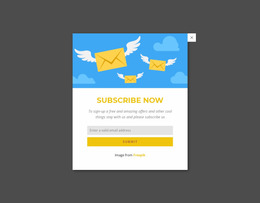
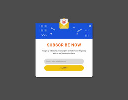
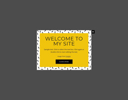
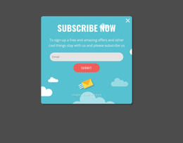

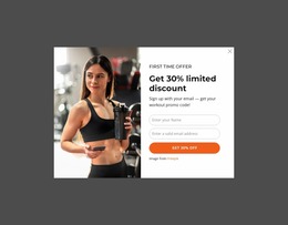


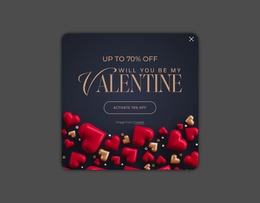

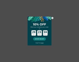

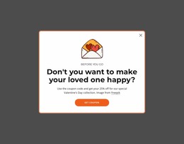
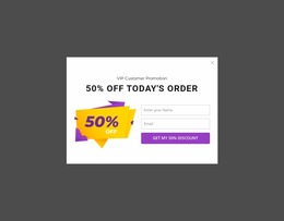
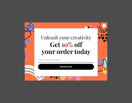
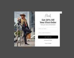
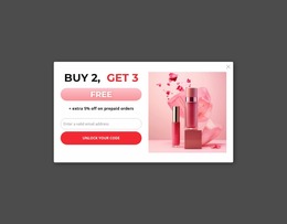
Responsive Modal Popup Website Mockup Blocks for Screen-Size Review
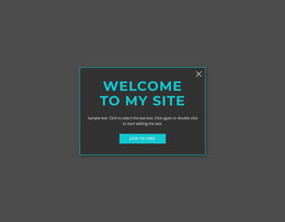
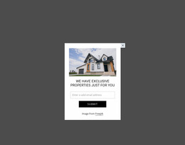
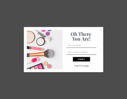
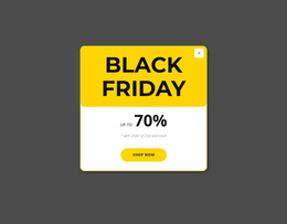
A Modal Popup Website Mockup helps evaluate a temporary overlay before or during implementation rather than treating it as another permanent section in the page flow. The review centers on how clearly the popup isolates its message, how much content fits inside the focused area, and how that composition holds together across different screen widths.
How Should a Modal Popup Be Evaluated in a Website Mockup?
A mockup review can compare more than breakpoints. Check: - alternative popup proportions for the same message; - the page before and after opening the modal; - foreground-to-background balance when the overlay is active; - two or three composition variants before choosing the final direction.
Start with the interaction the visitor will actually experience. A modal popup appears above the existing page after a trigger, takes temporary visual priority, and then allows the visitor to return to the underlying content. That makes focal hierarchy more important than simply matching the proportions of nearby sections.
Review whether the headline, supporting text, form, image, or CTA has an obvious order. A popup intended for a short notice needs different density from one carrying a signup form or additional product detail. The overlay should remain understandable as a self-contained interaction and not be mistaken for a separate full page.
Professional Popup Review Across Screen Sizes
A wide-screen popup can accommodate spacing and horizontal relationships that become crowded at narrower widths. Website mockup evaluation should therefore compare the same overlay under different screen conditions rather than approving it from a single desktop view.
Look at the size of the focused content area, text wrapping, image scale, spacing between controls, and the relationship between the popup and the visible page behind it. Dense promotional copy or a form with several fields may need substantially different visual balance on a phone than on a large screen.
Nicepage Responsive Modes support this review by providing Large Screen, Desktop, Laptop, Tablet, and phone views. They are useful here because the suffix is about visual evaluation: the goal is to judge how the modal composition behaves as available screen space changes.
Modal Popup vs Contact Form in a Layout Review
A Contact Form and a Modal Popup may contain similar elements, but you should not evaluate them as the same block type. A form is defined by fields, labels, visitor input, and submission. It can remain visible in the normal page flow.
A modal is defined by the temporary overlay interaction. Even when the popup contains a form, the mockup review must also consider the overlay boundary, visual focus, trigger-to-popup relationship, and return to the underlying page.
Nicepage provides a Modal Popup feature specifically for this overlay pattern. Keeping that interaction model clear prevents a generic card, form, or promotional panel from being evaluated as a popup by default.
Review Content Density Before Finalizing the Overlay
The strongest mockup is not necessarily the one with the most content. A short promotion may need a headline, one supporting sentence, and one action, while a detail popup can justify more visual structure. The amount of information should match the interruption the overlay creates.
Compare alternative arrangements when the hierarchy feels crowded. Reducing copy, changing image prominence, or reorganizing the action area can make the temporary content easier to interpret without changing the block's purpose.
Modal Popup Website Mockup FAQ
How does Nicepage handle different screen sizes?
Nicepage provides Responsive Modes for Large Screens, Desktops, Laptops, Tablets, and horizontal and vertical phone views. You can use these views to review how a popup composition appears across different widths.
Is a website mockup automatically a wireframe?
No. In this context, the mockup is used to evaluate the visual and responsive composition of the modal popup, including hierarchy, density, and presentation across screen sizes. It should not automatically be described as a low-fidelity wireframe or prototype.
What should I check first in a modal popup mockup?
Check whether the overlay establishes one clear focal task. Then review the hierarchy of its message, media, form, or CTA, followed by content density and how those relationships change at narrower screen widths.
Why compare the popup before and after it opens?
The comparison shows whether the overlay creates enough visual separation without losing the context of the page beneath it.
Evaluate a Modal Popup Before Using It on the Page
Choose a popup design that matches the intended temporary action, adapt its content in the Nicepage editor, and review its focal hierarchy in Responsive Modes. Compare the overlay across screen sizes, refine crowded areas, and integrate it into the project only when its message and interaction remain clear.