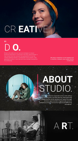
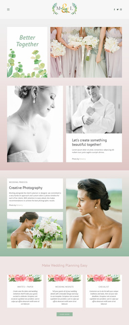
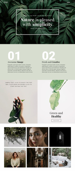
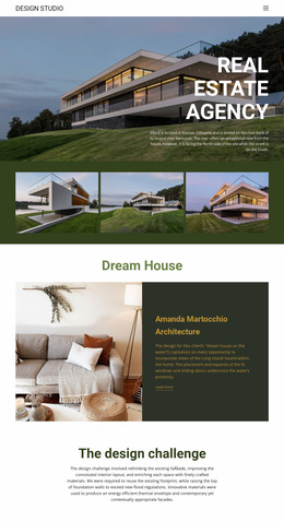
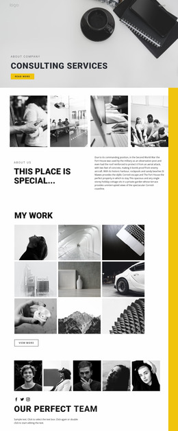
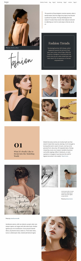
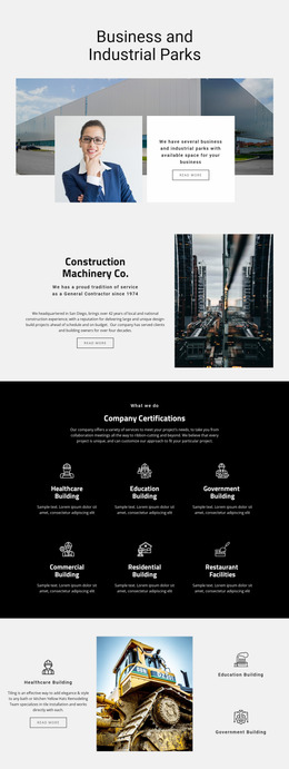
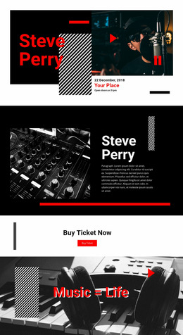
460 Food & Restaurant Website Mockups
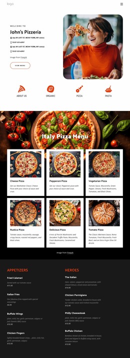
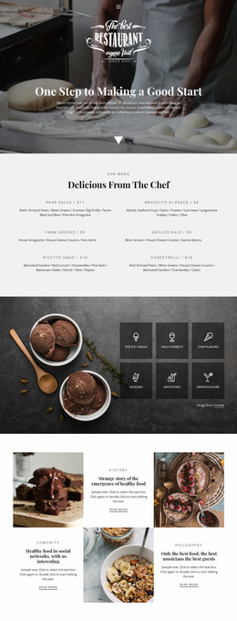
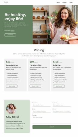
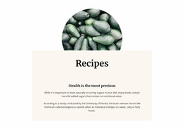

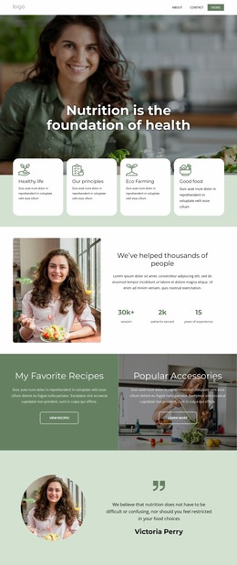
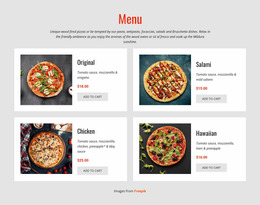
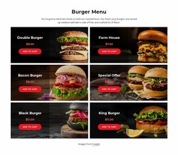
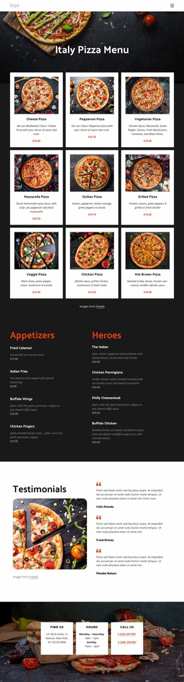
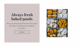
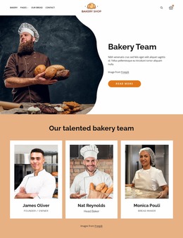
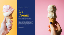
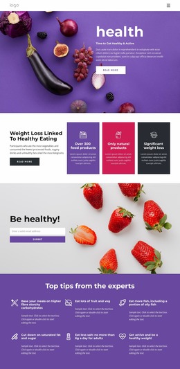
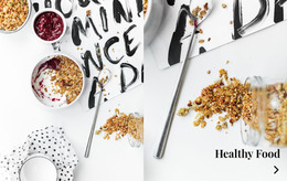
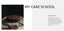
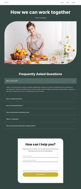
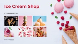
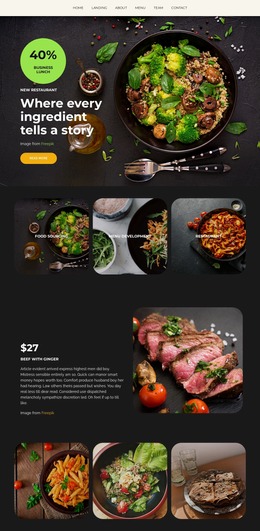
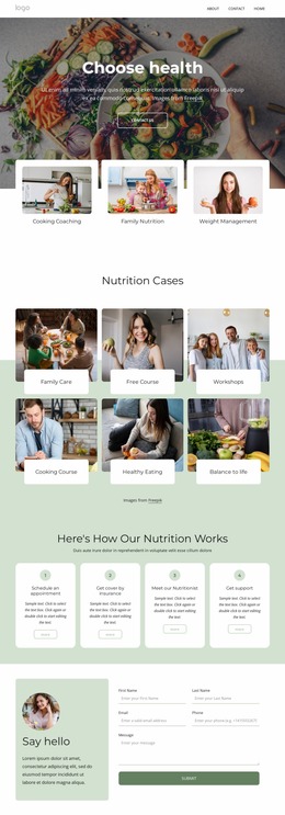
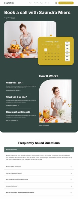
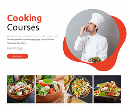
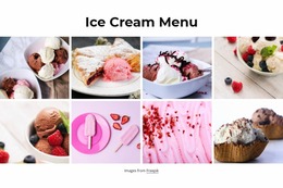
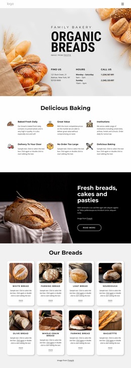
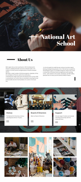
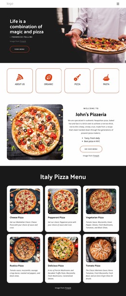
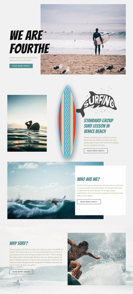
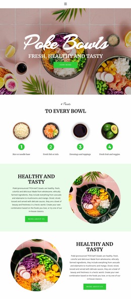
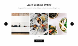
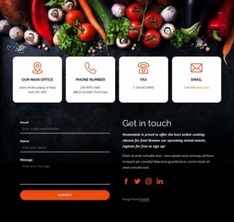
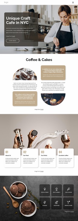

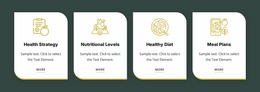
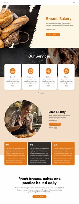
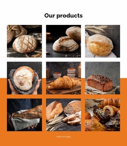
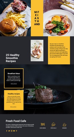
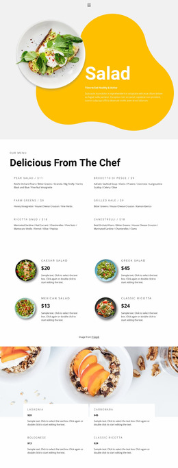
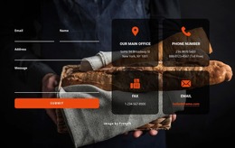
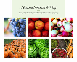
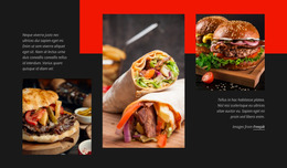
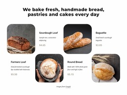
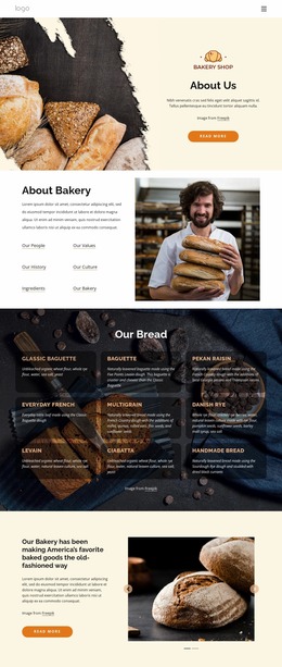

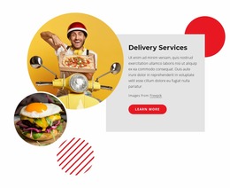
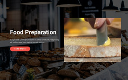
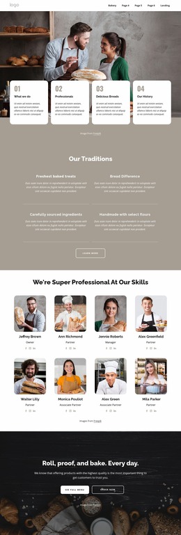
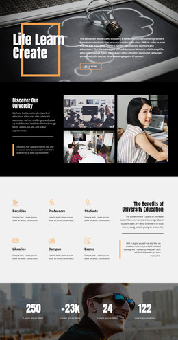
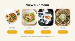
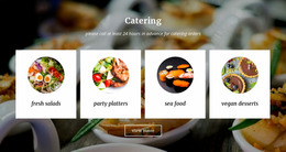

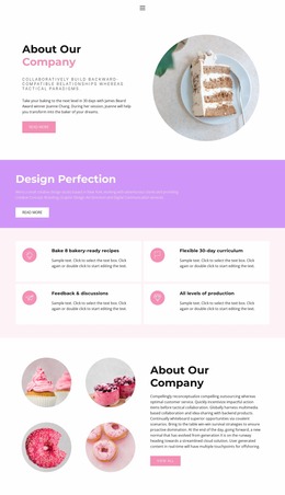
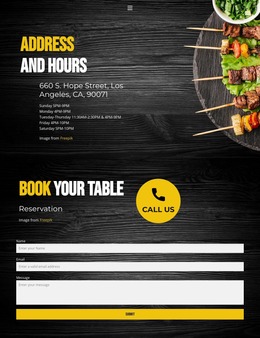
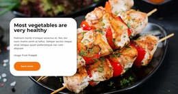
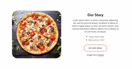
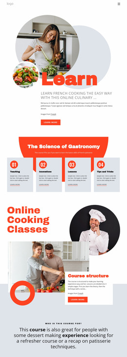
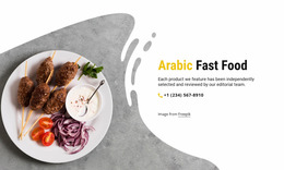
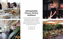
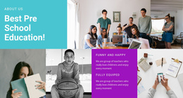
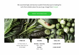
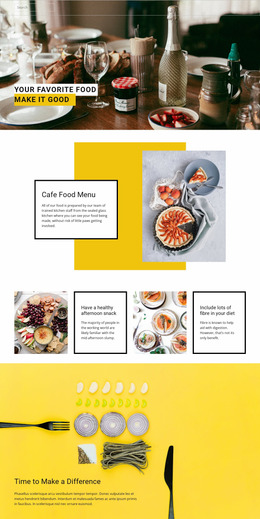
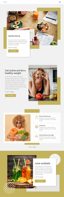
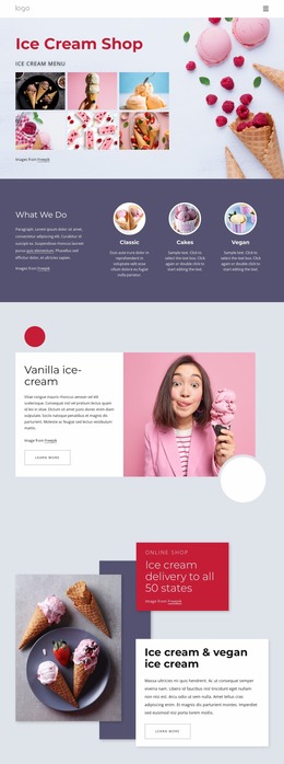
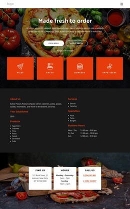
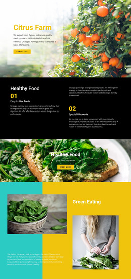
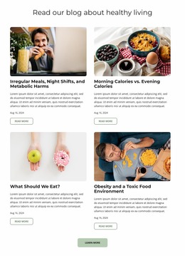

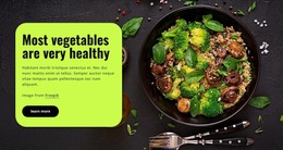
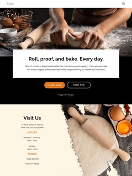
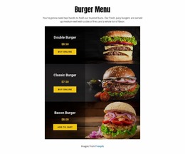
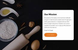
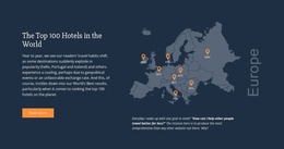
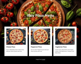
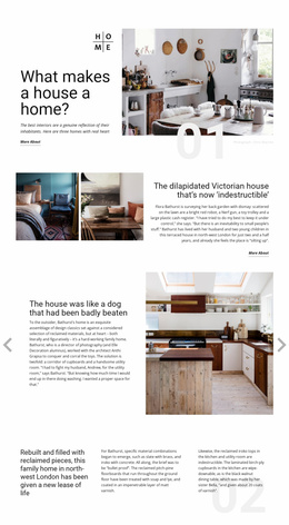
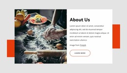
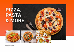
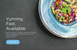
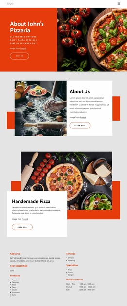
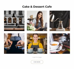
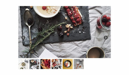
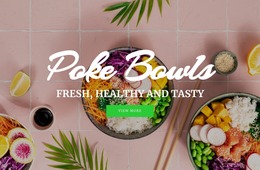
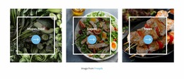
Professional Food & Restaurant Website Mockup Ideas
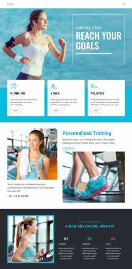
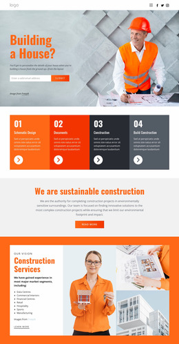
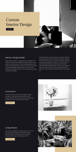
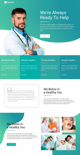
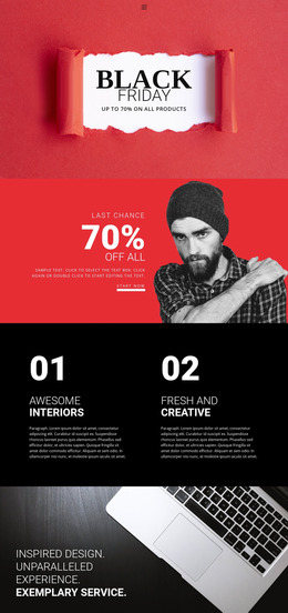
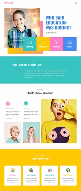
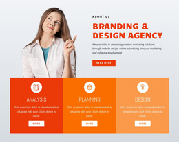
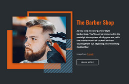
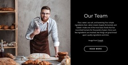
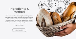
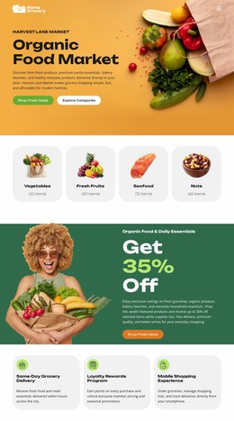
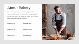
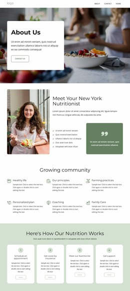
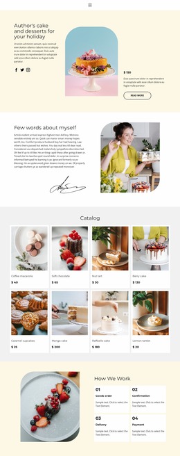
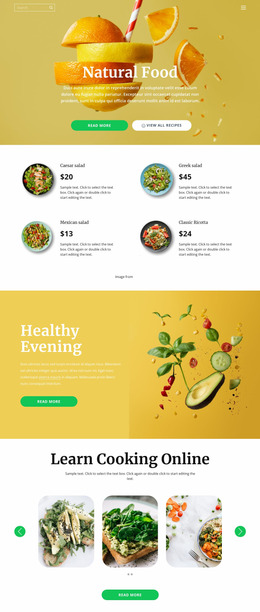
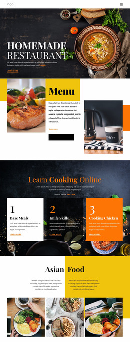
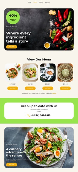
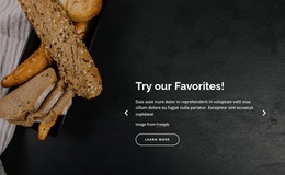
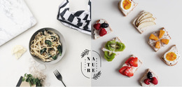
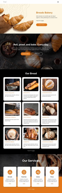
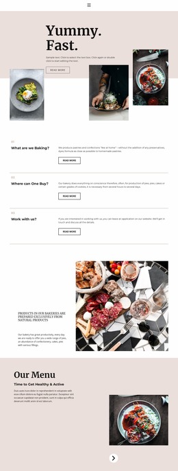
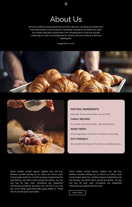
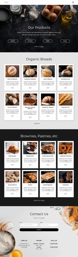
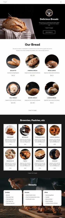
For restaurant owners, chefs, caterers, and food brands, a food & restaurant website mockup is a practical way to compare page ideas before production begins. A mockup can test hierarchy, menu density, CTA placement, image balance, and mobile flow. At the same time, the structure is still easy to change, so teams can choose a stronger direction before committing to the final implementation.
What Should a Restaurant Website Mockup Test?
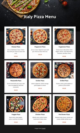
A useful prototype should answer practical layout questions before development starts. Does the hero clearly communicate the venue and primary action? Can visitors scan a long menu without losing prices or categories? Are reservation, order, or inquiry CTAs visible at the right moments? Do location details and opening hours appear where visitors naturally expect them?
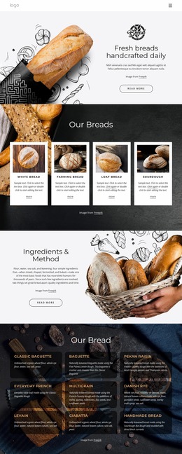
Restaurants: Compare a hero-first concept with a menu-first alternative. Caterers: Test whether packages or inquiry actions deserve earlier placement. Fast-food brands: Compare compact product grids with larger promotional cards. Food creators: Check how much visual space photography can take before navigation and content become harder to scan.
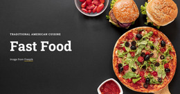
A catering business can compare service structures through catering website concepts. At the same time, quick-service teams can study fast-food layouts when they want to emphasize dishes, offers, and short conversion paths.
Prototype Menu Density, CTA Placement, and Mobile Flow
Nicepage supports iterative visual testing before the site reaches production. The editor interface provides controls for content, layout, colors, fonts, and responsive modes, making it practical to build several restaurant mockup variations and compare them side by side.
Hierarchy and content tests
- Try different orders for hero, menu, gallery, reviews, location, and contact sections.
- Compare compact menu cards with roomier layouts when dish names or descriptions vary in length.
- Test whether booking, order, call, or inquiry CTAs work better in the header, hero, after the menu, or near venue details.
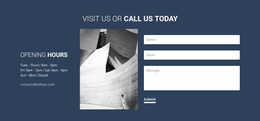
- Check how opening hours, address, phone details, and map-related content fit into the page flow.
Responsive prototype checks
- Review whether the primary CTA remains visible and understandable on phones.
- Compare stacked and grid-based menu treatments for narrow screens.
- Check whether food photography pushes important actions too far down the mobile page.
- Test navigation and section order before production decisions become harder to reverse.
Nicepage Blocks provide a block-based page structure that can begin from blank, preset, or predesigned sections. That makes it easier to duplicate a concept, move sections, and compare alternatives without treating the first layout as final.
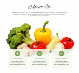
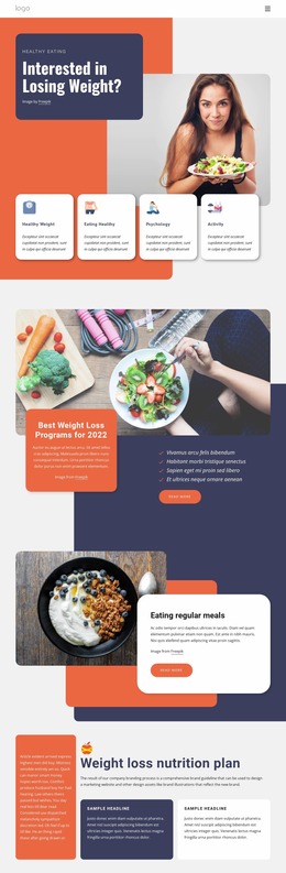
Broader food website ideas can provide additional visual direction for recipe brands, producers, chefs, and hospitality businesses, while each mockup stays focused on a specific user path.
Compare Variants Before Moving to Production
A mockup is most valuable when it helps eliminate weaker choices early. Prepare two or three variations when the decision is important: for example, a menu-led restaurant homepage versus an atmosphere-led version, or a sticky booking CTA versus an inline CTA after signature dishes.
Compare the concepts using the same real content wherever possible. Long dish names, actual opening hours, real contact details, several menu categories, and representative photography reveal layout problems more clearly than generic placeholders. Review desktop and mobile versions before choosing the direction for final production.
Practical Questions About Restaurant Website Mockups
What should I test first in a restaurant website mockup?
Start with hierarchy and the primary visitor action. Check whether users can quickly understand the restaurant, reach the menu, and identify the booking, order, call, or inquiry action without searching through the page.
Should I test more than one restaurant homepage concept?
Yes. Comparing two or more variations can show whether a menu-led, image-led, offer-led, or reservation-led structure works better before you build the final page
How can I prototype repeated dish or catering cards?
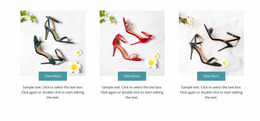
Use the Grid Repeater to create a consistent card structure for dishes, packages, services, or locations, while keeping individual text and images distinct. This makes it practical to compare card density, hierarchy, and visual rhythm before final implementation.
Refine the Restaurant Prototype Before Production
Start with a suitable design direction, build the main restaurant flow in the visual canvas, and test the decisions that matter most: section hierarchy, menu density, CTA placement, opening and location details, and mobile behavior. Compare alternatives while changes are still inexpensive, then carry the strongest mockup into the appropriate publishing or export workflow.