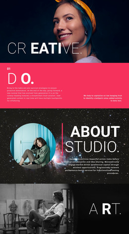
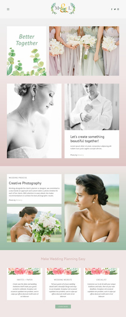
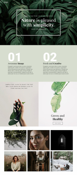
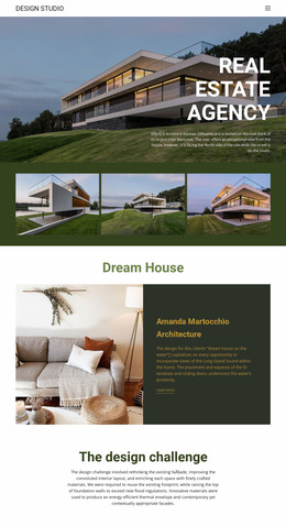
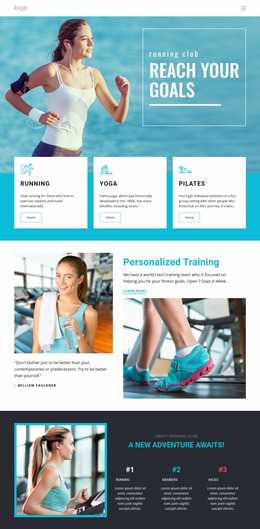
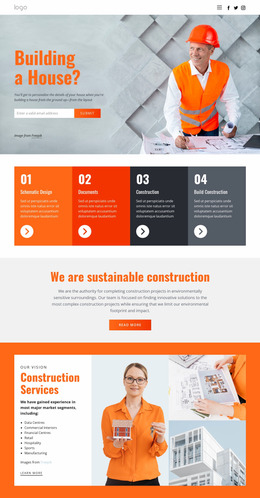
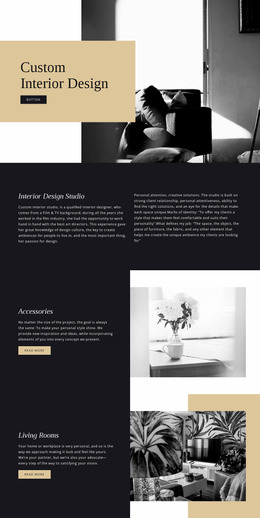
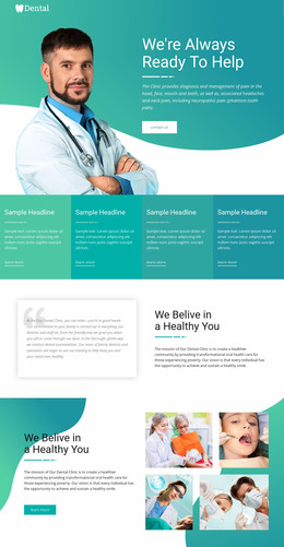
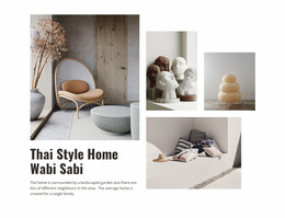
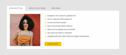
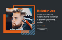
100 Text & Button Website Mockups
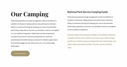
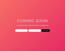
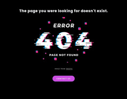
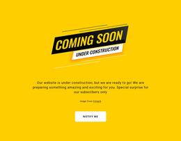
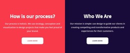
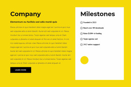
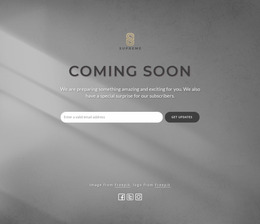
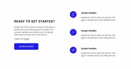



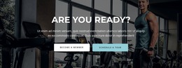
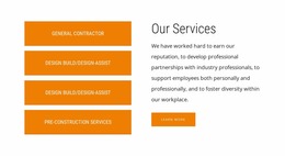
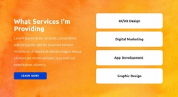
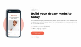

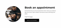
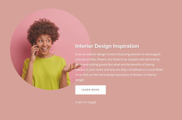
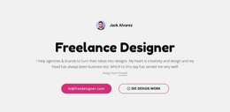
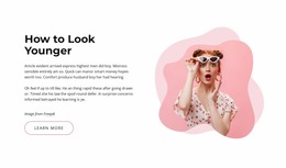
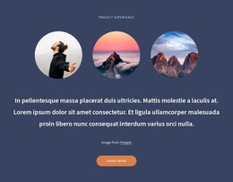
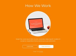
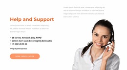

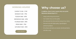
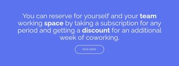
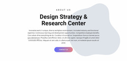
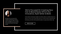

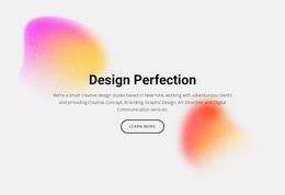
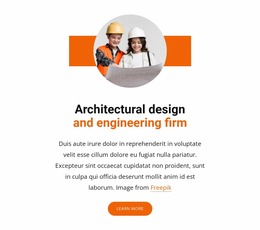
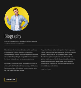

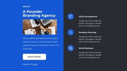

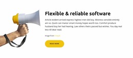


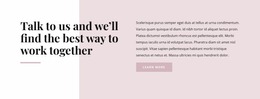
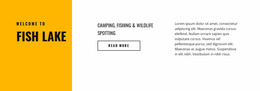
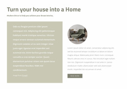


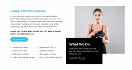




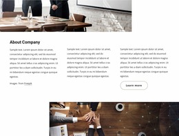
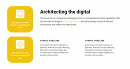
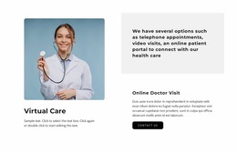
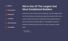
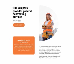
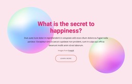
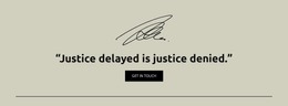





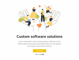


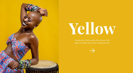
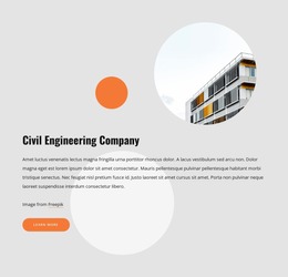
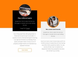
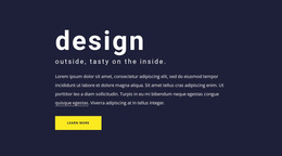
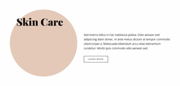
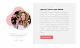
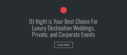
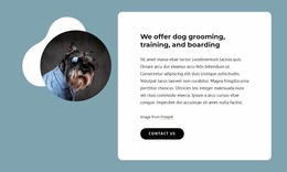
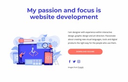

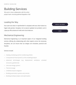
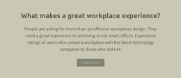
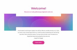
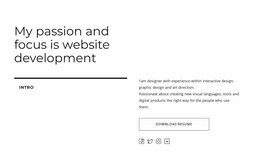
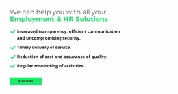
Responsive Text & Button Website Mockup for CTA Evaluation
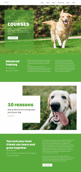
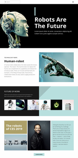
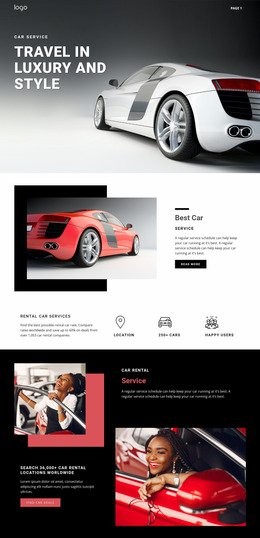
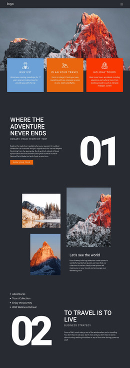
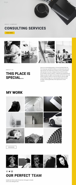
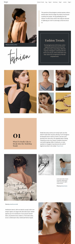
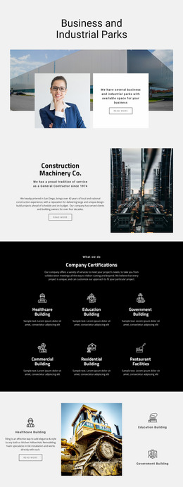
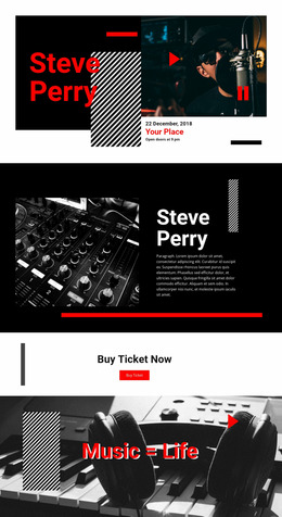
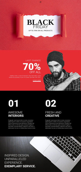
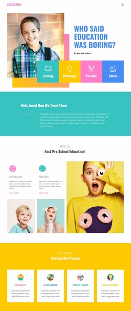
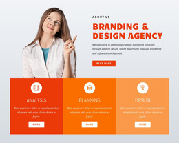
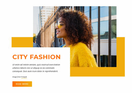
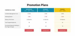
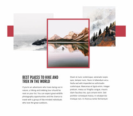
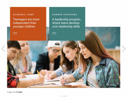
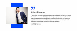
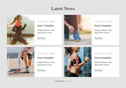
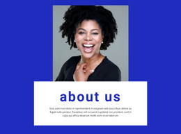
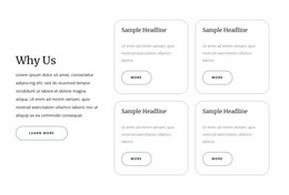
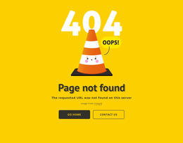
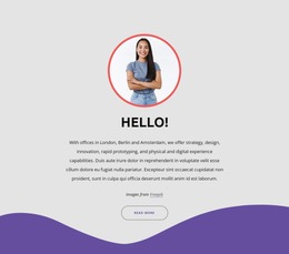
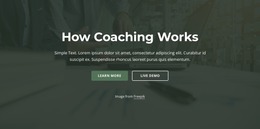
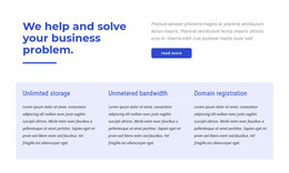
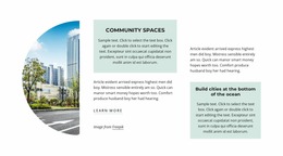
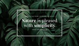
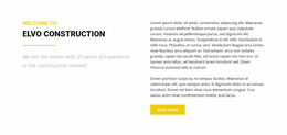
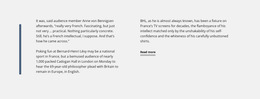
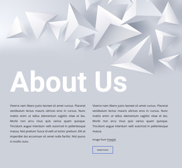
A Text & Button Website Mockup is useful when you already have a section composition and need to review how well it works with realistic content. The goal isn't just to find an attractive preview, but to test whether the message, supporting copy, and CTA stay clear when the block is filled with real text and viewed at relevant screen sizes.
Review the Mockup With Realistic Content
Replace placeholder text with the approximate headline length, supporting copy, and button label you expect to use. A layout that looks balanced with short sample copy can feel crowded once you add the real message.
Review practical details such as:
- whether the headline still has enough visual priority;
- whether supporting copy makes the section too dense;
- whether the CTA remains easy to associate with the message;
- whether imagery or a backdrop competes with the action;
- whether the overall section still feels balanced with realistic content.
Evaluate CTA Prominence and Section Density
A useful mockup check focuses on three relationships:
- Message hierarchy: does the headline establish the main point before the supporting copy adds detail?
- CTA prominence: is the Button Element easy to find without looking detached from the text?
- Content density: does the amount of copy leave enough space for the action to remain obvious?
If one of these relationships breaks, adjust copy length, text width, spacing, or CTA position, then review the result again.
Check the Composition Across Responsive Widths
Mockup evaluation becomes especially important when the available width changes. A side-by-side composition may work well on a large screen but become crowded when text and buttons stack more tightly.
Nicepage Responsive Modes provide views for Large Screens, Desktops, Laptops, Tablets, and horizontal and vertical phones. Use them to check whether text wrapping, spacing, imagery, and CTA placement preserve the same hierarchy at narrower widths.
Compare Variants by How Well They Hold Up
If you are considering more than one composition, compare them using the same real content and the same width conditions. A stronger mockup keeps the intended hierarchy stable with fewer compromises.
That makes the choice evidence-based: not “which preview looks nicest,” but which composition works best with the actual Text & Button content.
Text & Button Website Mockup FAQ
Can I review a Text & Button section at different screen sizes?
Yes. Nicepage provides Responsive Modes for Large Screens, Desktops, Laptops, Tablets, and horizontal and vertical phones. Use those views to evaluate hierarchy, density, spacing, and CTA prominence at different widths.
Should I replace placeholder text before evaluating the mockup?
Yes. Realistic headline and supporting-copy lengths make the review more useful because they show whether the composition remains balanced with the content you actually expect to use.
What should I check first in a Text & Button mockup?
Start with message hierarchy, CTA prominence, and content density. These relationships usually reveal whether the section works before you spend time on smaller visual refinements.
Can I use a pre-designed block as the basis for mockup review?
Yes. A pre-designed block can be a practical starting composition. Add realistic content, review it at relevant widths, and refine the arrangement based on how well the section actually works.
What makes a mockup review useful before final editing?
It helps expose layout problems early, such as overcrowded copy, weak CTA prominence, awkward wrapping, or spacing that breaks the relationship between the message and action.
Evaluate the Section Before Finalizing the Arrangement
Use realistic content, review the hierarchy and density, test the section across relevant widths, and compare variants under the same conditions.