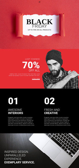
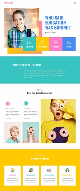
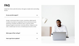
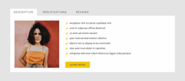
130 Layered Images Website Mockups















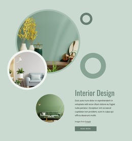

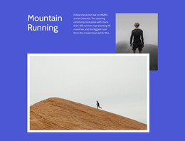


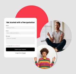

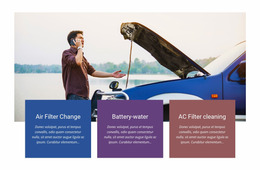

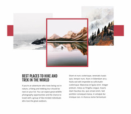



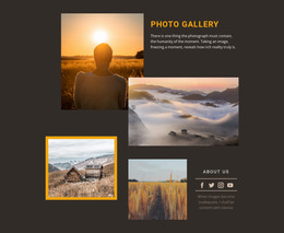


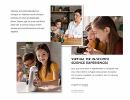



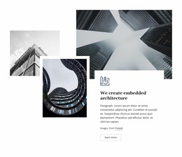
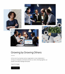







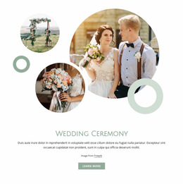
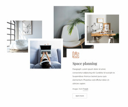


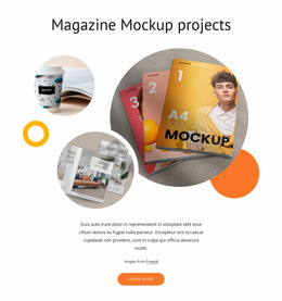
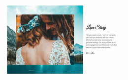
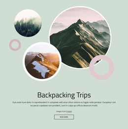






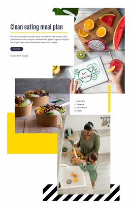




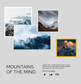



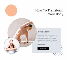
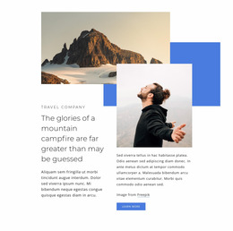

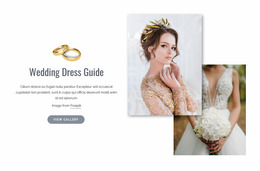


























Responsive Layered Images Website Mockup for Composition Evaluation
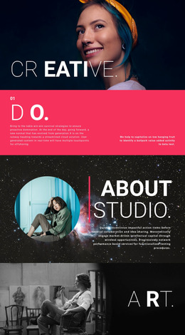
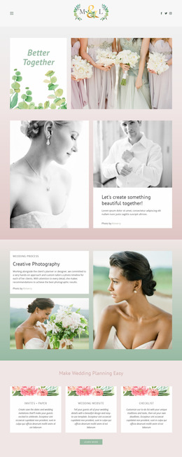
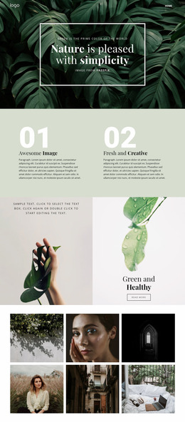
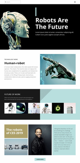
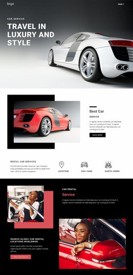
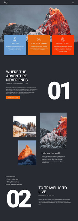
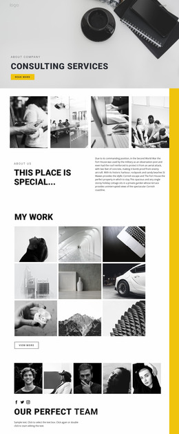
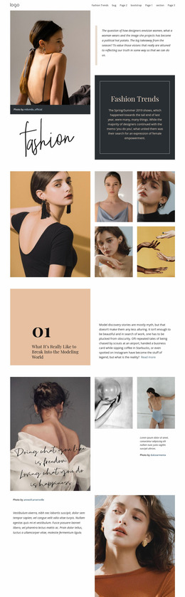
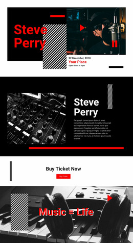
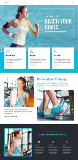
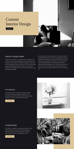
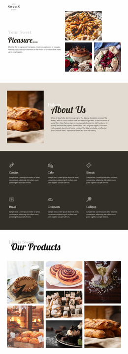
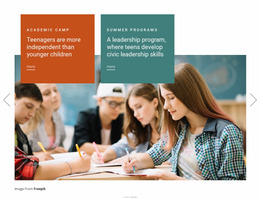
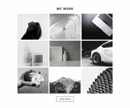
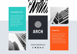
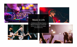
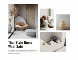
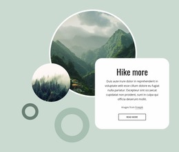
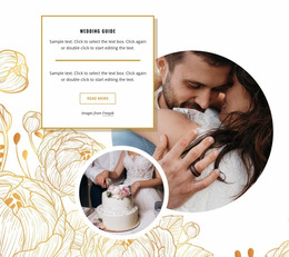
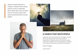
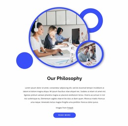
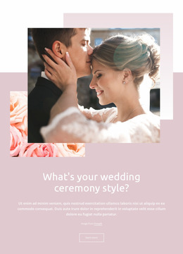
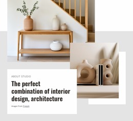
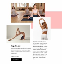
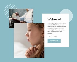
Layered Images Website Mockups are useful for evaluating how an overlapping image composition behaves before final integration. The focus isn't on browsing visual ideas, but on checking whether the arrangement preserves a clear hierarchy, enough visible image area, readable supporting content, and stable relationships across different screen widths.
Evaluate Focal Hierarchy in a Layered Images Mockup
Start by checking which image attracts attention first and whether the supporting visuals strengthen that priority.
Review details such as:
- Dominant image clarity — one image should still read as the main focal point.
- Occlusion — supporting visuals should not cover important parts of the primary image.
- Crop loss — key content should remain visible after resizing or repositioning.
- Visual density — overlaps should create depth without making the section feel compressed.
- Text clearance — headings, descriptions, or CTAs should remain visually separate from the image stack.
Compare Alternative Layered Arrangements
If a composition feels too dense or the focal order is unclear, compare alternative arrangements before finalizing the section.
You may test:
- a smaller supporting image;
- a wider offset between layers;
- a different front-to-back order;
- reduced overlap near text;
- a more open composition with additional negative space.
Use the comparison to verify which arrangement preserves the intended hierarchy most reliably.
The Image Element is the core image content used in these compositions, and the Image Element documentation covers how images can be edited in the Nicepage editor.
Review Responsive Behavior Across Screen Sizes
Width changes can introduce crop loss, crowded overlaps, or reduced text clearance on tablets and phones.
Nicepage Responsive Modes support customization for Large Screens, Desktops, Laptops, Tablets, and horizontal or vertical phone views. The Responsive Modes workflow is useful for checking how the same composition behaves across supported screen sizes.
During responsive review, inspect:
- mobile stacking and the order in which images move;
- hierarchy preservation when elements shrink;
- overlap depth after the available width changes;
- text clearance around the image group;
- visible crop area for the main and supporting visuals.
Verify the Composition Before Final Integration
Before final integration, compare desktop and mobile states side by side. Check that the dominant image remains obvious and no important text or image content is obscured. If the hierarchy changes, refine the arrangement and review it again.
Layered Images Website Mockup FAQ
What should I evaluate first in a Layered Images Website Mockup?
Start with focal hierarchy. Identify the dominant image, then check whether supporting visuals add depth without competing equally for attention.
How can I check whether image overlap is too strong?
Inspect how much of each image remains visible, whether important content is obscured, and whether the composition still has enough open space around the layered edges.
Can I compare the mockup on different screen sizes?
Yes. Nicepage Responsive Modes support Large Screens, Desktops, Laptops, Tablets, and horizontal or vertical phone views.
What should I review on mobile?
Check stacking order, crop loss, text clearance, image scale, and whether the same focal hierarchy is preserved as the composition narrows.
Review and Verify the Layered Composition
Use the mockup to inspect image hierarchy, overlap, density, crop behavior, and responsive changes. Compare alternative arrangements where needed, then finalize the version that preserves the clearest visual relationship across screen sizes.